DevExpress Radial Progress Bar for .NET MAUI
- 3 minutes to read
The RadialProgressBar control is a gauge that allows you to visualize statistics, loading states, or the progress of an operation.

Radial Progress Bar Elements (Anatomy)
The following figure shows basic elements of a radial progress bar:

Add a Radial Progress Bar to a Project
Follow the steps below to add a RadialProgressBar to an app:
- Install the DevExpress.Maui.Gauges NuGet package. Refer to the following topic for more information: Get Started. Note that
DevExpress.Maui.Gaugesautomatically references theSkiaSharp.Views.Maui.Controlslibrary that is used to render gauges. - Declare the
xmlns:dxga="clr-namespace:DevExpress.Maui.Gauges;assembly=DevExpress.Maui.Gauges"namespace in the ContentPage. - Add
<dxga:RadialProgressBar>…</dxga:RadialProgressBar>tags to the page.
<ContentPage ...
             xmlns:dxga="clr-namespace:DevExpress.Maui.Gauges;assembly=DevExpress.Maui.Gauges">
    <dxga:RadialProgressBar Value="0.3"
                            StartAngle="-180"
                            SweepAngle="360"/>
</ContentPage>
Specify Value Boundaries
You can set the progress bar Value property to a number between default boundaries of 0 and 1. You can specify StartValue and EndValue to define custom value boundaries.
<dxga:RadialProgressBar Value="30"
                        StartValue="0"
                        EndValue="100"/>
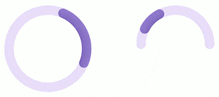
Define Indeterminate State
Set a progress bar’s IsIndeterminate property to true to switch the progress bar to indeterminate state. In this state, RadialProgressBar moves its value indicator along the ring or arc to indicate that some operation is in progress. Note that different animation effects apply to the value indicator for a circle scale and arc scale.
<dxga:RadialProgressBar ...
                        IsIndeterminate="{Binding Source={x:Reference switch}, Path=IsToggled, Mode=TwoWay}">
Specify Scale Layout
The position of a scale depends on the following properties:
- StartAngle
The clockwise rotation angle that defines the scale start position, in degrees. The following image shows a radial progress bar with different starting angles (the sweep angle is 240 degrees).

- SweepAngle
Specifies the sweep angle of a scale, clockwise in degrees. The following image shows a radial progress bar with different sweep angles (the start angle is 0):

The following figure shows how StartAngle and SweepAngle affect the scale:

<dxga:RadialProgressBar ...
                        StartAngle="0" SweepAngle="360"/>
<dxga:RadialProgressBar ...
                        StartAngle="-180" SweepAngle="180"/>
Configure Animation
You can apply different animation effects to the value indicator when the Value property changes. Enable a progress bar’s AllowAnimation property. You can use the AnimationDuration property to set the animation progress time.
Specify the AnimationEasing property to define how the value indicator animation speeds up or slows down. The following easing functions are available:
- BackEasingFunction
- BounceEasingFunction
- CircleEasingFunction
- CubicEasingFunction
- ElasticEasingFunction
- ExponentialEasingFunction
- LinearEasingFunction
- PowerEasingFunction
- QuadraticEasingFunction
- QuarticEasingFunction
- QuinticEasingFunction
- SineEasingFunction
The following example applies animation effects to a radial progress bar:

<dxga:RadialProgressBar ...
                        AllowAnimation="True"
                        AnimationDuration="0:0:2">
    <dxga:RadialProgressBar.AnimationEasing>
        <dxcore:ExponentialEasingFunction EasingMode="In" Exponent="2"/>
    </dxga:RadialProgressBar.AnimationEasing>
</dxga:RadialProgressBar>
Add Center Content
Specify a progress bar’s Content property to add any content to the center of the progress bar. The ContentTemplate property allows you to define how the content looks. ContentTemplate uses the object you put to Content as its binding context.

<dxga:RadialProgressBar ...
                        SweepAngle="360" StartAngle="-180"
                        Value="{Binding ChargeInfo.Value}"
                        StartValue="0" EndValue="100"
                        Content="{Binding ChargeInfo}">
    <dxga:RadialProgressBar.BindingContext>
        <local:MainViewModel/>
    </dxga:RadialProgressBar.BindingContext>
    <dxga:RadialProgressBar.ContentTemplate>
        <DataTemplate>
            <dxcore:DXStackLayout Orientation="Vertical">
                <dxcore:DXImage Source="{Binding Icon}"
                                TintColor="#8F79CA" HeightRequest="50"/>
                <Label HorizontalOptions="Center" FontSize="Title" >
                    <Label.FormattedText>
                        <FormattedString>
                            <Span Text="{Binding Value}" FontAttributes="Bold"/>
                            <Span Text="%"/>
                        </FormattedString>
                    </Label.FormattedText>
                </Label>
            </dxcore:DXStackLayout>
        </DataTemplate>
    </dxga:RadialProgressBar.ContentTemplate>
</dxga:RadialProgressBar>
public class MainViewModel {
    public ChargeInfo ChargeInfo { get; set; } = new() { Value = 30, Icon = ImageSource.FromFile("lightning.svg") };
}
public class ChargeInfo : INotifyPropertyChanged {
    double _value;
    public ImageSource Icon { get; set; }
    public double Value {
        get { return _value; }
        set {
            _value = value;
            OnPropertyChanged();
        }
    }
    public event PropertyChangedEventHandler PropertyChanged;
    private void OnPropertyChanged([CallerMemberName] string propertyName = "") {
        PropertyChanged?.Invoke(this, new PropertyChangedEventArgs(propertyName));
    }
}
Customize Appearance
The following properties allow you to customize radial progress bar appearance:

<dxga:RadialProgressBar ...
                        Fill="LightGray"
                        ValueIndicatorFill="Coral"
                        Thickness="40"
                        ValueIndicatorThickness="34"/>