Get Started with Pie Chart for .NET MAUI
- 4 minutes to read
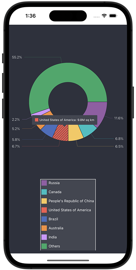
This topic explains how to create a sample application that uses PieChartView to visualize the distribution of the world’s land by country.
Create a Project
Create a new .NET MAUI project. Name it PieChartGetStarted.
If the wizard does not suggest a template for .NET MAUI projects, you can call the following command in a CLI to create a new .NET MAUI project:
dotnet new maui -n PieChartGetStartedInstall the
DevExpress.Maui.ChartsNuGet package.Refer to the following help topics for more information:
Note
DevExpress Pie Chart for .NET MAUI supports iOS and Android. The project should contain only these platforms.
Add a Pie Chart to the Main Page
In the MauiProgram.cs file, call UseDevExpress and UseDevExpressCharts methods to register a handler for the PieChartView class.
using DevExpress.Maui;
using Microsoft.Maui;
using Microsoft.Maui.Controls.Compatibility;
using Microsoft.Maui.Controls.Compatibility.Hosting;
using Microsoft.Maui.Controls.Hosting;
using Microsoft.Maui.Hosting;

namespace PieChartGetStarted {
    public static class MauiProgram {
        public static MauiApp CreateMauiApp() {
            var builder = MauiApp.CreateBuilder();
            builder
                .UseMauiApp<App>()
                .UseDevExpress()
                .UseDevExpressCharts()
                .ConfigureFonts(fonts => {
                    fonts.AddFont("OpenSans-Regular.ttf", "OpenSansRegular");
                    fonts.AddFont("univia-pro-regular.ttf", "Univia-Pro");
                    fonts.AddFont("roboto-bold.ttf", "Roboto-Bold");
                    fonts.AddFont("roboto-regular.ttf", "Roboto");
                })
                .UseMauiCompatibility();

            return builder.Build();
        }
    }
}
In the MainPage.xaml file, define the dx XAML namespace, remove default content, and add an instance of the PieChartView class to the page.
<ContentPage xmlns="http://schemas.microsoft.com/dotnet/2021/maui"
             xmlns:x="http://schemas.microsoft.com/winfx/2009/xaml"
             xmlns:dx="http://schemas.devexpress.com/maui"
             xmlns:local="clr-namespace:PieChartGetStarted"
             xmlns:ios="clr-namespace:Microsoft.Maui.Controls.PlatformConfiguration.iOSSpecific;assembly=Microsoft.Maui.Controls"
             ios:Page.UseSafeArea="true"
             x:Class="PieChartGetStarted.MainPage">
    <dx:PieChartView>
        <!-- ... -->
    </dx:PieChartView>
</ContentPage>
Remove default content event handlers in the code-behind. We also recommend that you remove default styles (fonts, colors, and other settings) from the App.xaml file.
Populate the Pie Chart with Data
In this example, the chart compares countries by area. Create a ViewModel.cs file with the following classes:
namespace PieChartGetStarted
{
    class ViewModel
    {
        public IReadOnlyList<LandAreaItem> LandAreas { get; }

        public ViewModel()
        {
            LandAreas = new List<LandAreaItem>()
            {
                new LandAreaItem("Russia", 17.098),
                new LandAreaItem("Canada", 9.985),
                new LandAreaItem("People's Republic of China", 9.597),
                new LandAreaItem("United States of America", 9.834),
                new LandAreaItem("Brazil", 8.516),
                new LandAreaItem("Australia", 7.692),
                new LandAreaItem("India", 3.287),
                new LandAreaItem("Others", 81.2)
            };
            // ...
        }
        // ...
    }
    // ...
    class LandAreaItem
    {
        public string CountryName { get; }
        public double Area { get; }

        public LandAreaItem(string countryName, double area)
        {
            this.CountryName = countryName;
            this.Area = area;
        }
    }
}
In the MainPage.xaml file, add a new DonutSeries object to the PieChartView.Series collection. To bind the series to data, set the DonutSeries.Data property to a PieSeriesDataAdapter object. Use the adapter’s properties to specify the data source and fields that contain values and labels for series points.
<ContentPage.BindingContext>
    <local:ViewModel/>
</ContentPage.BindingContext>

<dx:PieChartView>
    <dx:PieChartView.Series>
        <dx:DonutSeries>
            <dx:DonutSeries.Data>
                <dx:PieSeriesDataAdapter DataSource="{Binding LandAreas}"
                                         LabelDataMember="CountryName"
                                         ValueDataMember="Area"/>
            </dx:DonutSeries.Data>
            <!-- ... -->
        </dx:DonutSeries>
    </dx:PieChartView.Series>
</dx:PieChartView>
Add a Legend to the Pie Chart
Create a Legend object, modify its settings, and assign this object to the PieChartView.Legend property.
<dx:PieChartView>
    <dx:PieChartView.Legend>
        <dx:Legend Orientation="TopToBottom"
                   HorizontalPosition="Center"
                   VerticalPosition="BottomOutside">
                   <!-- ... -->
        </dx:Legend>
    </dx:PieChartView.Legend>
</dx:PieChartView>
Enable Series Labels
Set the DonutSeries.Label property to a PieSeriesLabel object with specified TextPattern, Position, and Indent settings.
<dx:PieChartView>
    <dx:PieChartView.Series>
        <dx:DonutSeries.Label>
            <dx:PieSeriesLabel Position="TwoColumns" TextPattern="{}{VP}%" Indent="20">
                <!-- ... -->
            </dx:PieSeriesLabel>
        </dx:DonutSeries.Label>
    </dx:PieChartView.Series>
</dx:PieChartView>
Enable Tooltips for Chart Segments
Set the PieChartView.Hint property to a PieHint object. Set the PieHint.Enabled property to True.
<dx:PieChartView>
    <dx:PieChartView.Hint>
        <dx:PieHint Enabled="True">
            <!-- ... -->
        </dx:PieHint>
    </dx:PieChartView.Hint>
</dx:PieChartView>
Specify the tooltip pattern for donut segments.
<dx:DonutSeries.HintOptions>
    <dx:PieSeriesHintOptions PointTextPattern="{}{L}: {V}M sq km"/>
</dx:DonutSeries.HintOptions>
Modify the Pie Chart Appearance
In the view model, define a palette for donut segments.
class ViewModel
{
// ...
    public ViewModel()
    {
    // ...
        palette = PaletteLoader.LoadPalette("#975ba5", "#03bfc1", "#f8c855", "#f45a4e",
                                            "#496cbe", "#f58f35", "#d293fd", "#25a966");
    }
    // ...
    readonly Color[] palette;
    public Color[] Palette => palette;
}
// ...
static class PaletteLoader
{
    public static Color[] LoadPalette(params string[] values)
    {
        Color[] colors = new Color[values.Length];
        for (int i = 0; i < values.Length; i++)
            colors[i] = Color.FromArgb(values[i]);
        return colors;
    }
}
Set the PieChartView.ChartStyle property to a PieChartStyle object with specified Palette and BackgroundColor properties.
<dx:PieChartView>
    <dx:PieChartView.ChartStyle>
        <dx:PieChartStyle Palette="{Binding Palette}"
                          BackgroundColor="#2d313d"/>
    </dx:PieChartView.ChartStyle>
</dx:PieChartView>
Use the PieChartView.SelectionBehavior property to specify how to highlight a donut segment when a user selects it.
<dx:PieChartView SelectionBehavior="Hatch">
    <!-- ... -->
</dx:PieChartView>
Set the Legend.Style property to a LegendStyle object to change legend appearance. Specify object’s properties that customize the legend colors, indents, and text size.
<dx:PieChartView>
    <dx:PieChartView.Legend>
        <dx:Legend>
            <dx:Legend.Style>
                <dx:LegendStyle BorderColor="LightGray" BorderThickness="1"
                                BackgroundColor="#424651"
                                MarkerSize="18" TextIndent="6"
                                ItemsVerticalIndent="12">
                    <dx:LegendStyle.TextStyle>
                        <dx:TextStyle Color="White" Size="12"/>
                    </dx:LegendStyle.TextStyle>
                </dx:LegendStyle>
            </dx:Legend.Style>
        </dx:Legend>
    </dx:PieChartView.Legend>
</dx:PieChartView>
Set the PieSeriesLabel.Style property to a PieSeriesLabelStyle object with specified TextStyle and ConnectorThickness properties.
<dx:PieChartView>
    <dx:PieChartView.Series>
        <dx:DonutSeries>
            <dx:DonutSeries.Label>
                <dx:PieSeriesLabel>
                    <dx:PieSeriesLabel.Style>
                        <dx:PieSeriesLabelStyle ConnectorThickness="1">
                            <dx:PieSeriesLabelStyle.TextStyle>
                                <dx:TextStyle Color="#eff2f6" Size="12"/>
                            </dx:PieSeriesLabelStyle.TextStyle>
                        </dx:PieSeriesLabelStyle>
                    </dx:PieSeriesLabel.Style>
                </dx:PieSeriesLabel>
            </dx:DonutSeries.Label>
        </dx:DonutSeries>
    </dx:PieChartView.Series>
</dx:PieChartView>
Use the PieHintStyle.BackgroundColor property to change the hint background color.
<dx:PieChartView>
    <dx:PieChartView.Hint>
        <dx:PieHint Enabled="True">
            <dx:PieHint.Style>
                <dx:PieHintStyle BackgroundColor="#424651"/>
            </dx:PieHint.Style>
        </dx:PieHint>
    </dx:PieChartView.Hint>
</dx:PieChartView>