Accent Colors in Fluent Themes
- 4 minutes to read
When you apply a Fluent theme to DevExpress Blazor UI Controls, you specify an accent color. You can select a predefined color or pick a custom color based on user preferences or brand colors. The DevExpress theming algorithm uses the specified primary color to generate its associated color scale – lighter or darker shades. You can customize these colors too - review instructions later in this help topic. Once colors are set, controls use them to highlight their interactive elements in different states.
This topic describes how to manage accent colors in Fluent themes. For general information about DevExpress themes, refer to the following help topic: Themes.
Select the Accent Color from the Predefined Palette
Fluent themes include eleven predefined accent colors stored in the ThemeFluentAccentColor enumeration:
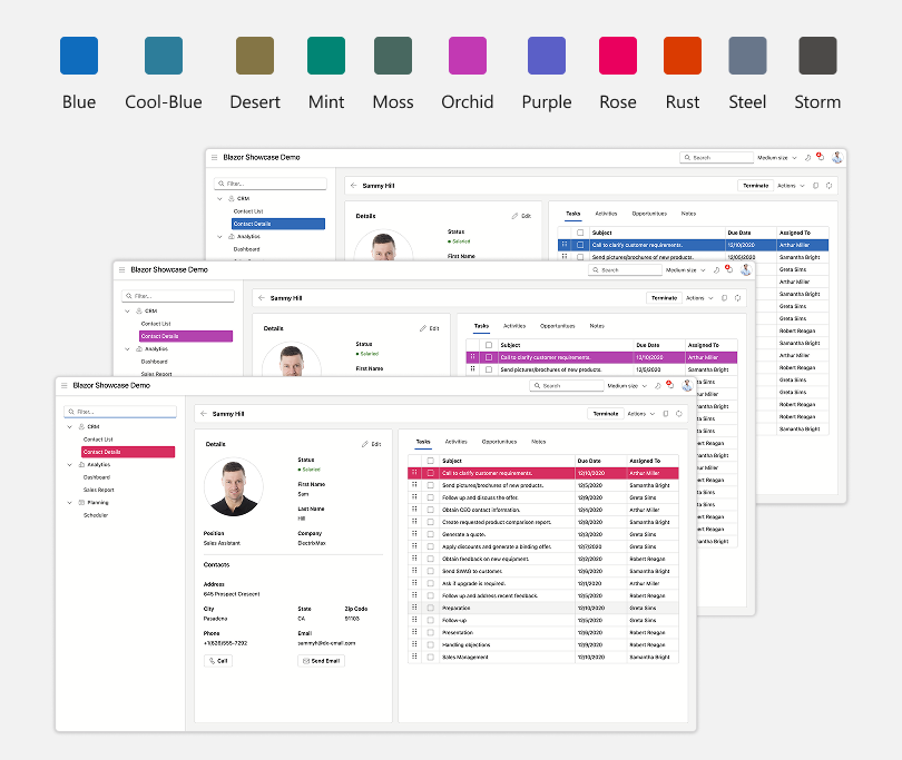
The default theme is Fluent Light Blue. To apply this theme, call the RegisterTheme(ITheme) method in the Components/App.razor file and pass Themes.Fluent as a parameter:
@DxResourceManager.RegisterTheme(Themes.Fluent)
To apply another predefined accent color, clone the default theme using the Clone(ThemeFluentProperties) method and specify the AccentColor property:
Note
We recommend that you specify the Name property for each theme you clone. The Name property value serves as a unique theme identifier.
@DxResourceManager.RegisterTheme(Themes.Fluent.Clone(properties => {
    properties.Name = "Fluent Light CoolBlue";
    properties.AccentColor = ThemeFluentAccentColor.CoolBlue;
}))
All code snippets above apply themes in default Light mode. To change the theme mode to Dark, use the ThemeFluentProperties.Mode option:
@DxResourceManager.RegisterTheme(Themes.Fluent.Clone(properties => {
        properties.Name = "Fluent Dark";
        properties.Mode = ThemeMode.Dark;
        @* ... *@
    }))
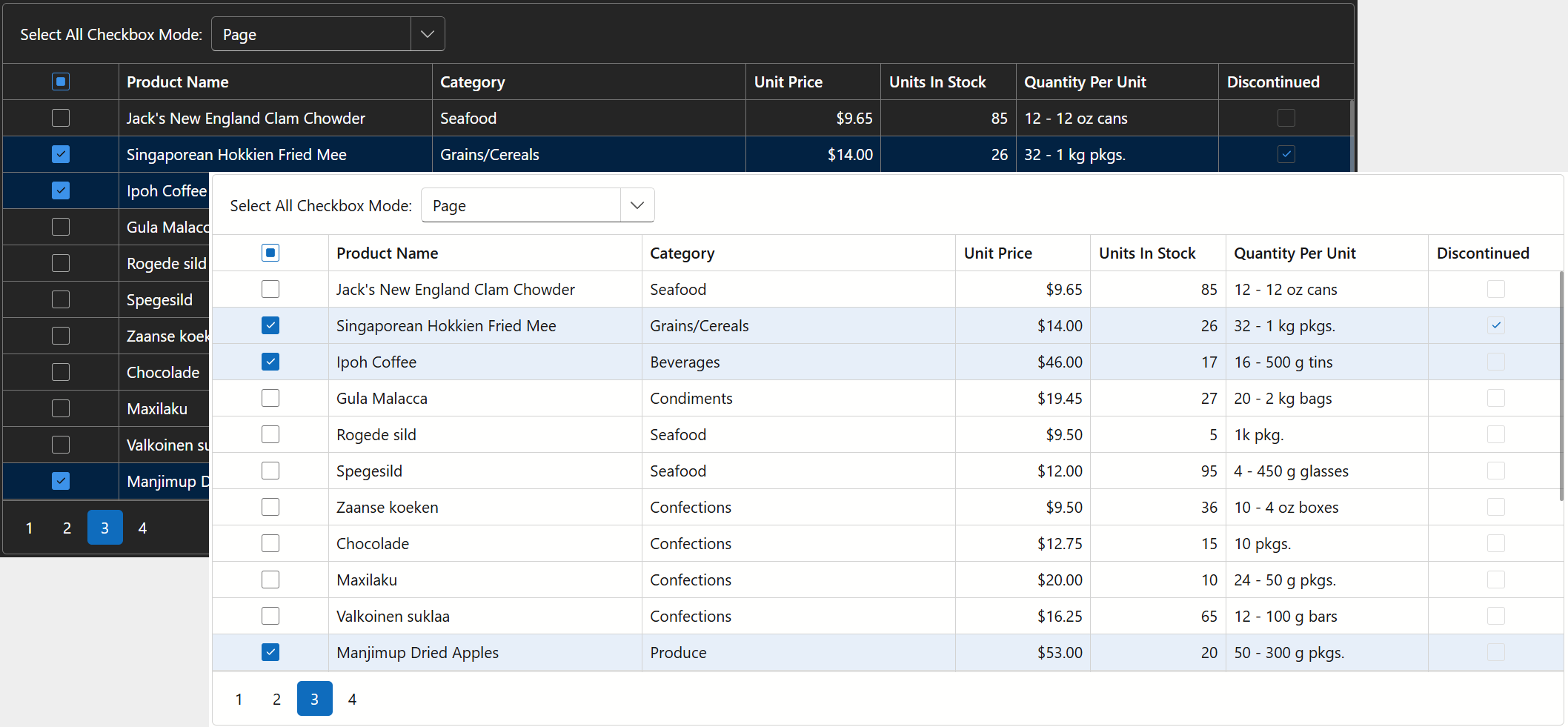
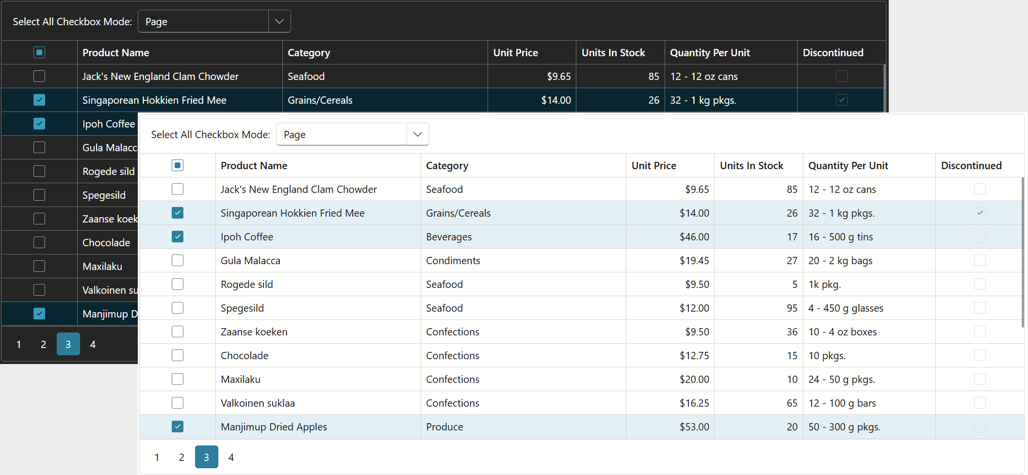
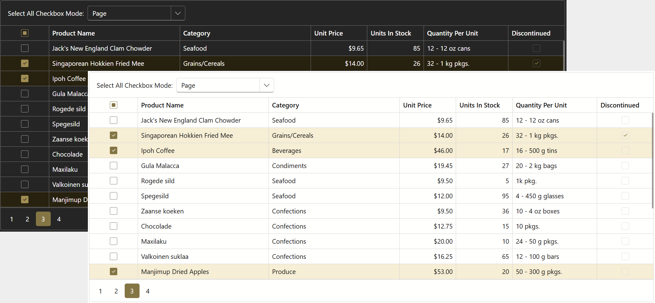
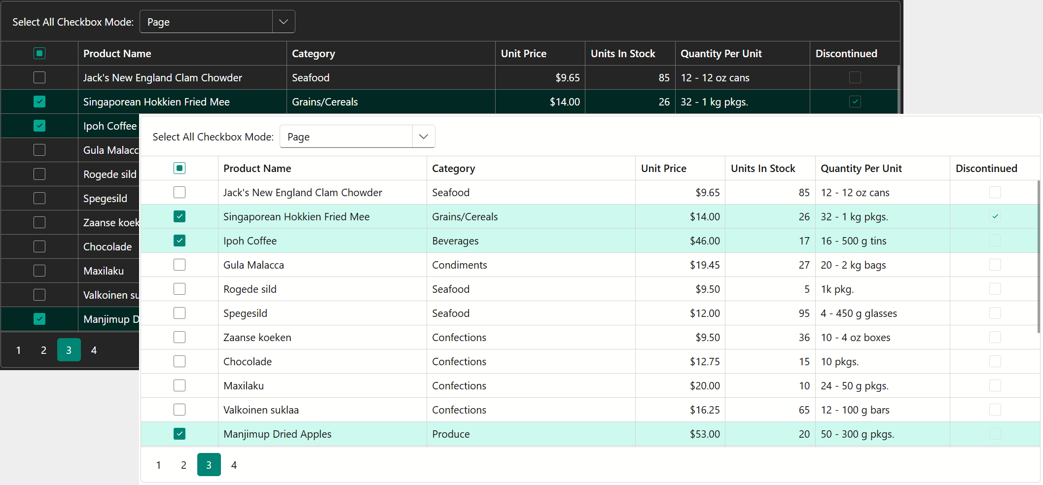
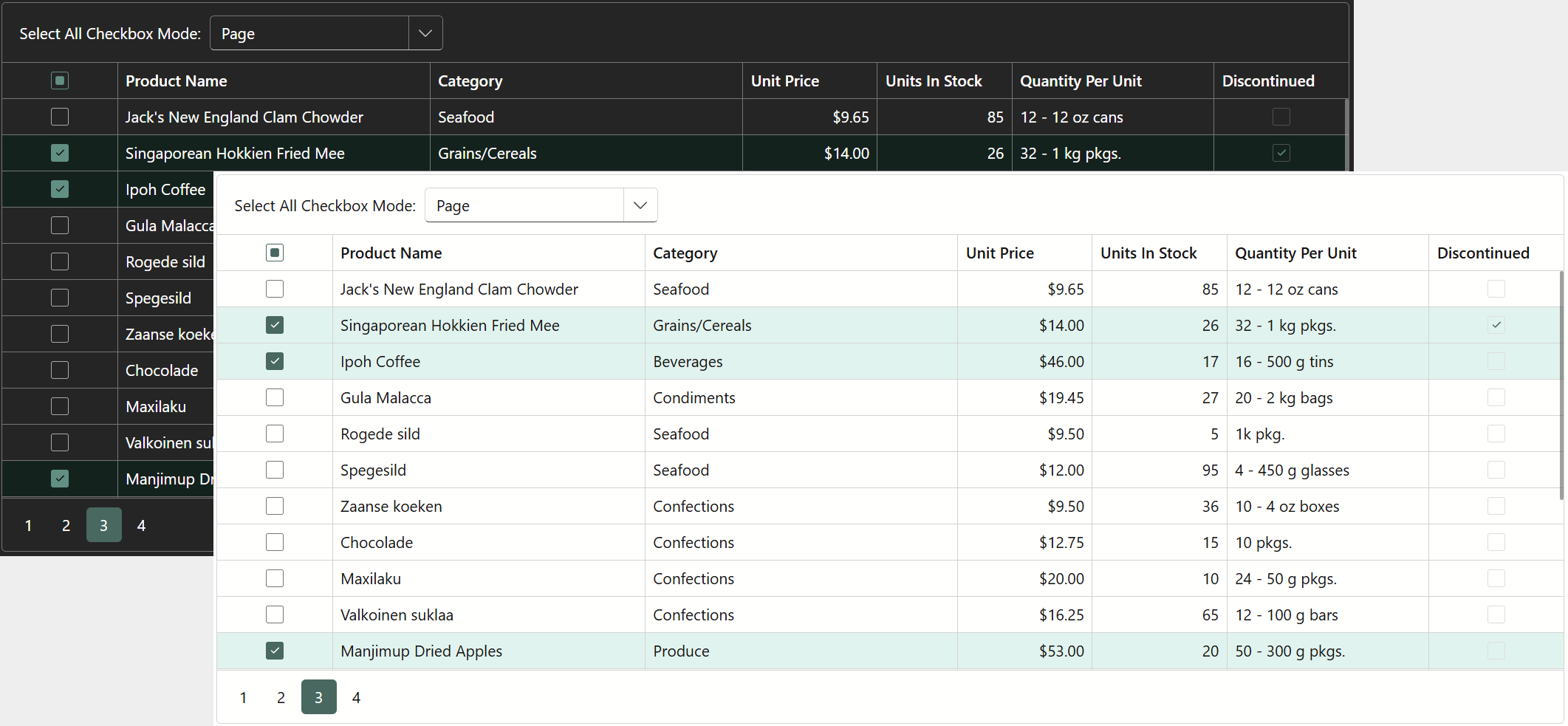
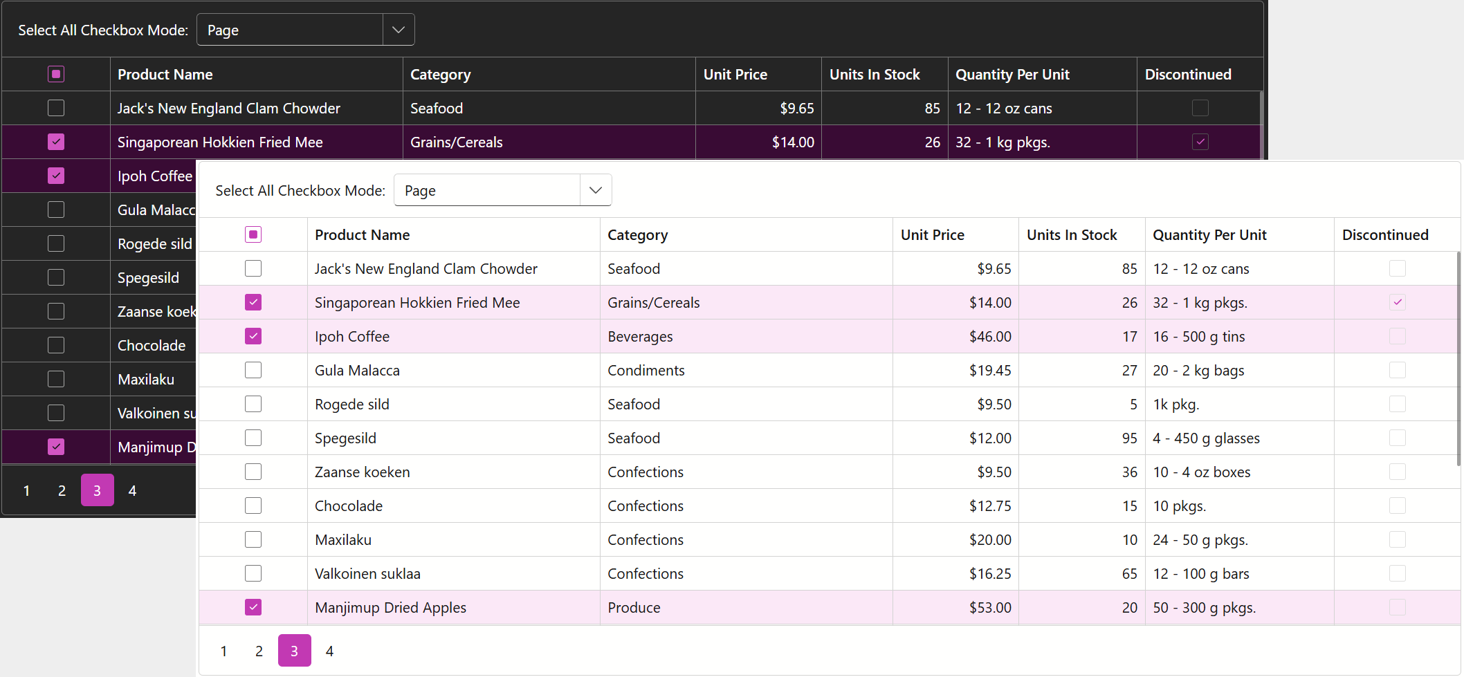
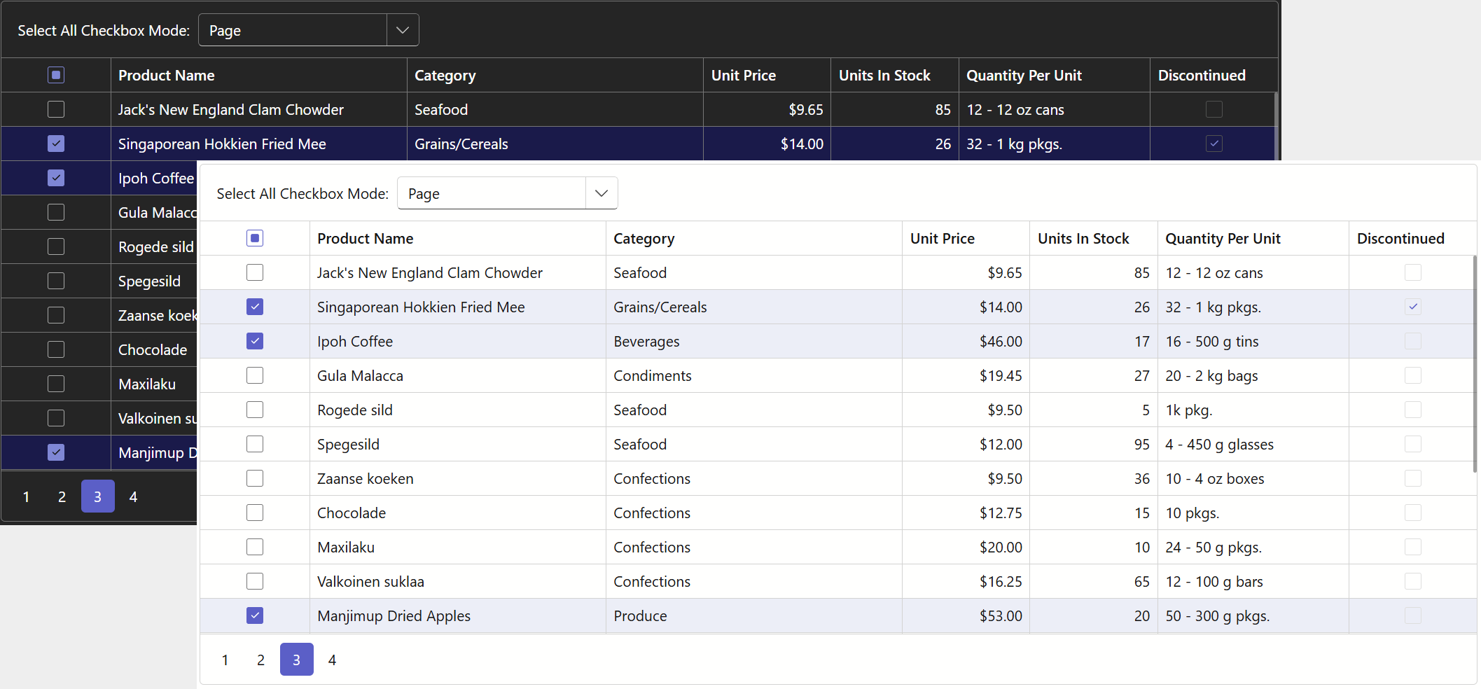
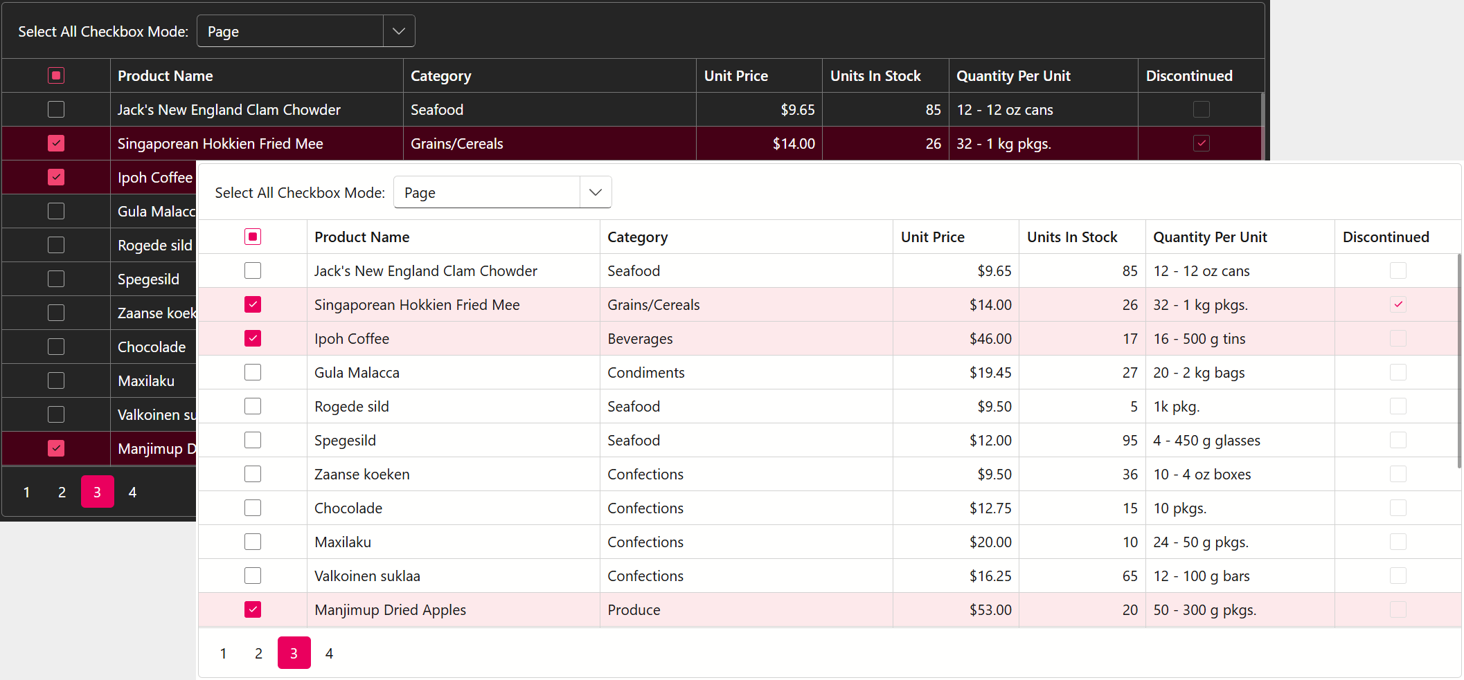
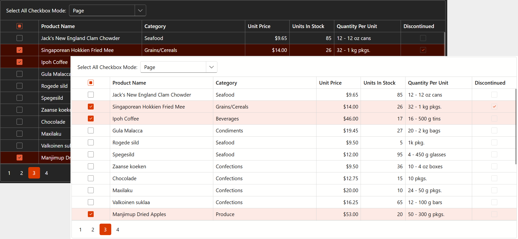
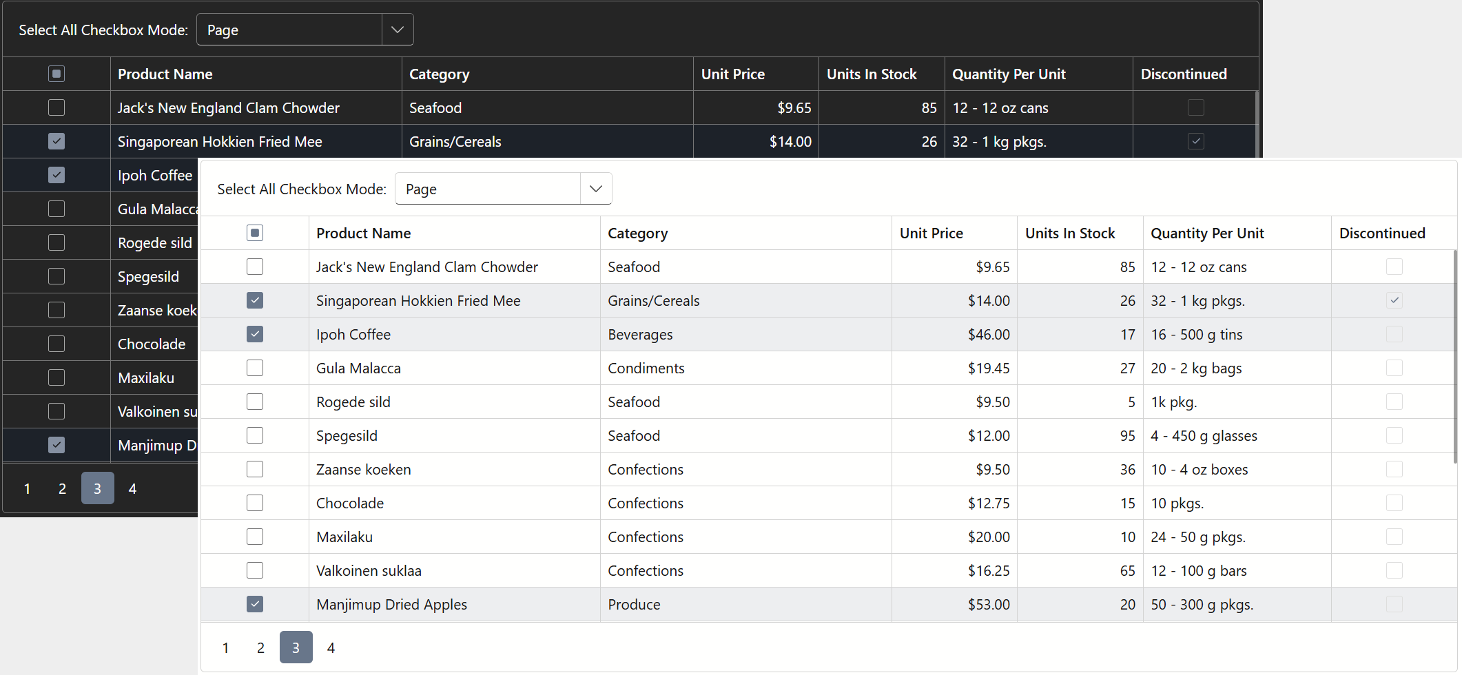
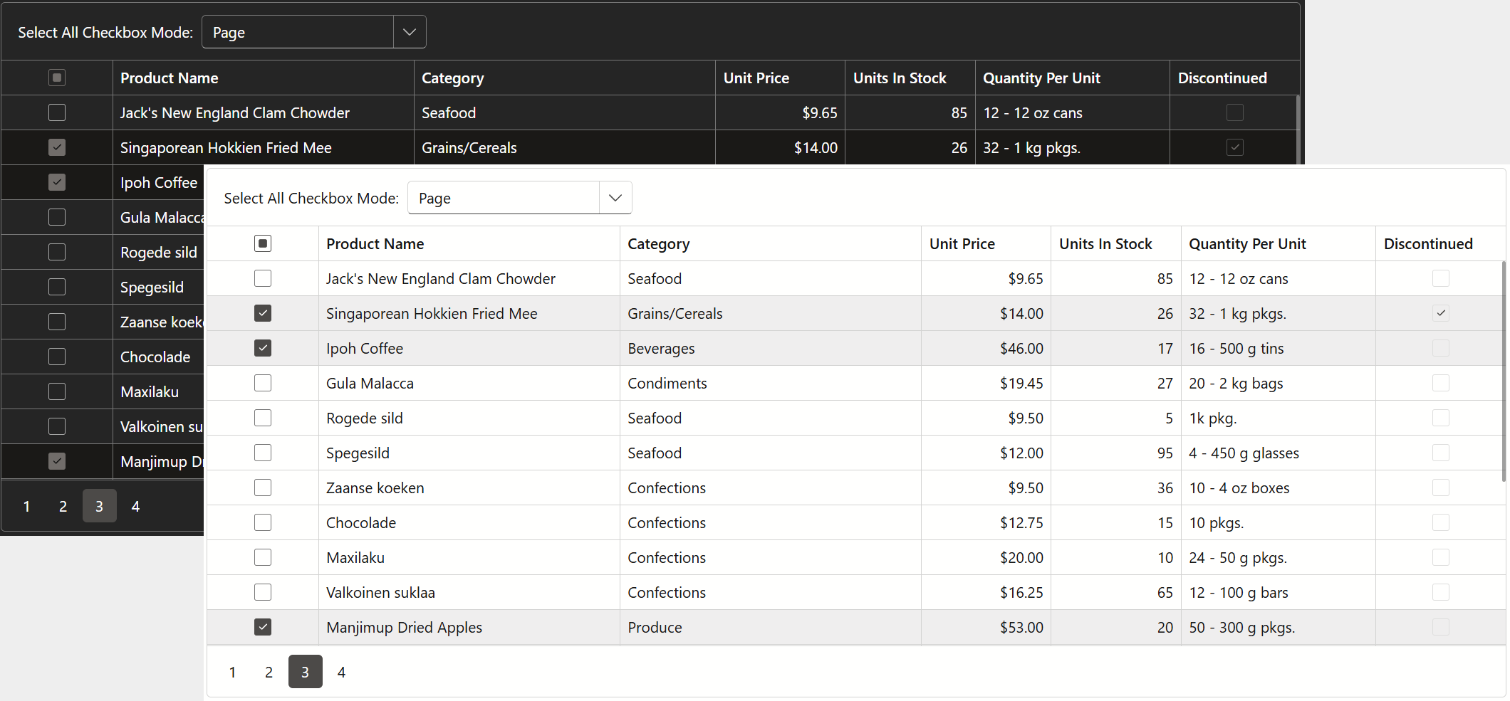
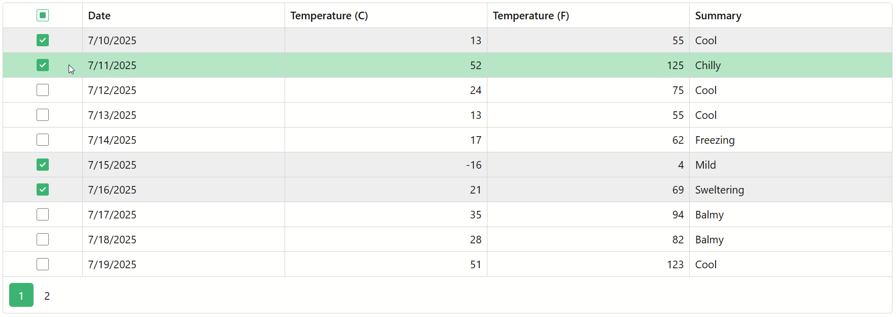
The images below demonstrate how accent colors affect the appearance of our Blazor Grid component:
Specify a Custom Accent Color
Fluent theme APIs also allow you to apply a custom accent color to your Fluent theme to align with your brand or design requirements. Key steps include:
- Call the RegisterTheme(ITheme) method in the Components/App.razor file and pass Themes.Fluent as a parameter.
- Use the Clone(ThemeFluentProperties) method to access theme properties.
- Call the ThemeFluentProperties.SetCustomAccentColor(color) method and pass the selected color as a parameter.
Tip
The SetCustomAccentColor method’s parameter accepts the following formats:
- Longhand and shorthand hexadecimal color values:
#ffff00,#ff0. - RGB and RGBA color codes:
rgb(255, 0, 0),rgba(0, 230, 0, 0.3). - HTML color name (case-insensitive):
red,DarkGreen.
@DxResourceManager.RegisterTheme(Themes.Fluent.Clone(properties => {
    properties.Name = "Fluent Custom";
    @* Hex *@
    properties.SetCustomAccentColor("#3cb371");
    @* RGB *@
    properties.SetCustomAccentColor("RGB(60, 179, 113)");
    @* HTML *@
    properties.SetCustomAccentColor("MediumSeaGreen");
}))
Change Accent Color using CSS Variables
Primary color scale is a group of seventeen CSS variables (from --dxds-primary-10 to --dxds-primary-170). You can override values of individual variables or customize all of them for better consistency across different UI elements.
The following example overrides all --dxds-primary-* CSS variables in a separate stylesheet:

@DxResourceManager.RegisterTheme(Themes.Fluent.Clone(properties => {
    properties.Name = "Custom Fluent";
    properties.AddFilePaths("css/FluentPrimary.css");
}))
Refer to the following help topic for additional information: CSS Variables in Fluent Themes.