Editing and Validation in Blazor Grid
- 2 minutes to read
DevExpress Blazor Grid supports multiple edit modes. Use any of these modes to allow users to create, modify, and delete grid rows. In all edit modes, the Grid component validates input data and displays errors if necessary.
Edit Cell
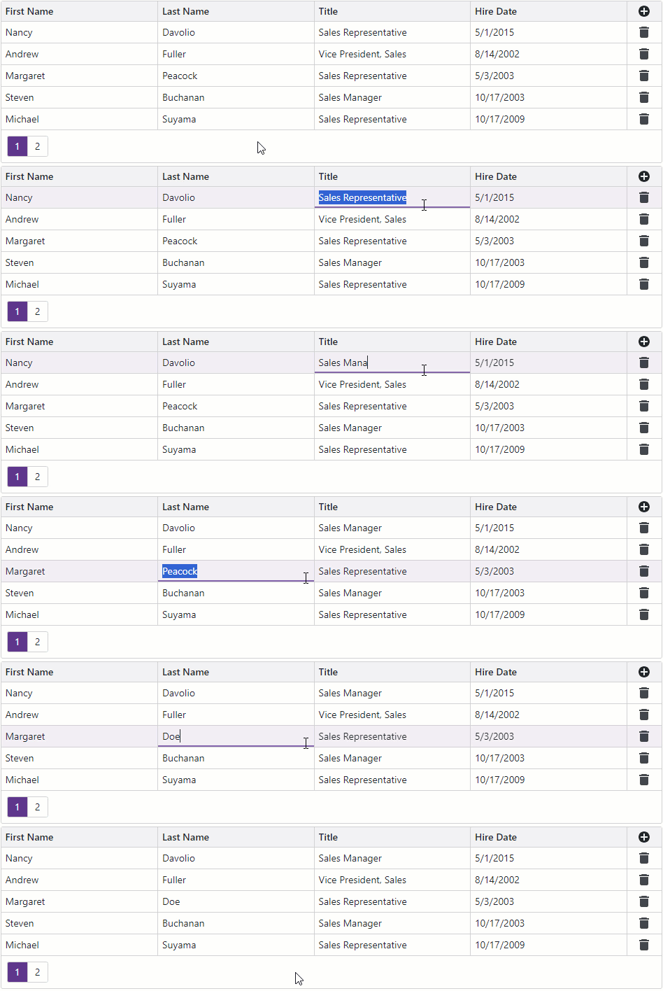
In EditCell mode, users can click a data cell to display its in-place editor. When focus moves to another row, the control validates pending user input and saves changes.
Edit Forms
In the EditForm or PopupEditForm mode, the Grid displays an inline or pop-up edit form instead of the edited data row. Users can click command buttons to create, modify, and delete grid rows.

Edit Row
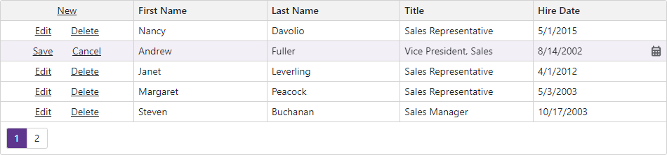
In EditRow mode, the Grid component displays in-place editors in all data cells of the edited row. Users can click command buttons to create, modify, and delete grid rows.
Input Validation
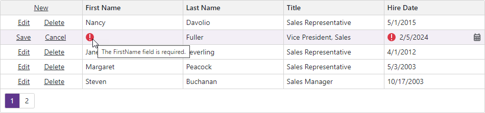
The Grid component validates user input based on data annotation attributes defined in the edit model. Once validation is completed, the component marks editors with colored outlines or displays validation icons. Users can hover the mouse pointer over an error icon to display the corresponding error message within the tooltip.