Icons
- 8 minutes to read
DevExpress Blazor components can use icons from DevExpress collections (such as DevExpress Icon Library or DevExtreme Icons), third-party libraries (such as Open Iconic), or local files.
Assign Icons to DevExpress Blazor Components
You can see predefined icons in multiple DevExpress Blazor components, such as expand buttons in DxAccordion and DxTreeView or series legend items in Charts.
To assign icons to Blazor components, use one of the following options:
Reference Icons in Markup
Use IconUrl properties to specify icon paths directly in markup. You can also use IconCssClass properties to modify icon appearance, for example, change icon sizes or colors.
@using DevExpress.Images.Blazor

@* Use an icon from the DevExpress Icon Library *@
<DxButton RenderStyle="@ButtonRenderStyle.Link"
          Text="Delete"
          IconUrl="@Icon.Delete"/>

@* Specify local icon path and modify icon size *@
<DxButton RenderStyle="@ButtonRenderStyle.Link"
          Text="Delete"
          IconUrl="/images/delete.svg"
          IconCssClass="icon-style" />
Assign Icons as CSS Classes
Use IconCssClass properties to assign icons to Blazor components through CSS classes. For example, use this property to display icons from third-party icon libraries such as “Open Iconic”.
@* Use an icon from the Open Iconic collection *@
<DxProgressBar Value="57"
               ShowIcon="true"
               IconCssClass="oi oi-task" />

@* Specify an icon using CSS properties *@
<DxProgressBar Value="57"
               ShowIcon="true"
               IconCssClass="accept-icon" />
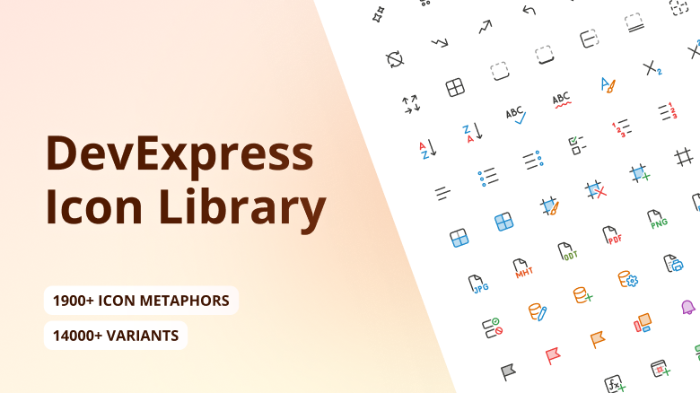
DevExpress Icon Library (CTP)
DevExpress Blazor components can display predefined icons from the DevExpress Icon Library.
Important
The DevExpress Icon Library is currently available as a community technology preview (CTP).
Explore Icons
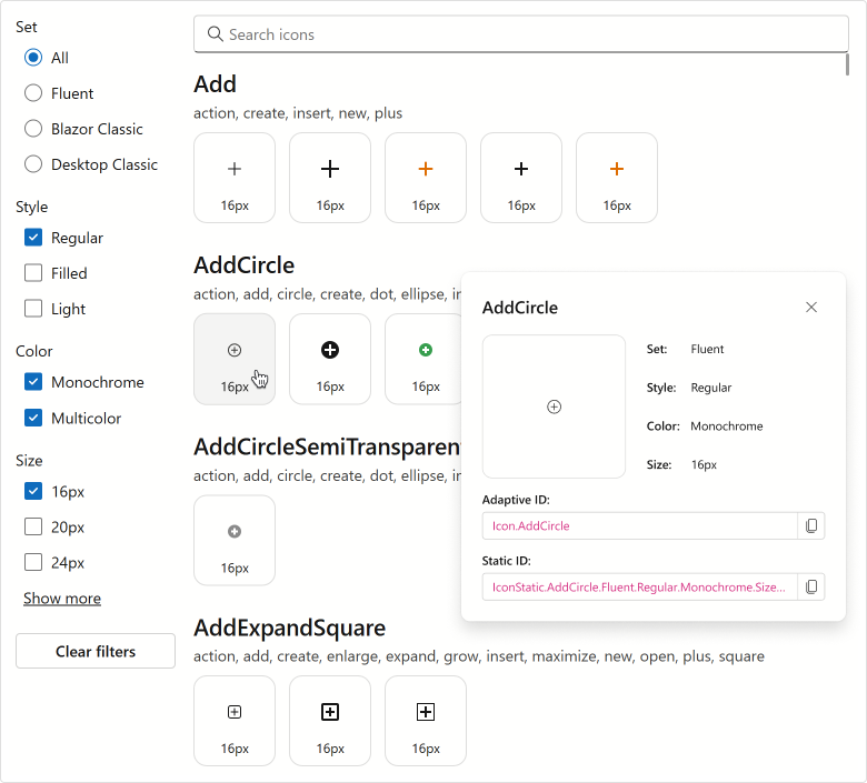
The DevExpress Icon Library includes over 13,000 icons designed to address a variety of UI requirements. Icons are categorized by the following attributes:
- Set: Fluent, Desktop Classic, Blazor Classic
- Style: Regular, Light, Filled
- Color: Multicolor, Monochrome
- Size: 12, 16, 20, 24, 28, 32, 48
You can browse available icons in the Icon Explorer demo. The demo includes the following capabilities:
- Find icons by name or associated tag using the built-in search panel.
- Filter icons by attribute.
- Display detailed icon information (including API identifiers that you can copy directly into code).
To view the Icon Explorer demo locally, open the DevExpress product installation folder, run the Demo Center, and proceed to Icon Library → Icon Explorer.
Use Icons
To incorporate icons from the DevExpress Icon Library into a Blazor application, install the DevExpress.Images.Blazor NuGet package and register the corresponding namespace in the _Imports.razor file:
@using DevExpress.Images.Blazor
You can assign icons to Blazor components using their IconUrl properties (such as DxAccordionItem.IconUrl or DxRibbonItem.IconUrl).
Note
DxMap.MarkerIconUrl and DxMapMarker.IconUrl properties do not support the DevExpress Icon Library.
Based on the way you reference an icon, Blazor components can display adaptive or static icons.
- Adaptive Icons
Assign icons by their adaptive identifiers, also called metaphors. These identifiers include only icon names and do not specify size or style. The framework automatically selects the appropriate icon version based on the current theme and UI settings.
Example:
IconUrl="@Icon.Cancel"- Static Icons
Assign icons using full identifiers that specify the theme set, style, color, and size. Unlike adaptive icons, static icons do not change based on the theme or UI settings.
Example:
IconUrl="@IconStatic.Cancel.Fluent.Regular.Multicolor.Size16"
Refer to Icon and IconStatic class descriptions for additional information and examples.
Additional Icon Resources
In addition to the DevExpress Icon Library, you can use icons from other DevExpress resources or third-party collections.
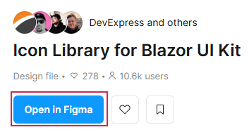
DevExpress SVG Icons on Figma
You can use our Figma UI Kit to explore and download predefined icons used in Blazor components and XAF:
Navigate to Icon Kit for Blazor UI and click the Open in Figma button. Note that you need a Figma account to view UI Kit files.
In the left sidebar, choose the Blazor & XAF page:
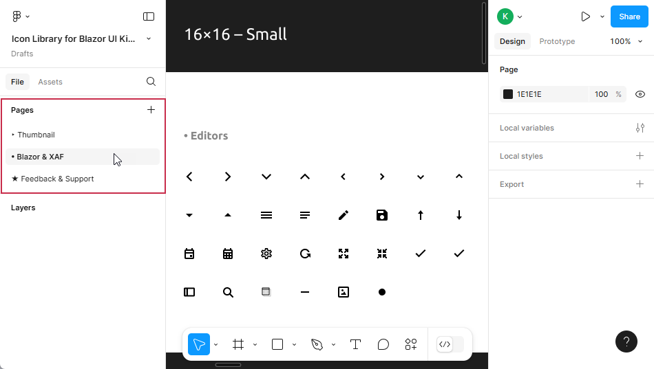
Select icons you want to download: hold Ctrl+Shift and click icons you need.
In the right sidebar, expand the Export section, set the icon format to
SVG, and click the Export X layers button to download all selected icons as an archive.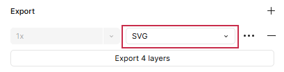
Add downloaded icons to the application’s solution folder.
Assign icons to Blazor components using
IconUrlandIconCssClassproperties.
DevExtreme Icons
If your application combines DevExtreme-based UI with Blazor components, you can use DevExtreme Icons to maintain UI consistency:
- Use npm to incorporate DevExtreme into your application.
- Add a link to one of the DevExtreme themes in the Components/App.razor file to access the associated icon set.
- Assign a
dx-icon-<icon-name>CSS class to a component’sIconCssClassproperty.
The following code snippet assigns DevExtreme icons to DxToolbar commands:
<DxToolbar>
    <DxToolbarItem Text="Item" />
    <DxToolbarItem Text="Link to the next demo"
                   NavigateUrl="https://demos.devexpress.com/blazor/Toolbar#DropDown" />
    <DxToolbarItem BeginGroup="true" IconCssClass="dx-icon-alignleft" />
    <DxToolbarItem IconCssClass="dx-icon-aligncenter" />
    <DxToolbarItem IconCssClass="dx-icon-alignright" />
    <DxToolbarItem IconCssClass="dx-icon-preferences"
                   Alignment="ToolbarItemAlignment.Right"
                   BeginGroup="true" />
    <DxToolbarItem Text="About"
                   IconCssClass="dx-icon-info" />
</DxToolbar>
Third-Party Icon Libraries
DevExpress Blazor components also support icons from third-party libraries, such as Open Iconic or Bootstrap. Follow the steps below to use external icon collections:
Add an icon resource to the project.
If you create a Blazor application using the DevExpress Template Kit, enable the Add Open Iconic Resources option to automatically include Open Iconic resources.
- Assign icon CSS classes to
IconCssClassproperties.
The following code snippet assigns Open Iconic icons to DxToolbar commands:
<DxToolbar>
    <DxToolbarItem Text="Item" />
    <DxToolbarItem Text="Link to the next demo"
                   NavigateUrl="https://demos.devexpress.com/blazor/Toolbar#DropDown" />
    <DxToolbarItem BeginGroup="true" IconCssClass="oi oi-align-left" />
    <DxToolbarItem IconCssClass="oi oi-align-center" />
    <DxToolbarItem IconCssClass="oi oi-align-right" />
    <DxToolbarItem IconCssClass="oi oi-cog"
                   Alignment="ToolbarItemAlignment.Right"
                   BeginGroup="true" />
    <DxToolbarItem Text="About"
                   IconCssClass="oi oi-info" />
</DxToolbar>

Icon Colors in the DevExpress Design System
Important
Applicable to DevExpress Blazor Fluent themes only.
The icon color system is designed to be universal and semantically consistent across all themes and platforms. SVG images apply a color based on the current theme and color mode.
Use Icon Variables in SVG
You can use icon-related CSS variables to apply colors to SVG images. For example, the icon below uses the following variables:
--dxds-icon-color-black--dxds-icon-color-red--dxds-icon-color-green--dxds-icon-color-blue--dxds-icon-color-yellow
<svg xmlns="http://www.w3.org/2000/svg" version="1.1" viewBox="0 0 32 32" width="32" height="32">
  <path style="fill:var(--dxds-icon-color-black, #3A3A38)" d="M15.8086 2.00098C11.49 2.00098 7.59023 4.21304 5.06558 7.0533C2.56561 9.86581 1.28535 13.4602 2.5465 16.2342C2.88265 16.9736 3.28549 17.5224 3.75807 17.9002C4.2358 18.2821 4.76054 18.4697 5.30298 18.5211C6.35085 18.6205 7.46329 18.2065 8.4503 17.8056C8.58525 17.7507 8.71808 17.6961 8.84885 17.6423C9.72854 17.2803 10.5157 16.9564 11.2297 16.8764C11.6228 16.8324 11.9588 16.8686 12.2512 16.9981C12.5401 17.1261 12.8287 17.3639 13.0983 17.7952C13.5108 18.4554 13.7612 19.3567 13.9725 20.4202C14.0484 20.8026 14.1202 21.2124 14.1939 21.6333C14.3173 22.3378 14.4463 23.0737 14.6093 23.7642C14.8743 24.8869 15.2511 26.0036 15.9152 26.9176C16.5908 27.8474 17.5495 28.5473 18.926 28.8484C21.6572 29.4459 24.4581 28.2013 26.5424 25.8952C28.6324 23.5829 30.0527 20.1593 30.0527 16.245C30.0527 8.37826 23.6754 2.00098 15.8086 2.00098ZM3.45684 15.8204C2.44043 13.5847 3.41461 10.4159 5.813 7.71766C8.1867 5.0472 11.8293 3.00098 15.8086 3.00098C23.1231 3.00098 29.0527 8.93055 29.0527 16.245C29.0527 19.9214 27.7179 23.1033 25.8005 25.2247C23.8774 27.3524 21.4184 28.37 19.1397 27.8716C18.0114 27.6247 17.2611 27.0687 16.7242 26.3298C16.1759 25.5751 15.8366 24.6105 15.5825 23.5344C15.424 22.863 15.3067 22.1909 15.1886 21.5143C15.114 21.0868 15.0391 20.6575 14.9533 20.2254C14.7399 19.1508 14.463 18.092 13.9463 17.2652C13.5896 16.6946 13.158 16.3061 12.6563 16.0839C12.1582 15.8631 11.6332 15.8249 11.1183 15.8826C10.2524 15.9797 9.3171 16.3662 8.45593 16.7221C8.32677 16.7755 8.19927 16.8282 8.07393 16.8791C7.05706 17.2922 6.16559 17.5984 5.39737 17.5256C5.03176 17.4909 4.69541 17.3693 4.38249 17.1191C4.0644 16.8648 3.74701 16.4586 3.45684 15.8204Z"/>
  <path style="fill:var(--dxds-icon-color-red, #ED3D3B)" d="M15.5 8C16.3284 8 17 7.32843 17 6.5C17 5.67157 16.3284 5 15.5 5C14.6716 5 14 5.67157 14 6.5C14 7.32843 14.6716 8 15.5 8Z"/>
  <path style="fill:var(--dxds-icon-color-green, #379E4E)" d="M23 8.5C23 9.32843 22.3284 10 21.5 10C20.6716 10 20 9.32843 20 8.5C20 7.67157 20.6716 7 21.5 7C22.3284 7 23 7.67157 23 8.5Z"/>
  <path style="fill:var(--dxds-icon-color-blue, #1E8BCD)" d="M24.5 15C25.3284 15 26 14.3284 26 13.5C26 12.6716 25.3284 12 24.5 12C23.6716 12 23 12.6716 23 13.5C23 14.3284 23.6716 15 24.5 15Z"/>
  <path style="fill:var(--dxds-icon-color-yellow, #DE6C00)" d="M26 19.5C26 20.3284 25.3284 21 24.5 21C23.6716 21 23 20.3284 23 19.5C23 18.6716 23.6716 18 24.5 18C25.3284 18 26 18.6716 26 19.5Z"/>
  <path style="fill:var(--dxds-icon-color-black, #3A3A38)" d="M20.5 25C21.3284 25 22 24.3284 22 23.5C22 22.6716 21.3284 22 20.5 22C19.6716 22 19 22.6716 19 23.5C19 24.3284 19.6716 25 20.5 25Z"/>
</svg>
Note: A developer or designer specifies the fallback color while creating an icon. This color is used only when CSS variables are not available in the environment. We recommend that you use values of the light color mode as a fallback to ensure the icon remains visible if CSS variables are not available.
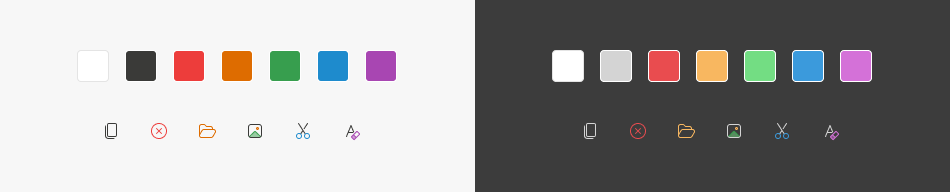
CSS Variables
This section lists base CSS variables and associated values for both color modes as defined in the Fluent theme.
| CSS Variable | Value | Preview |
|---|---|---|
--dxds-icon-color-white |
#FFFFFF | |
--dxds-icon-color-black |
#3A3A38 | |
--dxds-icon-color-red |
#ED3D3B | |
--dxds-icon-color-yellow |
#DE6C00 | |
--dxds-icon-color-green |
#379E4E | |
--dxds-icon-color-blue |
#1E8BCD | |
--dxds-icon-color-purple |
#A846B2 |