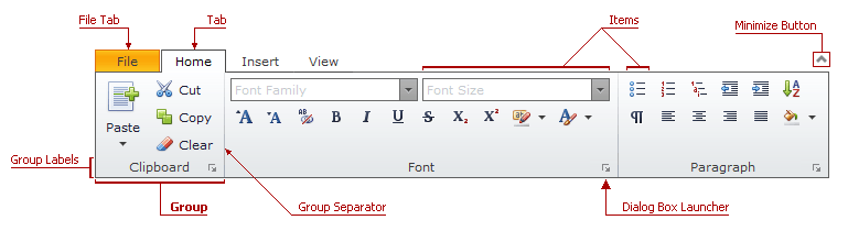
Group
A Group is used to divide items in a tab into logical groups.
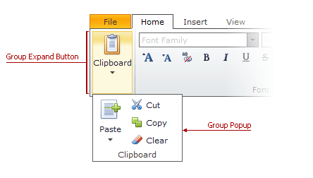
A group can be collapsed when the ribbon control has insufficient space to display all its items. In this case, the collapsed group displays an expand button. Group items are contained in the group popup window.
The table below lists the main members that affect element appearance and functionality.
Characteristics | Members |
|---|---|
Access Key | |
Dialog Box Launcher Visibility | |
Group Expand Button Style | RibbonStyles.GroupExpandButton (via RibbonSettings.Styles.GroupExpandButton) |
Group Expand Button Image | |
Group Popup Style | RibbonStyles.GroupPopup (via RibbonSettings.Styles.GroupPopup) |
Group Label Visibility | |
Group Label Style | RibbonStyles.GroupLabel (via RibbonSettings.Styles.GroupLabel) |
Group Separator Style | RibbonStyles.GroupSeparator (via RibbonSettings.Styles.GroupSeparator) |
Items | |
One Line Mode Settings | RibbonGroup.OneLineModeSettings, RibbonStyles.OneLineModeGroupExpandButton (via RibbonSettings.Styles.OneLineModeGroupExpandButton) |
Style | RibbonStyles.Group (via RibbonSettings.Styles.Group) |
Text | |
Visibility |
The following table outlines the element’s structural API:
| Structural Element | API Reference |
|---|---|
| Class | MVCxRibbonGroup |
| Collection | MVCxRibbonTab.Groups |