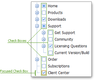
Check Box
Check Boxes allow end-users to check/uncheck nodes. The TreeView allows you to change the appearance and visibility of all check boxes or customize a particular node’s check box.

The table below lists the main members that affect element appearance and functionality.
Characteristics | Members |
|---|---|
Visibility | TreeViewSettings.AllowCheckNodes, TreeViewNode.AllowCheck (via MVCxTreeViewNode.AllowCheck) |
Appearance | TreeViewStyles.NodeCheckBox (via TreeViewSettings.Styles.NodeCheckBox), TreeViewNode.CheckBoxStyle (via MVCxTreeViewNode.CheckBoxStyle), TreeViewStyles.NodeCheckBoxFocused (via TreeViewSettings.Styles.NodeCheckBoxFocused) |
A check box can be in one of the states listed in the table below. You can specify an image for check boxes in a particular check state.
| Check Box State | Appearance | CheckState property value | Image Member |
|---|---|---|---|
| Grayed |  |
CheckState.Indeterminate | TreeViewImages.CheckBoxGrayed (via TreeViewSettings.Images.CheckBoxGrayed) |
| Checked |  |
CheckState.Checked | TreeViewImages.CheckBoxChecked (via TreeViewSettings.Images.CheckBoxChecked) |
| Unchecked |  |
CheckState.Unchecked | TreeViewImages.CheckBoxUnchecked (via TreeViewSettings.Images.CheckBoxUnchecked) |