State Indicator Gauges
- 2 minutes to read
This topic describes the State Indicator Gauge types included with the ASPxGaugeControl component, and explains how to use them in your application.
Refer to the corresponding topics in the following section for details on other gauge types: Gauge Types.
A state indicator gauge is a container of state indicators - objects that have states with corresponding vector images.
A state indicator only displays an image associated with the current state. When the indicator’s state changes, a corresponding image is automatically displayed. You can use a state indicator gauge to emulate static visual objects that have a fixed set of states (for instance, bulbs, traffic lights, and arrows).
The following image shows three gauges, each of which displays a static indicator with a specific state:

State indicators display images according to their states. The set of images for state indicators is predefined.
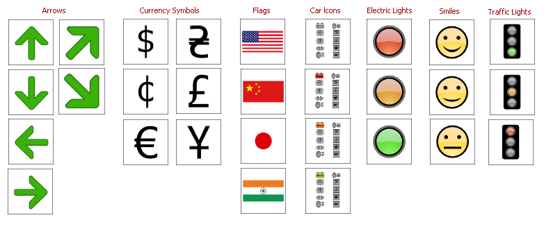
All images for state indicators can be grouped into the following categories:
- Arrows;
- Currency Symbols;
- Flags;
- Car Icons;
- Electric Lights;
- Smile Icons;
- Traffic Lights.
Some images from these categories are shown below.

A full set of indicator images is available at design time in the gauge preset manager.
StateIndicatorGauge Class
A State Indicator Gauge is an instance of the StateIndicatorGauge class. Use the ASPxGaugeControl.Gauges property to access a State Indicator Gauge.
ASPxGaugeControl gaugeControl1 = new ASPxGaugeControl();
StateIndicatorGauge gauge1 =  gaugeControl1.Gauges[0] as StateIndicatorGauge;
You can create a State Indicator Gauge control at design time within Visual Studio or programmatically at runtime. The following example demonstrates how to do this:
State Indicator Elements
This section describes state indicator gauge elements and their properties.
A state indicator gauge consists of a base indicator element.
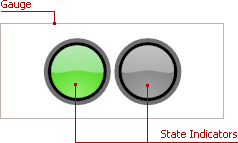
The following image shows a sample state indicator gauge that indicates gauge elements:

A state indicator gauge can display one or more state indicators, and each can have its own set of states. In the image above, the gauge contains two state indicators.
A state indicator includes the following main display options:
- StateIndicator.States - contains states for the indicator;
- StateIndicator.StateIndex - specifies the current state;
- StateIndicator.Center - specifies the position of the state indicator within the gauge.
For more information on gauge elements, see the following section: State Indicator (Visual Elements).