Appearance Properties
- 4 minutes to read
This document describes the purpose and implementation of appearance properties – a special set of properties that allow you to customize the appearance of a report and its elements.
Appearance Properties Overview
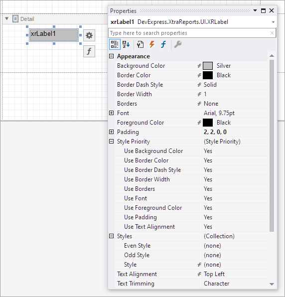
Each report element (control, band, and report properties) has a set of properties that define their appearance. The following is a list of these properties։
- BackColor
- Gets or sets a control’s background color.
- BorderColor
- Gets or sets the control’s border color.
- BorderDashStyle
- Specifies the dash style for the control’s border.
- Borders
- Specifies a set of borders (top, right, bottom, left) that should be visible for the control.
- BorderWidth
- Specifies the width of cell borders in pixels, as a floating point value.
- Font
- Gets or sets the control’s font.
- ForeColor
- Gets or sets the control’s foreground color.
- Padding
- Gets or sets the control’s padding values (measured in report units).
- TextAlignment
- Specifies the positioning of text within a control.
When you drop a control from the Toolbox onto the report band or a panel, the values for appearance properties are retrieved from the band or the panel (the parent of the control or the parent of its parent).

Appearance properties specified for bands or panels propagate to child controls, even though they may not take effect for some report elements. An example of this behavior is the DetailBand element that has no visible border or background color, even though it passes appearance property settings to its child controls. Another example is the XRPageBreak control that has the XRControl.BackColor property, but ignores its value during rendering.
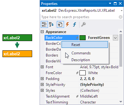
To reset an appearance property, right-click the property in the Properties window, and select Reset in the context menu. After a property is reset, the parent control’s property determines its value.

If a report element has a style assigned to it, the priority of the properties defined by that style is determined by the StylePriority property. Note that if conditional formatting is involved, the appearance it defines has a higher priority.
Reset the Control’s Appearance at Runtime
This code snippet assigns custom appearance settings to report labels. The ResetStyle method clears the appearance settings of the control. This makes the control use the values from the parent control’s settings.
using System;
using System.Drawing;
using System.Drawing.Printing;
using DevExpress.XtraPrinting;
using DevExpress.XtraReports.UI;

public partial class XtraReport1 : XtraReport {
    public XtraReport1() {
        InitializeComponent();

        XRControlStyle myStyle = new XRControlStyle {
            Name = "MyStyle1",
            BackColor = Color.LightBlue,
            BorderColor = Color.LightGray,
            Borders = BorderSide.Top,
            BorderWidth = 2f,
            Font = new Font("Segoe Script", 16),
            ForeColor = Color.Green,
            TextAlignment = TextAlignment.TopCenter,

    };
        this.StyleSheet.Add(myStyle);
    }


    private void xrLabel1_BeforePrint(object sender, System.ComponentModel.CancelEventArgs e) {
        ((XRLabel)sender).StyleName = "MyStyle1";

    }
    private void XrLabel2_BeforePrint(object sender, System.ComponentModel.CancelEventArgs e) {
        ApplyAppearanceSettings((XRLabel)sender);
    }

    private void XrLabel3_BeforePrint(object sender, System.ComponentModel.CancelEventArgs e) {
        ApplyAppearanceSettings((XRLabel)sender);
        ResetStyle((XRLabel)sender);
    }

    // Assign custom appearance settings to a control.
    private void ApplyAppearanceSettings(XRLabel label) {
        label.BackColor = Color.Orange;
        label.BorderColor = Color.DarkGray;
        label.Borders = BorderSide.All;
        label.BorderWidth = 0.5f;
        label.Font = new Font(label.Parent.Font, FontStyle.Bold);
        label.ForeColor = Color.White;
        label.TextAlignment = TextAlignment.MiddleRight;
    }

    // Reset appearance settings and use parent control settings.
    private void ResetStyle(XRLabel label) {
        label.ResetBackColor();
        label.ResetBorderColor();
        label.ResetBorders();
        label.ResetBorderWidth();
        label.ResetFont();
        label.ResetForeColor();
        label.ResetPadding();
        label.ResetTextAlignment();
    }
}