Excel-Style Column Filter
- 7 minutes to read
Data controls support column filter menus inspired by Microsoft Excel.
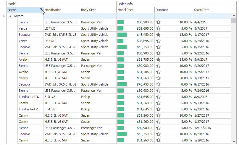
The Excel-style filter menu has two tabs:
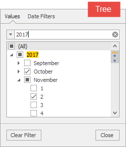
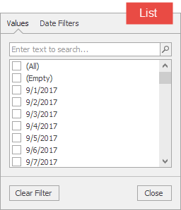
Values — users can select specific values or value ranges in this tab.
- The default UI used for value selection depends on the data type: lists for strings, tree lists for dates, check boxes for Booleans, track bars for numbers, and much more.
- Values can be grouped by columns. This allows you to filter data by multiple columns from a single menu.
Filters — users can create a custom filter in this tab.
- Comparison operators depend on the data type. For example, Between, Greater Than for numbers; Today, Next Week, Last Month, This Year for dates. You can hide specific comparison operators.
- You can use a dedicated event to create custom filters. See the following section below for details: Custom Filters.
Tip
Run the following demos to see Excel-style filter menus in action:
- Excel-Style Filter Module in the XtraGrid Main Demo
- Excel-Style Filter Module in the XtraTreeList Main Demo
- Vertical Grid Module in the XtraVerticalGrid Main Demo
- Excel-Style Filter Module in the XtraPivotGrid Main Demo
To view the source code, click Open Solution in the ribbon UI. Note that DevExpress WinForms Components must be installed.
Options
Use the following properties to customize/configure filter settings for all data columns.
- GridView.OptionsFilter
- TreeList.OptionsFilter
- VGridControl.OptionsFilter
- PivotGridControl.OptionsFilter
To override an option for a specific column, use the following properties:
- GridColumn.OptionsFilter
- TreeListColumn.OptionsFilter
- RowProperties.OptionsFilter
- PivotGridField.OptionsFilter
Default Tab
When a user opens a filter menu, the active tab depends on the column data type. Use the following properties to specify the active tab for a specific column:
- OptionsColumnFilter.PopupExcelFilterDefaultTab
- TreeListOptionsColumnFilter.PopupExcelFilterDefaultTab
- VGridOptionsRowFilter.PopupExcelFilterDefaultTab
- PivotGridFieldOptionsFilter.PopupExcelFilterDefaultTab

using DevExpress.Utils.Filtering;

bcSalesDate.OptionsFilter.PopupExcelFilterDefaultTab = ExcelFilterDefaultTab.Values;
Numeric Columns
The Values tab can display a track bar or a list for numbers. Use the following properties to specify the UI for a particular column:
- OptionsColumnFilter.PopupExcelFilterNumericValuesTabFilterType
- TreeListOptionsColumnFilter.PopupExcelFilterNumericValuesTabFilterType
- VGridOptionsRowFilter.PopupExcelFilterNumericValuesTabFilterType
- PivotGridFieldOptionsFilter.PopupExcelFilterNumericValuesTabFilterType
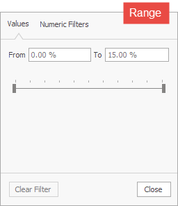
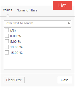
Note that the track bar does not allow a user to select the Null value even if the column contains it. To allow a user to select the Null value, arrange values in a list instead.

using DevExpress.Utils.Filtering;

bcDiscount.OptionsFilter.PopupExcelFilterNumericValuesTabFilterType = ExcelFilterNumericValuesTabFilterType.List;
Date Columns (DateTime and DateOnly)
The Values tab can arrange dates in a regular or tree list. Use the following properties to specify the UI for a particular column:
- OptionsColumnFilter.PopupExcelFilterDateTimeValuesTabFilterType
- TreeListOptionsColumnFilter.PopupExcelFilterDateTimeValuesTabFilterType
- VGridOptionsRowFilter.PopupExcelFilterDateTimeValuesTabFilterType
- PivotGridFieldOptionsFilter.PopupExcelFilterDateTimeValuesTabFilterType
using DevExpress.Utils.Filtering;

bcSalesDate.OptionsFilter.PopupExcelFilterDateTimeValuesTabFilterType = ExcelFilterDateTimeValuesTabFilterType.List;
TimeOnly Columns
The Values tab can display a track bar or a tree list. Use the PreferredTimeValuesTabFilterType property to specify the UI for a particular column. The following code snippet changes the default (Range) value to Tree:
using DevExpress.Utils.Filtering;

ExcelFilterOptions.Default.PreferredTimeValuesTabFilterType = ExcelFilterOptions.TimeValuesTabFilterType.Tree;


Text Columns
For string type columns, the following properties specify whether to show pattern-matching (e.g., Is Like) and relational (e.g., Greater Than) operators:
- OptionsColumnFilter.PopupExcelFilterTextFilters
- TreeListOptionsColumnFilter.PopupExcelFilterTextFilters
- VGridOptionsRowFilter.PopupExcelFilterTextFilters
- PivotGridFieldOptionsFilter.PopupExcelFilterTextFilters
Enumeration Columns
The following properties specify whether to show the Greater Than, Greater Than Or Equal To, Less Than, Less Than Or Equal To, and Between operators:
- OptionsColumnFilter.PopupExcelFilterEnumFilters
- TreeListOptionsColumnFilter.PopupExcelFilterEnumFilters
- VGridOptionsRowFilter.PopupExcelFilterEnumFilters
- PivotGridFieldOptionsFilter.PopupExcelFilterEnumFilters
When to Apply a Filter
When a user selects a filter in the menu, it can be applied immediately or when the menu is closed. Use the following properties to specify this behavior for a particular column:
- OptionsColumnFilter.ImmediateUpdatePopupExcelFilter
- TreeListOptionsColumnFilter.ImmediateUpdatePopupExcelFilter
- VGridOptionsRowFilter.ImmediateUpdatePopupExcelFilter
- PivotGridFieldOptionsFilter.PopupExcelFilterImmediateUpdate
bcSalesDate.OptionsFilter.ImmediateUpdatePopupExcelFilter = DevExpress.Utils.DefaultBoolean.True;
Specify Filter Options Dynamically
The following events fire before the menu is displayed and allow you to override settings for a particular column:
- ColumnView.ShowFilterPopupExcel
- TreeList.ShowFilterPopupExcel
- VGridControl.ShowFilterPopupExcel
- PivotGridControl.ShowFilterPopupExcel
The example below applies filter settings to specific columns.
using DevExpress.Utils.Filtering;
using DevExpress.Utils.Filtering.Internal;

private void TreeList_ShowFilterPopupExcel(object sender, FilterPopupExcelEventArgs e) {
    if (e.Column == bcName || e.Column == bcTrademark) {
        e.ShowCustomFilters = false;
        e.DefaultFilterType = CustomUIFilterType.BeginsWith;
    }
    if (e.Column == bcModification) {
        e.ShowFiltersTab = false;
        e.IsRadioMode = true;
    }
}
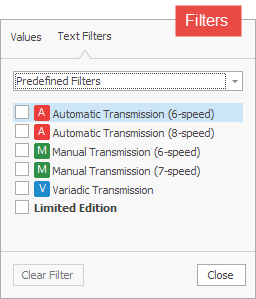
Custom Filters
If the ShowPredefinedFilters option is enabled, you can display custom filters when a user selects the Predefined Filters item in the Filters tab. To create custom filters, handle the following events:
- ColumnView.FilterPopupExcelData
- TreeList.FilterPopupExcelData
- VGridControl.FilterPopupExcelData
- PivotGridControl.FilterPopupExcelData
For example, to show predefined filters similar to those in the figure below, use the following code.
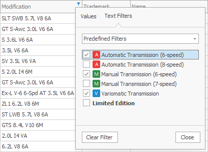
void gridView_FilterPopupExcelData(object sender, FilterPopupExcelDataEventArgs e) {
    string fieldName = e.Column.FieldName;
    if(e.Column == bcModification) {
        e.AddFilter("<image=A><nbsp>Automatic Transmission (6-speed)", "Contains([" + fieldName + "], '6A')", true);
        e.AddFilter("<image=A><nbsp>Automatic Transmission (8-speed)", "Contains([" + fieldName + "], '8A')", true);
        e.AddFilter("<image=M><nbsp>Manual Transmission (6-speed)", "Contains([" + fieldName + "], '6M')", true);
        e.AddFilter("<image=M><nbsp>Manual Transmission (7-speed)", "Contains([" + fieldName + "], '7M')", true);
        e.AddFilter("<image=V><nbsp>Variomatic Transmission", "Contains([" + fieldName + "], 'VA')", true);
        e.AddFilter("<b>Limited Edition</b>", "Contains([" + fieldName + "], 'Limited')", true);
    }
    if(e.Column == bcMPGCity) {
        e.AddFilter("Fuel Economy (<color=green>High</color>)", "[" + fieldName + "]<=15", true);
        e.AddFilter("Fuel Economy (<color=orange>Medium</color>)", "[" + fieldName + "]>15 AND [" + fieldName + "]<25", true);
        e.AddFilter("Fuel Economy (<color=red>Low</color>)", "[" + fieldName + "]>=25", true);
    }
}
Custom Function-Based Filters
You can display a filter based on a custom function. For example, the following menu displays the Black Friday Discount filter. This filter is based on its corresponding custom function:

See the following help topic for more information: Custom Function Based Filters.
Grouped Filters
A column’s filter menu shows only values available in that column. To filter data by multiple columns, invoke each column’s filter menu.
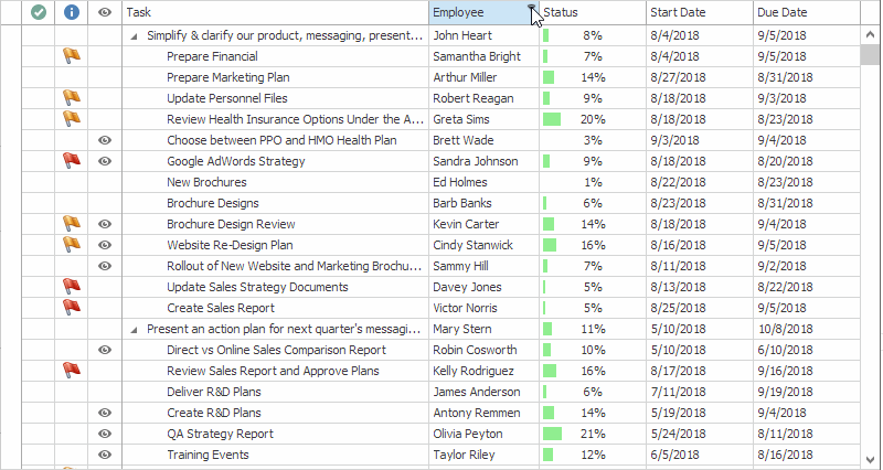
It is also possible to group filter values in the current column’s filter menu by another column. This allows you to filter data for multiple columns from a single menu.
The following properties specify data fields (columns) by which you can group filter values in a specific column’s filter menu:
- OptionsColumnFilter.PopupExcelFilterGrouping
- TreeListOptionsColumnFilter.PopupExcelFilterGrouping
- VGridOptionsRowFilter.PopupExcelFilterGrouping
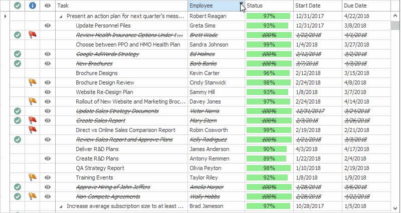
Data fields (columns) should be specified by their names as strings separated by a comma, semicolon, space or tab character. The code below shows how to display assigned tasks below each employee as illustrated in the figure above.
//Customize the Employee column's filter menu.
colEmployee.OptionsFilter.PopupExcelFilterGrouping = "Employee;Task";
//As values of the customized column are displayed at the root level, you can omit the column name ("Employee").
//The code below has the same effect.
colEmployee.OptionsFilter.PopupExcelFilterGrouping = "Task";
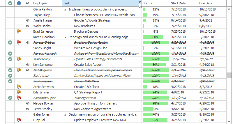
You can specify two or more data fields (columns) to group filter values by multiple columns. The field name order determines the group hierarchy. To show assigned tasks below each employee in the Task column’s filter menu, use the following code:
//Customize the Task column's filter menu.
//As values of the customized column are not displayed at the root level in this case, its name ("Task") cannot be omitted.
colTask.OptionsFilter.PopupExcelFilterGrouping = "Employee;Task";
The result is that values from the Employee column are shown at the root level.
Tip
To view grouped filters in action, refer to the Task column’s filter menu in the following demo: Hierarchy Column Module in the XtraTreeList Main Demo.
If you have a Code First data source, you can annotate data fields with the FilterGroup attribute.