Layout Group's Contents
- 2 minutes to read
A layout group is a container of regular layout items and other groups. The child items are arranged within a group next to each other and the group’s client area is occupied by the child items in its entirety (there is no space that is not occupied by the child items except for the group’s border and caption). To insert an empty space to a group Empty Space Items objects are used.
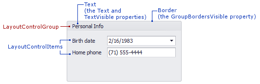
A layout group consists of the caption area, border and client area that displays child layout items:
A group’s layout can be customized by dragging layout items to, from and within the group. At design time this functionality is always enabled. At runtime, the group’s customization is only enabled in customization mode. To prevent the group’s layout from being modified in customization mode you can set the LayoutItemContainer.AllowCustomizeChildren property to false. Additionally, it’s possible to prevent the customization mode from being activated via the LayoutControl.AllowCustomization property.
To access a group’s child layout items in code you can use the indexer (LayoutGroup.Item). This allows you to iterate through the immediate children. Note that a child item can represent another group that can have its own children. To get the number of immediate child layout items use the LayoutGroup.Count property.
The following methods can be used to customize a group in code.
| Method | Description |
|---|---|
| LayoutGroup.Add | Adds a layout item to a group. |
| BaseLayoutItem.Move | Moves the specified layout item to another position. |
| LayoutControlGroup.AddTabbedGroup | Adds a tabbed group to a group. |
In specific instances it’s necessary to identify a group’s element that is located at a specific point. To do this, use the LayoutControl.CalcHitInfo method. Please refer to the Hit Information topic for more details.