Layout Groups
- 2 minutes to read
If you wish to combine your editors and controls into titled panels or present them as tabbed pages, there is no need to combine them with external Panels or TabbedControls. You can easily do this with the help of built-in Layout Groups and Tabbed Groups.
A layout group represents a container of layout items and other groups within the Layout Control. A layout group has a border and caption that can be optionally hidden. In customization mode, dragging a group by its header will drag its contents as well.
In the Layout Control, layout items can only be displayed within groups. The control always contains a top level root group. This group is automatically created when a LayoutControl is created. When you drag a control onto an empty Layout Control, a new layout item is created, and it’s added to the root group.
The following image shows a sample Layout Control painted using the Money Twins skin.
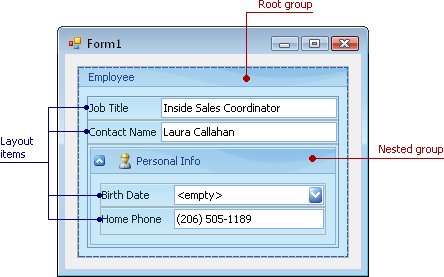
Here, two groups are displayed: 1) Employee is the root group and 2) Personal Info is a nested group. In this image, the root group’s caption is visible, although, by default, it’s hidden at design time.
Layout groups are represented by the LayoutControlGroup class. To access the root group’s settings, use the LayoutControl.Root property. You can display a custom caption image and enable an expand/collapse button for a group. See Layout Group’s Settings to learn more.
A layout group can be displayed as a tab within a tabbed group. See the Tabbed Group topic for additional information.
Concepts
Task-Based Help
- How to: Create layout groups and items in code
- How to: Create a layout in Regular mode in code
- How to: Create a tabbed group in code