Scheduler Control
The topics in this section describe the SchedulerControl‘s elements that you see on screen. Each topic contains a screenshot that demonstrates the element, and a brief overview with a list of properties that control the element’s visibility, content and appearance. Several elements are specific to particular Scheduler Views only.
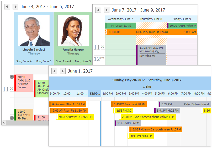
The following visual elements are available:
- All-Day Area
- Appointments
- Appointment Flyout
- Day Headers
- Day of Week Headers
- Date Navigation Bar
- Group Separator
- More Buttons
- Navigation Buttons
- Resource Headers
- Resource Navigator
- Scroll More Buttons
- Selection Bar
- Status Lines
- Time Cells
- Time Ruler
- Time Indicator
- Time Scales
- Dependencies
You can use the SchedulerViewInfoBase.CalcHitInfo method to explore visual elements by analyzing the SchedulerHitInfo.HitTest property.