Views
- 4 minutes to read
A Navigation Bar View determines the way the control and its child elements look and behave.
- Explorer Bar View
- Side Bar View
- Navigation Pane
- Change a Navigation Bar View
- Change a Navigation Bar View by Selecting a Template
Explorer Bar View
The default Navigation Bar View.
Demo Center 18.2: Run a demo

Key features:
- groups can be expanded and collapsed individually;
- group “…List” styles are not supported (the NavBarGroup.GroupStyle property);
- end-users can utilize either exterior buttons or a regular scrollbar to scroll the oversized Navigation Bar content (the NavBarControl.SkinExplorerBarViewScrollStyle property);
- the last Navigation Bar group can stretch to fill the remaining control space (the NavBarControl.ExplorerBarStretchLastGroup property).
Side Bar View
Emulates the old-styled side bar similar to the one that was in Microsoft Outlook prior to version 2003.

Key features:
- only one Navigation Bar group can be expanded at a time;
- an expanded group fills the entire control space, which is not occupied with headers of other (inactive) groups;
- supports interior scroll buttons to scroll the content of an expanded group.
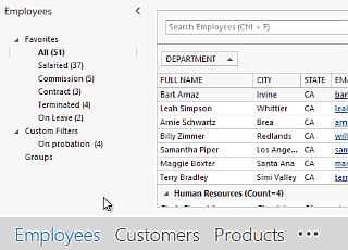
Navigation Pane View
An advanced View inspired by Microsoft Outlook’s navigation pane.
Demo Center 18.2: Run a demo

On touch devices, the Navigation Pane View does not support group content scrolling using swipe gestures. Group content can be scrolled by tapping the scroll buttons or dragging this content.
Navigation Pane View: Layout
In Navigation Pane View, the Navigation Bar consists of four zones.
|
|

Navigation Pane View: Collapsed State
End-users can click the expand/collapse button in the NavBar header area to minimize the control. To do the same in code, modify the OptionsNavPane.NavPaneState property.
|
|

Navigation Pane View: Customization Menu
The ellipsis button in the overflow panel area allows end-users to change the number of items shown in the inactive group area, activate hidden groups and (if the OptionsNavPane.AllowOptionsMenuItem property is enabled) customize the group order and font settings.

Navigation Pane View: Integration with the Office Navigation Bar Control
The Office Navigation Bar control can replace the inactive group and overflow panel areas of a Navigation Pane. See this link to learn more.
Change a Navigation Bar View
To change a Navigation Bar View, modify the NavBarControl.PaintStyleKind property. At design time, this property is accessible through the control’s smart tag.

Change a Navigation Bar View by Selecting a Template
An alternative approach to changing the Navigation Bar View is to modify the NavBarControl.PaintStyleName property to apply a specific template. A template changes the View and applies a specific paint style to a control ignoring the look&feel settings.
View Type | Related Templates |
|---|---|
Explorer Bar |
|
Side Bar |
|
Navigation Pane |
|
The NavBarControl.PaintStyleName property has a priority over the NavBarControl.PaintStyleKind setting.