Navigation Pane
- 6 minutes to read
The NavigationPane is a multi-page content container that supports collapsed and expanded tabs.
- Pages
- Design-time Access
- Page Content
- Tab Header Orientation
- Page Captions and Icons
- Expanding, Collapsing and Resizing Pages
- Overlay Resize
- Custom Header Buttons
Pages
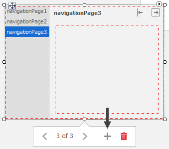
Navigation Page tabs are NavigationPage class objects. Dropping a VS Toolbox control onto your form automatically adds two pages. You can add more pages by doing one of the following:
Select a Navigation Pane and click the “Add Page” button.
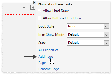
Invoke the control’s smart tag and click the “Add Page” link.
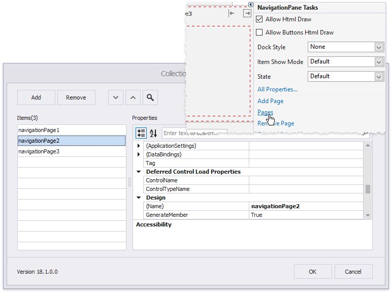
Invoke the control’s smart tag and click the “Pages” link. The invoked collection editor dialog allows you to add and remove pages, as well as specify their properties.
Add pages to the NavigationFrame.Pages collection in code.
Use the NavigationFrame.SelectedPage or NavigationFrame.SelectedPageIndex properties to choose the active navigation page.
Design-time Access
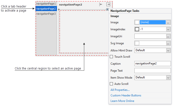
You need to modify properties that belong to the control and the individual pages it contains to customize the Navigation Pane. To set up page properties at design-time, click tab headers to bring the page to the front, and click its central area to select it. Page smart tags provide easy access to the most frequently used page settings.
Page Content
You can drag controls from the VS Toolbox and drop them on a page’s surface to populate a page. Or you can design your page content in a separate XtraUserControl and place this User Control instance inside a page. The latter can be done in two ways:
Add controls to the Page Controls collection.
Handle the NavigationFrame.QueryControl event. This event is raised when a Navigation Pane is about to display an empty Page. Event arguments allow you to identify this page and provide content to this page.
private void NavigationPane1_QueryControl(object sender, DevExpress.XtraBars.Navigation.QueryControlEventArgs e) {
    switch (e.Page.Caption) {
        case ("Page 1"):
            e.Control = new MyUserControl1() { Dock = DockStyle.Fill };
            break;
        case ("Page 2"):
            e.Control = new MyUserControl2() { Dock = DockStyle.Fill };
            break;
        //. . .
    }
}
Tab Header Orientation
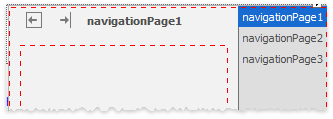
Tab headers are arranged according to the control’s position inside the form and are anchored to the control’s left edge by default. Changing the Pane’s Dock property to Dock.Right aligns headers to the right edge.
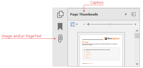
Page Captions and Icons
Navigation pages use the following interconnected properties to specify their captions and icons:
- NavigationPageBase.Caption - specifies the page title and tab header caption by default;
- NavigationPageBase.PageText - when not set to null (Nothingin VB), it overrides the NavigationPageBase.Caption to specify the tab header caption;
- Image and SvgImage properties (accessible through the NavigationPageBase.ImageOptions property group) – replaces the tab header caption with an image;
- Properties.ShowMode - allows you to choose whether the tab header should display either text or an image, or both;
- NavigationPane.ItemOrientation - set this property to Orientation.Vertical to rotate tab header captions 90 degrees clockwise.
Expanding, Collapsing and Resizing Pages
End-users can expand and collapse the Navigation Pane using the corresponding buttons at a page’s top right corner.
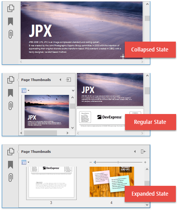
- Regular state - the control occupies the area its Size property specifies.
- Expanded state - the control occupies the area its MaximumSize property specifies.
- Collapsed state - pages are hidden and only the tab header area remains visible.
Note
Related API * NavigationPane.State - modify this property to set the control state manually.
- NavigationPageDefaultProperties.ShowExpandButton[NavigationPageProperties.ShowExpandButton](xref:DevExpress.XtraBars.Navigation.NavigationPageProperties.ShowExpandButton) - specify whether this individual page\all navigation pages display the expand button.
- NavigationPageDefaultProperties.ShowCollapseButton[NavigationPageProperties.ShowCollapseButton](xref:DevExpress.XtraBars.Navigation.NavigationPageProperties.ShowCollapseButton) - specify whether this individual page\all navigation pages display the collapse button.
End-users can also drag the Page side border to resize it. This allows the control to be any size between the MinimumSize and MaximumSize. To disable this feature, set the NavigationPane.AllowResize property to false.
Overlay Resize
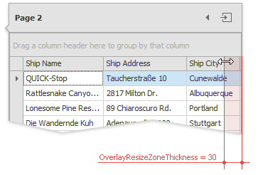
An overlay resize zone specifies the area at a page’s border that users can click without interacting with underlying page elements. If this zone is too thin and clickable UI elements are close to the page’s border, users can accidentally click or resize these elements instead of resizing the page.
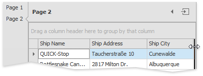
To avoid this, enable the NavigationPane.AllowOverlayResize property which forces the Navigation Pane to handle all clicks near its edge. You can increase the numeric NavigationPane.OverlayResizeZoneThickness property value to enlarge the overlay resize zone. For example, the following figure illustrates the same sample, but with the overlay resize zone thickness set to 30:
Custom Header Buttons
Page headers display the expand and collapse buttons by default. You can add more buttons that perform custom actions on the NavigationPage.CustomButtonClick, NavigationPage.CustomButtonChecked and NavigationPage.CustomButtonUnchecked events by modifying the NavigationPage.CustomHeaderButtons collection at design time or in code.
//Add buttons
navigationPage2.CustomHeaderButtons.Add(new DevExpress.XtraBars.Docking.CustomHeaderButton() {
    Caption = "Back",
    //The Style property allows you to choose between regular (push) and check buttons
    //Check buttons can be grouped into a category to act like radio buttons
    Style = DevExpress.XtraBars.Docking2010.ButtonStyle.PushButton,
    //Tags are any objects that serve as unique page IDs
    Tag = "back_button",
    //VisibleIndex specifies the button position
    //Set to a negative value to place a button before the default "Collapse" button
    //Set to a value greater than 100 to place a button after the default "Expand" button
    VisibleIndex = -1
});
navigationPage2.CustomHeaderButtons.Add(new DevExpress.XtraBars.Docking.CustomHeaderButton() {
    Caption = "Forward",
    Style = DevExpress.XtraBars.Docking2010.ButtonStyle.PushButton,
    Tag = "forward_button",
    VisibleIndex = 101
});

//Provide the button functionality
navigationPage2.CustomButtonClick += NavigationPage2_CustomButtonClick;

private void NavigationPage2_CustomButtonClick(object sender, DevExpress.XtraBars.Docking2010.ButtonEventArgs e) {
    NavigationPage page = sender as NavigationPage;
    NavigationPane pane = page.Parent as NavigationPane;
    switch (e.Button.Properties.Tag) {
        case ("back_button"):
            pane.SelectedPageIndex--;
            break;
        case ("forward_button"):
            pane.SelectedPageIndex++;
            break;
    }
}