Accordion Control
- 8 minutes to read
The Accordion Control (the AccordionControl class object) is a side navigation control whose items can be organized into groups. The main Accordion features include:
|
|
In this section:
- Items and Groups
- Items with Content Containers
- Expand and Collapse Elements
- Control Footer
- Search Panel
- Element Header Layout
- Interaction with Office Navigation Bar
- Interaction with Fluent Design Form
- Hamburger Menu View Style
Examples
- How To: Create AccordionControl in code
- How To: Replicate the appearance and behavior of the DevExpress Demo Center’s Accordion Control
Demos (DevExpress Demo Center)
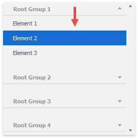
Items and Groups
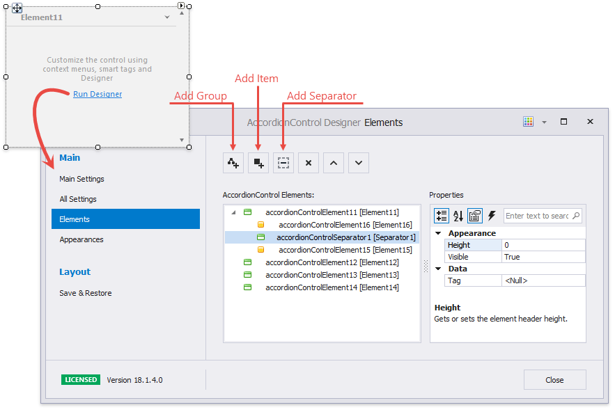
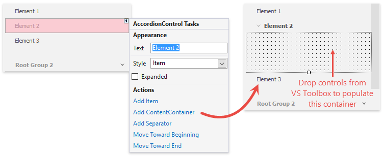
To add Accordion Control groups and items, click the “Run Designer” link on the control’s surface and switch to the designer’s “Elements” tab.
Tip
You can drag-and-drop elements in the “AccordionControl Elements” panel to re-arrange and categorize them.
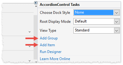
Alternatively, you can invoke the control smart tag and click the corresponding links:
In code, groups and items are AccordionControlElement class objects with different AccordionControlElement.Style property values. Root groups are stored in the Accordion’s AccordionControl.Elements collection, and individual groups store their child groups and\or items in AccordionControlElement.Elements collections.
Tip
See the How To: Create AccordionControl in code article for an example.
To allow element checked\unchecked states, enable the AccordionControl.AllowItemSelection setting.
Items with Content Containers
A regular item is a button that raises the AccordionControlElementBase.Click and AccordionControl.ElementClick events when clicked. In addition to these regular items, you can add items with content containers.
Click an item smart tag and select “Add ContentContainer”. To populate a content container, drag-and-drop controls from Visual Studio’s Toolbox onto this container.
Tip
Set a content container’s Padding property to -1 to use paddings based on the applied skin.
To populate a content container in code, specify the AccordionControlElementBase.ContentContainer property…
userControlPhoto uc = new userControlPhoto() { Dock = DockStyle.Fill };
AccordionContentContainer container = new AccordionContentContainer();
container.Controls.Add(uc);
//assign the required content container to an item
acePhoto.ContentContainer = container;
…or handle the AccordionControl.HasContentContainer and AccordionControl.GetContentContainer events.
//specify which items should raise the GetContentContainer event
private void accordionControl1_HasContentContainer(object sender, HasContentContainerEventArgs e) {
    if (e.Element.Text == "Photo") e.HasContentContainer = true;
}

//assign a content container to the item that fired this event
private void accordionControl1_GetContentContainer(object sender, GetContentContainerEventArgs e) {
    if (e.Element.Text == "Photo") {
        userControlPhoto uc = new userControlPhoto() { Dock = DockStyle.Fill };
        AccordionContentContainer container = new AccordionContentContainer();
        container.Controls.Add(uc);
        e.ContentContainer = container;
    }
}
Important
- Only items can have content containers.
- Items that already have content containers do not raise the AccordionControl.HasContentContainer event.
Expand and Collapse Elements
API | Description |
|---|---|
Gets or sets whether the element is expanded. | |
Call these methods to expand and collapse all Accordion elements at once. | |
If these settings are enabled, end-users can click element headers to expand and collapse elements. | |
Handle these events to perform certain actions when the element is about to collapse or expand, and after the element’s state changes. You can handle the AccordionControl.ExpandStateChanging event and clear the e.ElementsToExpandCollapse collection to abort the expand\collapse operation. For instance, the following code does not allow users to collapse the “Options” group: Alternatively, you can cancel the AccordionControl.ElementClick event to do the same. Note that code samples above do not allow users to collapse the Accordion group, but leave this group’s expand\collapse button visible. See the following table row to learn how to hide this button. | |
Use these properties to hide expand\collapse buttons for all items or groups at once. Initially, all groups - even if they are empty - display these buttons. Items show them only when they have content containers assigned. If you need to hide the expand\collapse button for individual elements, handle the AccordionControl.CustomDrawElement event. This event provides multiple e.Draw… , each method paints the specific element part. For instance, the sample below does not call the DrawExpandCollapseButton method for the “Options” group. | |
Gets or sets whether a single element or multiple elements can be expanded simultaneously. | |
Gets or sets whether expandable groups and elements are scrolled (if required) to make their contents visible when they are expanded. |
Control Footer
You can move root Accordion elements (groups and items from the AccordionControl.Elements collection) to the control’s footer. Footer elements act like tabs in a Tabbed UI: when a user clicks a footer element, the Accordion displays this element’s child items in the control’s main area. In the following figure, root items are displayed in the control’s footer. The ‘Mail’ item is active.
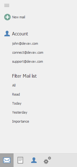
To enable this item display style, set the AccordionControl.RootDisplayMode property to “Footer”.
accordionControl1.RootDisplayMode = DevExpress.XtraBars.Navigation.AccordionControlRootDisplayMode.Footer;
Additional API
- AccordionOptionsFooter.ActiveGroupDisplayMode - Gets or sets whether the accordion control’s main menu displays the active group’s content, but not the header, or both the content and the header.
AccordionControlElement.ControlFooterAlignment - Gets or sets whether the element is aligned at the near or far side of the control footer in the accordion control’s expanded state.
accordionControl1.OptionsFooter.ActiveGroupDisplayMode = DevExpress.XtraBars.Navigation.ActiveGroupDisplayMode.GroupHeaderAndContent;
accordionControlElementSetting.ControlFooterAlignment = AccordionItemFooterAlignment.Far;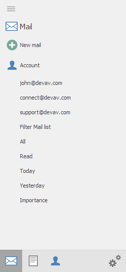
- OptionsMinimizing.FooterHeight - Gets or sets the control footer height in the accordion control’s minimized state.
- OptionsMinimizing.AllowFooterResizing - Gets or sets whether it is allowed to resize the control footer when the accordion control is minimized.
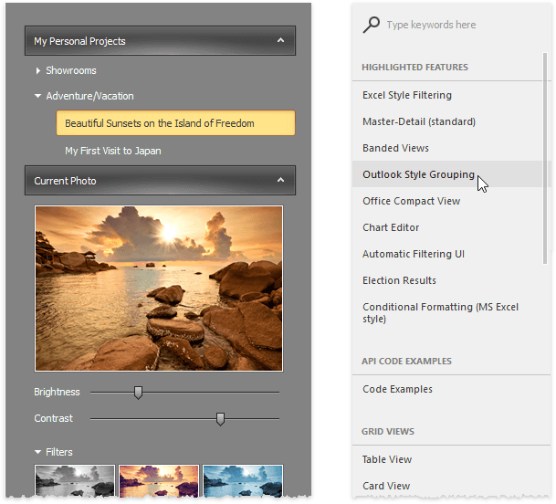
Search Panel
The embedded search panel allows end-users to quickly locate a required element. If a found item belongs to a group, this group is also visible. Vice versa, if a found element is a group, it shows its child elements.
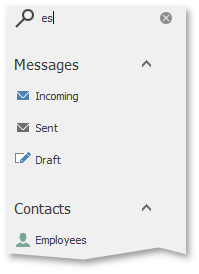
When the AccordionControl.ShowFilterControl property equals Always, the search panel is always visible. The Auto value allows end-users to press CTRL+F to invoke the search panel, and ESC to close it.
You can make a custom filter control for the Accordion. To do that, declare a class that implements the DevExpress.XtraBars.Navigation.IFilterContent interface and assign this class instance to the AccordionControl.FilterControl property.
Element Header Layout
Accordion groups and items can display four types of content within their headers:
- icon (the AccordionControlElementBase.Image property);
- caption (the AccordionControlElementBase.Text property);
- custom header control (the AccordionControlElementBase.HeaderControl property);
- context buttons (the AccordionControlElementBase.ContextButtons property).
See the Element Header Layout to learn how to re-arrange these content blocks.
Interaction with Office Navigation Bar
The Office Navigation Bar can show items, retrieved from the Accordion Control. Use the OfficeNavigationBar.NavigationClient property to attach an Office Navigation Bar to an Accordion.
Interaction with Fluent Design Form
The FluentDesignForm is a Windows 10-inspired form that includes the following features:
- Embedded Hamburger Menu (AccordionControl with the HamburgerMenu view type)
- Adaptive Layout mode for the Hamburger Menu (automatically switches between Inline, Overlay and Minimal display modes when you resize the form)
- Acrylic Material effect (a partially transparent texture)
- Reveal Highlight visual effect
See Fluent Design Form for more information.