Navigation Frame and Tab Pane
- 4 minutes to read
Navigation Frame and Tab Pane controls are simple controls that create single document interface (SDI) and share most concepts and features.
Navigation Frame | |
| NavigationFrame is a content container that hosts multiple pages, but allows only one of them to be displayed at a time. The Frame does not provide any visual elements to navigate through pages - no tab headers, buttons, sliders etc., which is a perfect solution when you need to implement a simple and clean application layout or you wish to restrict your end-users to navigate through pages manually. At design time, however, you will find navigation buttons that simplify populating pages, included in your Frame. Switching between pages can be followed by animation effects, available out-of-the-box. |
Tab Pane | |
| An upgraded version of the Navigation Frame control, the TabPane control provides navigation buttons to cycle through pages at runtime. Buttons are generated automatically depending on a page caption and image. The control also has a slightly different appearance when painted using DevExpress skins. |
Both controls are populated and customized in the very same way. At design time, when a control is focused, you will see a navigation toolbar (see below) that contains buttons to add a new page or remove the currently active. Arrow buttons allow to navigate through pages. The index of the currently displayed page is shown on the toolbar’s left.
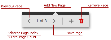
To do the same in code, access the pages collection using the control’s Pages property. The Navigation Frame stores the NavigationPage objects within this collection. Tab Pane in its turn uses the TabNavigationPage objects.
Pages themselves can be populated at design time by simply dropping required controls onto them. If you need to populate pages in code, handle the NavigationFrame.QueryControl event. This event fires whenever the page needs to be displayed. Alternatively, specify the page’s ControlName and (or) ControlTypeName properties. This dynamic page population is described in every detail for the Application UI Manager component, which uses this feature to populate its documents. Refer to the Deferred Load topic to learn more.
private void navigationFrame1_QueryControl(object sender, DevExpress.XtraBars.Navigation.QueryControlEventArgs e) {
    e.Control = new Label() { BackColor = Color.Teal, Dock = DockStyle.Fill, Text = "Sample Content", AutoSize = false, TextAlign = ContentAlignment.MiddleCenter };
}
The currently selected page is stored within the both controls’ SelectedPage property - the NavigationFrame.SelectedPage property for the Navigation Frame, the TabPane.SelectedPage property for the Tab Pane. You can also specify the index of the page within the control’s Pages collection to choose the currently selected page. To do so, use the NavigationFrame.SelectedPageIndex property. These approaches are the only way to switch to another Navigation Frame’s page at runtime, since this control gives no navigation UI elements. On the animation below, navigation is manually implemented by specifying the required navigation page when different AccordionControl items are clicked.
Show animation
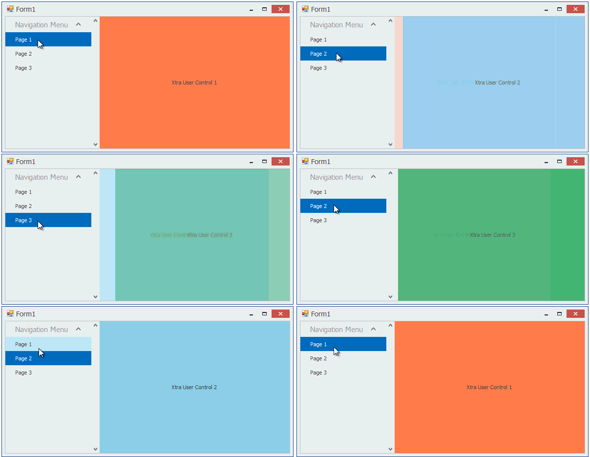
The Tab Pane control allows more flexible runtime behavior by displaying buttons for each child page. The animation below illustrates a Tab Pane cycling through its pages when an end-user clicks navigation buttons.
Show animation
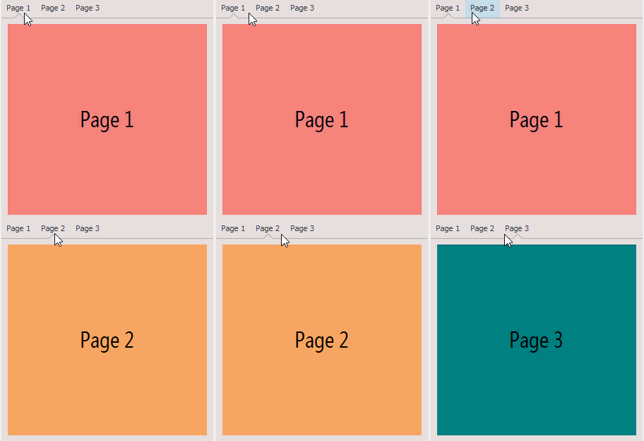
Tab Pane buttons are able to display text and image, assigned to the related page’s PageText and Image properties respectively. Depending on the control’s PageProperties.ShowMode property value, these buttons can display only image, only text or both types of their content simultaneously. The TabNavigationPage.ItemShowMode property overrides this global setting for individual Tab Pane’s pages.
Navigation buttons for the Tab Pane control can be aligned only to the control’s top. The only button modification allowed is setting the NavigationPane.ItemOrientation property to Orientation.Vertical. This rotates buttons and their content 90 degrees clockwise, as shown on the figure below. You can also use the NavigationPane.AppearanceButton property to modify button appearance settings, such as forecolor or font size.
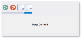
Both SDI containers support animation effects out-of-the-box. If the NavigationFrame.AllowTransitionAnimation property is enabled, navigating through pages is followed with an effect specified by the NavigationFrame.TransitionType property.
