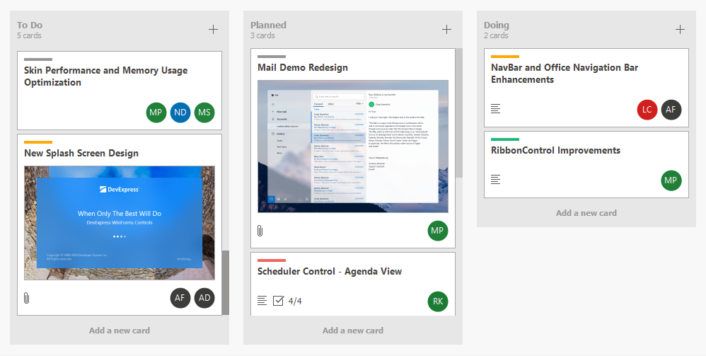
Kanban Board
- 6 minutes to read
This document shows how to implement a Kanban board in a Tile View, and provides information on the main Kanban customization options.
Demo
Limitations
TileView does not support Infinite Scrolling in Kanban mode.
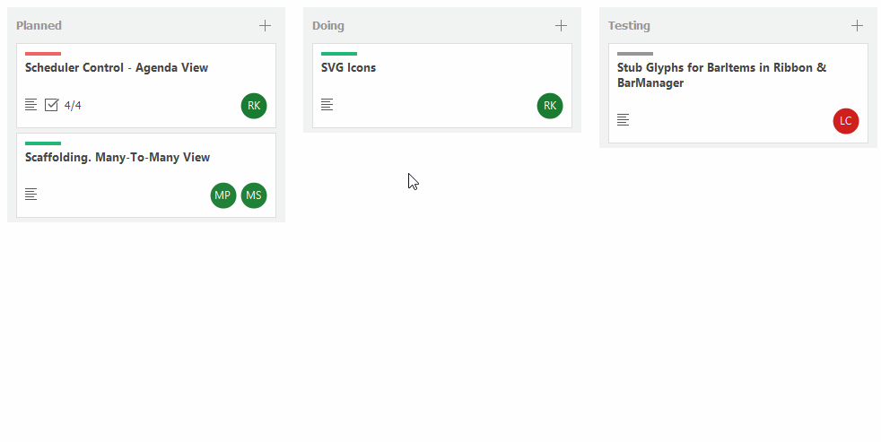
What is a Kanban Board
Kanban (‘signboard’ in Japanese) is a method of managing business processes, and the Kanban board provides a visual workflow.
A typical Kanban board consists of cards (tiles) combined into groups (columns or rows). Groups identify workflow stages (statuses), and cards represent workflow items. A user can drag-and-drop cards within a group and between groups to change their status and order.
Note
In this topic, the term “tile” will be used to refer to Kanban board items (cards).
Prepare Data and Bind It to Data Grid
Create a data source for your Kanban board. When the Tile View is bound to a data source, each data source record is rendered as a tile. Ensure the data source contains a status field (tiles are combined in groups according to their status field).
Use the GridControl.DataSource property to bind the data source to the Data Grid.
The following code snippet shows a Data Grid bound to data in the Tile View Kanban Board demo:
void InitData() {
    tasksData = KanbanHelper.LoadTasks();
    //...
    gridControl.DataSource = tasksData;
}

public static BindingList<TaskRecord> LoadTasks() {
    var _tasks = new BindingList<TaskRecord>();
    //...
    return _tasks;
}


public enum TaskStatus { ToDo, Planned, Doing, Testing, Done }
public class TaskRecord  {
    public string Caption { get; set; }
    public string Description { get; set; }
    public Image AttachedImage { get; set; }
    public TaskStatus Status { get; set; }
    //...
}
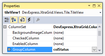
Enable Kanban Layout Mode and Tile Grouping
Set the TileView.OptionsTiles.LayoutMode property to Kanban to enable Kanban layout mode.
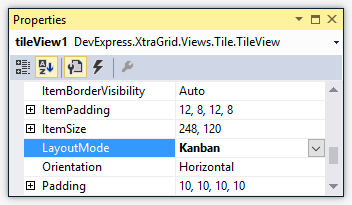
To combine tiles into groups, specify a group column via the TileView.ColumnSet.GroupColumn property.
Specify the Tile Template
The Tile View renders all tiles based on a tile template. To create a template, use the Tile Template page of the Data Grid’s Designer or the TileView.TileTemplate property in code.
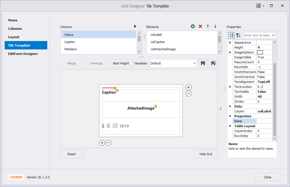
See the Tile View topic for information about how to create tile templates.
Automatic and Manual Group Generation
Automatic groups
The TileView automatically generates groups for all unique values in the group column (TileView.ColumnSet.GroupColumn). When a group becomes empty (for instance, when you remove all tiles from a group), the TileView deletes this group.
Manual groups
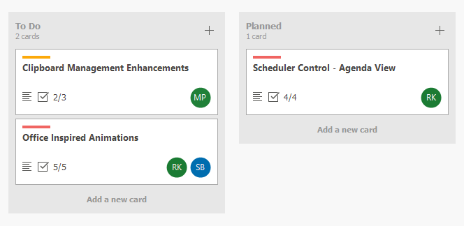
You can use the TileView.OptionsKanban.Groups collection to create Kanban groups (KanbanGroup objects) and use them to perform the following tasks:
- Maintain the group’s lifetime. Created groups are not automatically removed.
- Show only specific groups.
- Customize settings of individual groups.
The following animation shows three created groups:
See the TileView.OptionsKanban.Groups topic for more information.
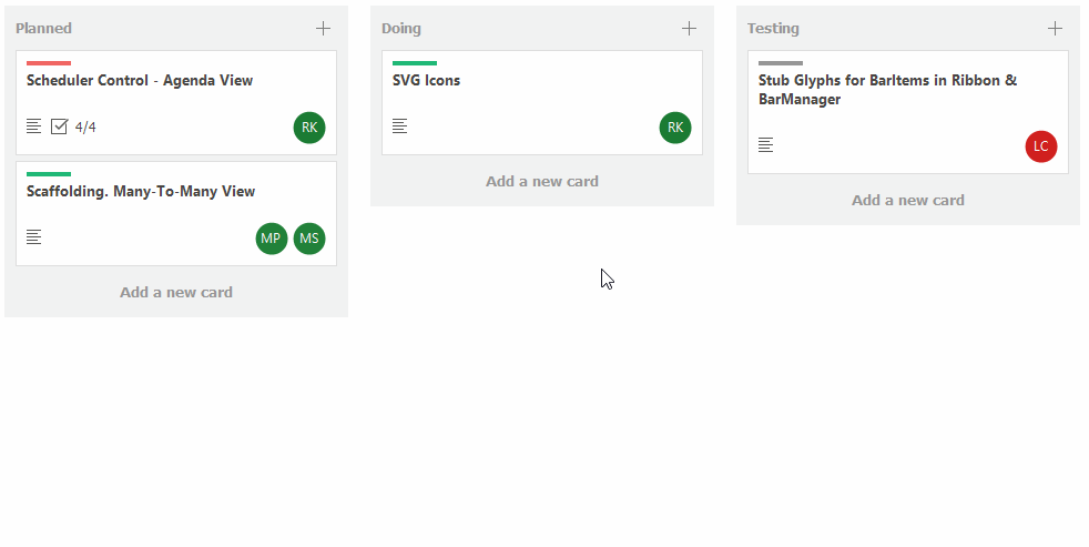
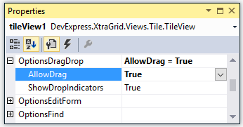
Enable Tile Drag-and-drop
The built-in tile drag-and-drop feature is disabled initially. You can use the TileView.OptionsDragDrop.AllowDrag property to allow users to drag tiles within and between groups.
Drag-and-drop operations in data-aware controls, including the Data Grid’s Tile View, are performed on the data source level. Whenever a tile is dragged-and-dropped in a new position, the Tile View moves the underlying record to the corresponding position in the data source. If a tile is moved to a different group, the record’s group column value is changed accordingly.
The following properties and events allow you to customize drag-and-drop operations:
- TileView.BeforeItemDrag event - Fires when a tile drag operation is about to be started. Allows you to provide a drag image, or to cancel the operation. This event does not fire when you enable drag-and-drop using Drag And Drop Behavior.
- TileView.BeforeItemDrop event - Fires when a tile drop operation is initiated. This event does not fire when you enable drag-and-drop using Drag And Drop Behavior.
- TileView.ItemDrag - Fires repeatedly when a user drags a tile. Allows you to prevent a tile from being dropped at a specific position. This event does not fire when you enable drag-and-drop using Drag And Drop Behavior.
- TileView.ItemDrop event - Fires after a tile drop operation has been completed. This event does not fire when you enable drag-and-drop using Drag And Drop Behavior.
- KanbanGroup.AllowItemDrag property - Gets or sets whether to disable tile drag-and-drop operations within and from the current group.
- KanbanGroup.DropTargetGroups property - The collection of groups that can accept tiles from the current group during drag-and-drop operations.
Enable Tile Editing Feature
See Tile Editing for instructions on how to allow users to edit tiles.
Additional Customizations
This section covers additional tile customization options.
Dynamic Tile Customization
Use the TileView.ItemCustomize event to dynamically modify tile elements according to your logic. This event fires for each tile when it is about to be displayed.
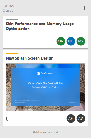
Tile Auto-Height
When you create a tile template, you can enable auto-height mode for a specific template row. This allows tiles to have different heights depending on their contents.
See the TableRowDefinition.AutoHeight topic for more information.
Group Header Text
The text displayed in group headers is specified by the Caption property of the group column (TileView.ColumnSet.GroupColumn). To provide custom display text, handle the ColumnView.CustomColumnDisplayText event.
The following code snippet from the Tile View Kanban Board demo displays the number of child tiles in group headers:
void TileView_CustomColumnDisplayText(object sender, Views.Base.CustomColumnDisplayTextEventArgs e) {
    if(e.IsForGroupRow) {
        var kanbanGroup = tileView.GetKanbanGroupByValue(e.Value);
        int count = tileView.GetChildRowCount(kanbanGroup);
        string cards = count == 1 ? " card" : " cards";
        e.DisplayText += "<br><size=-2><r>" + count.ToString() + cards;
    }
}
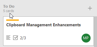
Buttons in Group Headers
Group headers can display additional buttons. These buttons can be always visible or visible only when you hover the mouse pointer over the group header.
Use the TileView.OptionsKanban.GroupHeaderContextButtons collection to add buttons. To perform actions when a button is clicked, handle the TileView.GroupHeaderContextButtonClick event.
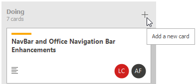
Group Footer Buttons
Use the TileView.OptionsKanban.GroupFooterButton property to add footer buttons to all groups.
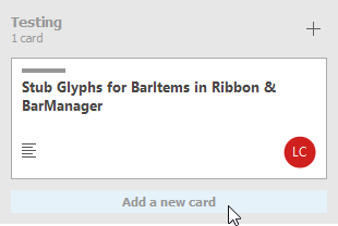
The KanbanGroup.FooterButton property allows you to show/hide footer buttons in individual Kanban groups.
Group Appearance Settings
The TileView.OptionsKanban.ShowGroupBackground property allows you to enable a background layer for groups.
The current skin specifies the default background color. You can use the TileView.Appearance.Group and KanbanGroup.Appearance properties to set a custom background color and group text color.
Horizontal or Vertical Alignment
Use the TileView.OptionsTiles.Orientation property to align Kanban groups horizontally or vertically. Tiles are arranged in columns in horizontal mode, and in rows in vertical mode.
Context Buttons in Tiles
You can add additional actions (for example, buttons) to tiles via the TileView.ContextButtons collection.