Filter and Search
- 13 minutes to read
When a filter is applied, the View displays only those records that meet the current filter criteria. You can filter data against one or multiple columns.
Most DevExpress data-aware components (Data Grid, Tree List, Vertical Grid, etc.) have the filtering UI and API similar to that described in this topic.
Filtering Dropdown Menus (Excel Style)
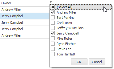
To invoke a filtering dropdown menu for a column, click the filter icon within the column header. In the “Values” tab, end-users can select specific cell values from those that are currently displayed by the Data Grid.
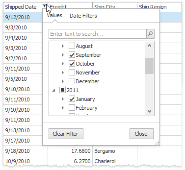
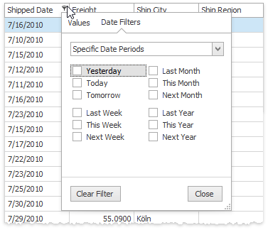
The “Filters” tab gives users a wider pool of filtering options. For example, when filtering by dates, you can only show those records that correspond to the previous week.
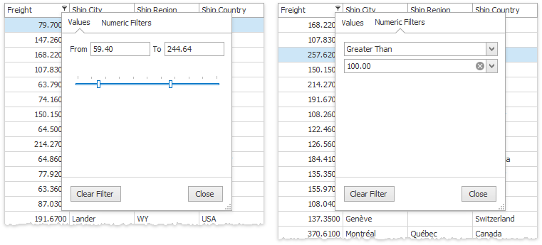
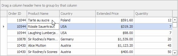
The content of a filtering dropdown menu depends on the type of data displayed by the related grid column. For instance, the figure below illustrates what this menu looks like when filtering by a numeric column.
This type of filtering dropdown menus is called Excel-style dropdowns and is the default filtering menu type starting with version 17.1.
Related API
- GridOptionsCustomization.AllowFilter - disables filtering for the entire Data Grid.
- OptionsColumnFilter.AllowFilter - disables filtering for this specific column.
- ColumnView.ColumnFilterChanged - Occurs when a column’s filter condition changes. This event also raises when the Find Panel finishes its search.
- ColumnViewOptionsFilter.ColumnFilterPopupMode - if a version of your DevExpress installation is older than 17.1, switch this setting to Excel to enable Excel-style filtering dropdowns.
- ColumnView.OptionsFilter - provides access to settings that affect filter menus for all columns. See ColumnViewOptionsFilter class members for the list of available settings.
- GridColumn.OptionsFilter - provides access to filter settings of this particular column. See OptionsColumnFilter class members for the list of available settings.
- ColumnView.ShowFilterPopupExcel - handle this event to customize Excel-styled filters.
See the Advanced Filter and Search Concepts article to learn how to dynamically customize Excel-style menus.
Classic Filtering Dropdown Menus
Instead of Excel-style dropdowns, the Data Grid can display classic filtering menus. These are calendars for the DateTime columns and regular dropdowns for columns of other types.
Related API:
- ColumnViewOptionsFilter.ColumnFilterPopupMode - set this property to Classic in order to enable classic filtering dropdowns for DevExpress installations of versions 17.1 and newer. In older versions, classic menus are enabled by default.
- WindowsFormsSettings.DefaultSettingsCompatibilityMode - setting this property to v16 is the alternative way to enable classic filtering dropdowns for versions 17.1 and newer.
- ColumnViewOptionsFilter.ColumnFilterPopupRowCount - gets or sets the maximum number of items that regular dropdowns can display simultaneously.
- ColumnViewOptionsFilter.AllowColumnMRUFilterList - if this property is enabled, regular dropdown lists will remember values, most recently selected by end-users. These values will be shown before the default “Custom” item.
- OptionsColumnFilter.ShowBlanksFilterItems - gets or sets whether or not the “(Blanks)” and “(Non Blanks)” items are available within filtering dropdowns.
- ColumnView.ColumnFilterChanged - Occurs when a column’s filter condition changes. This event also raises when the Find Panel finishes its search.
You can opt for checked list menus instead of regular dropdown menus.
Related API:
- OptionsColumnFilter.FilterPopupMode - set to CheckedList to enable this filtering menu style.
- ColumnViewOptionsFilter.ShowAllTableValuesInCheckedFilterPopup - gets or sets whether or not checked filter dropdown lists must display unique values from all data source records, or only from those records that meet the current filter criteria.
- ColumnView.ShowFilterPopupCheckedListBox - this event allows you to modify items within the checked list filtering menu, including the standard “Select All” item.
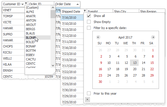
Calendar filtering menus can also be replaced with checked lists. Additionally, you can select between three types of calendar-based menus: DateSmart (default menu type), DateAlt and Date. The figure below illustrates the DateAlt menu.
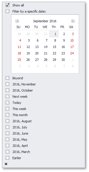
All three menus feature the same calendar for selecting a specific date, but with different sets of check boxes to select non-intersecting date intervals. The table below lists some of these intervals.
DateSmart | Date | DateAlt |
|---|---|---|
Check boxes are visible only if there are Data Grid records that fall into corresponding intervals.
| Same time intervals as for the DateSmart type. All check boxes are available, even if there is no data that falls into a corresponding date range. |
|
Related API:
- OptionsColumnFilter.FilterPopupMode - set this property to either Date, DateSmart or DateAlt to choose the required calendar-based dropdown menu.
- OptionsColumnFilter.ImmediateUpdatePopupDateFilterOnCheck - if this setting is enabled, toggling calendar-based menu check boxes immediately applies filtering.
- OptionsColumnFilter.ImmediateUpdatePopupDateFilterOnDateChange - if this setting is enabled, selecting a date (or a date range) within a calendar-based menu immediately applies filtering.
- OptionsColumnFilter.ShowEmptyDateFilter - gets or sets whether or not dropdown menus should display the “Show Empty” filter. End-users can check this filter to view records that have no values in the related DateTime column.
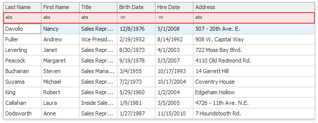
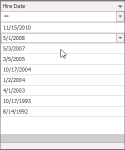
Automatic Filtering Row
Another way to filter data at runtime is to utilize the automatic filtering row. This row is displayed above regular data rows and allows end-users to type in filtering values (including ‘*’ and ‘%’ wildcards) and select filter operators (NotLike, Equals, Between, etc.).
Note that to allow users to enter any characters they wish, cell editors ignore their masks when shown in the Automatic Filtering Row. The following code demonstrates how to manually keep the numeric mask active for the Auto Filtering Row.
private void GridView1_ShownEditor(object sender, System.EventArgs e) {
    GridView view = sender as GridView;
    TextEdit edit = view.ActiveEditor as TextEdit;
    if (edit != null && view.IsFilterRow(view.FocusedRowHandle))
        edit.Properties.Mask.MaskType = DevExpress.XtraEditors.Mask.MaskType.Numeric;
}
Note that if an Auto Filter Row cell uses a RepositoryItemRichTextEdit in-place editor, users can only select the “Like” filter condition for this cell. Other conditions (“Starts with”, “Equals”, etc.) are not available for RTF values.
Related API:
- GridOptionsView.ShowAutoFilterRow - manages the visibility of the automatic filtering row.
- OptionsColumnFilter.AllowAutoFilter - allows you to exclude specific columns from the automatic filtering row without hiding this entire row.
- GridView.PopupMenuShowing - allows you to hide or remove specific conditions.
- GridOptionsFilter.AllowAutoFilterConditionChange - specifies whether or not the auto-filtering row’s condition selector is visible. If this selector is disabled, entered values will be compared using the “Equals” (for CheckEdit, LookUpEdit and ImageComboBoxEdit columns) or “Like” (for other columns) operator.
- OptionsColumnFilter.AutoFilterCondition - specifies the filter criteria operator for this column (“Equals”, “Like”, “Greater”, etc.).
- OptionsColumnFilter.ImmediateUpdateAutoFilter - if this setting is enabled, the Data Grid will filter its records immediately as end-users modify the filter condition. Otherwise, filtering will not be applied until a user presses the Enter key or moves focus to another cell.
- GridView.ShowAutoFilterConditionsMenu - call this method from code to invoke the automatic filtering row popup menu for the specific column.
- GridView.GetAutoFilterValue, GridView.SetAutoFilterValue - methods that allow you to retrieve the currently applied auto-filtering row condition and apply a new one from code.
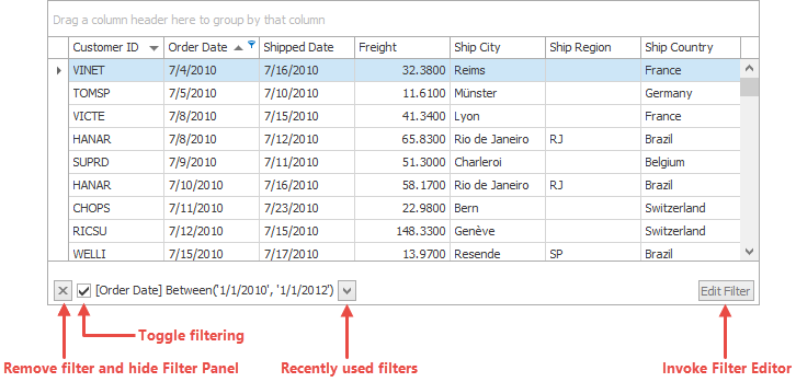
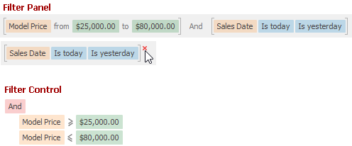
Filter Panel
When you apply filtering, a View shows a filter panel. End-users can utilize this panel to modify and remove current filters.
Related API:
- ColumnViewOptionsView.ShowFilterPanelMode - manages the filter panel visibility.
- ColumnView.ActiveFilterEnabled - allows you to toggle the current filter on or off.
- ColumnViewOptionsFilter.AllowMRUFilterList - allows you to hide the button that invokes the list with recently applied filters.
- ColumnViewOptionsFilter.AllowFilterEditor - controls the “Edit Filter” button visibility.
Incremental Search
End-users can focus a grid column and start typing. The Data Grid will focus and highlight the first matching record. To find other records, press Ctrl+Up and Ctrl+Down hotkeys.
Related API:
- GridOptionsBehavior.AllowIncrementalSearch - enables or disables this feature.
- ColumnView.GetIncrementalText - returns the text being searched during an incremental search.
- GridView.StartIncrementalSearch, GridView.StopIncrementalSearch - call these methods from code to manually trigger and cancel incremental search.
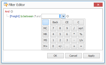
Filter Editor
The Filter Editor dialog allows end-users to build complex filtering criteria, combined from multiple expressions. To invoke this dialog end-users can do one of the following:
- click “Edit Filter” in Filter Panel;
- select “(Custom)” in a regular dropdown filter menus
- right-click a column header and select “Filter Editor”.
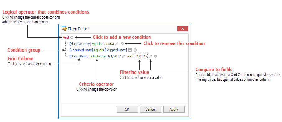
You can modify the ColumnViewOptionsFilter.DefaultFilterEditorView property to enable the Filter Editor’s “Text” panel\tab, where users can type filter expressions manually.
Starting with version 18.1, the legacy Filter Editor is replaced with its updated version that features the advanced “Text” panel. This panel now supports syntax highlighting and auto-complete to facilitate the input. To revert data-aware controls back to the legacy Filter Editor version, disable the static WindowsFormsSettings.UseAdvancedFilterEditorControl property.
Related API:
- ColumnViewOptionsFilter.AllowFilterEditor - gets or sets whether or not the Filter Editor is available.
- ColumnView.CustomFilterDialog - handle this event to alter the default behavior for end-users clicking the “Custom” filter drop-down menu item. See Advanced Filter and Search Concepts to learn more.
- ColumnView.FilterEditorCreated - this event fires when the Filter Editor is about to be shown. Allows you to customize the Editor dialog or prevent it from being displayed.
Show exampleThe code below allows end-users to filter the “Price” column’s data by using the SpinEdit and CalcEdit editors.
private void GridView1_FilterEditorCreated(object sender, DevExpress.XtraGrid.Views.Base.FilterControlEventArgs e) {
    e.FilterControl.BeforeShowValueEditor += FilterControl_BeforeShowValueEditor;
}
RepositoryItemSpinEdit reSpinEdit = new RepositoryItemSpinEdit();
RepositoryItemCalcEdit reCalcEdit = new RepositoryItemCalcEdit();
private void FilterControl_BeforeShowValueEditor(object sender, DevExpress.XtraEditors.Filtering.ShowValueEditorEventArgs e) {
    if (e.CurrentNode.FirstOperand.PropertyName != "Price") return;
    RepositoryItemTextEdit item = null;
    if (e.FocusedElementIndex == 2)
        item = reSpinEdit;
    else
        item = reCalcEdit;
    item.Mask.MaskType = DevExpress.XtraEditors.Mask.MaskType.Numeric;
    item.Mask.EditMask = "c";
    e.CustomRepositoryItem = item;
}
- ColumnViewOptionsFilter.UseNewCustomFilterDialog - enable this property to allow end-users to filter values of a GridColumn not only against a constant custom value, but also against values of other GridColumns.
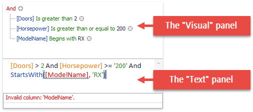
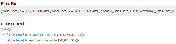
Filter Criteria Display Style
The following list demonstrates the available display styles of filter criteria in controls.
Visual -
Renders filter criteria in an easy-to-read format and uses skin-based colored highlights to differentiate between column names, functions and values. In the Filter Panel, the ‘x’ button is displayed when you hover over a condition. This button allows users to quickly remove individual conditions from the filter.
Text -
Renders filter criteria in a text-based format.
Related API:
- WindowsFormsSettings.FilterCriteriaDisplayStyle - Gets or sets the default display style of filter conditions in a control’s Filter Panel, MRU Filter List, and built-in Filter Editor.
- ColumnViewOptionsView.FilterCriteriaDisplayStyle - Gets or sets the display style of filter conditions in the Filter Panel and built-in Filter Editor.
Find Panel
The Find Panel allows your end-users to apply a temporary filter that filters data across all Data Grid columns at once. To invoke this panel, press “Ctrl+F” at runtime. Type in text you need to search for, then press Enter or click “Find”.
Note that the Find Panel does not highlight cells with HTML text.
Related API:
- ColumnViewOptionsFind.AllowFindPanel - Manages the availability of the Find Panel.
- ColumnViewOptionsFind.Behavior - Gets or sets whether records that do not match the query are hidden.
- ColumnViewOptionsFind.ParserKind - If a text entered into the Find Panel contains whitespaces, the Panel splits this string into separate logical blocks. The ParserKind setting specifies how these blocks are combined into a search query.
- ColumnViewOptionsFind.Condition - Gets or sets the condition according to which the Data Grid searches for the string entered into the Find Panel.
- ColumnViewOptionsFind.FindMode - Gets or sets whether a user must press Enter/click the “Find” button to start a search, or it starts automatically after a certain delay (the ColumnViewOptionsFind.FindDelay property).
See Find Panel to learn more.
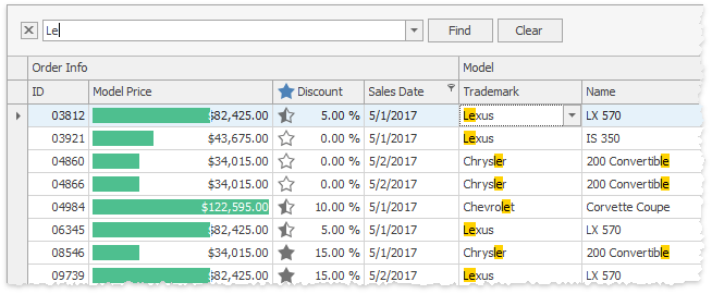
Search in Column Headers
You can use the GridView.OptionsFilter.InHeaderSearchMode property to enable built-in search boxes within the View’s column headers. The search boxes are used to filter column data, or to search in columns, depending on the mode you choose.
- ‘TextFilter’ Mode
Users can type text in the search boxes to filter against the columns.
- ‘TextSearch’ Mode
Users can type text in the search boxes to search for column data. The grid highlights cell text that matches the specified search string.
Use the following shortcuts to navigate between search results:
- CTRL+DOWN or F3 — Navigates to the next search result.
- CTRL+UP or SHIFT+F3 — Navigates to the previous search result.
The GridColumn.OptionsFilter.AllowInHeaderSearch property allows you to disable search boxes in individual column headers.
Search Syntax
The following list demonstrates sample search expressions supported in column header search boxes:
Spa— finds records whose column values contain this string (in non-numeric columns).10- finds records whose column values are equal to “10” (in numeric columns).=Spainor=22— finds records whose column values are equal to the specified value.<>40— finds records whose column values are not equal to the specified value .Other supported comparison operators include:
<,>,<=,>=, and!=(equivalent to<>).=USA,Spain,Germanyor=USA;Spain;Germany— finds records whose column values are equal to any of these listed values.[10:20]or[10..20]— finds records whose column values belong to the specified inclusive range.
Text search is case-insensitive.
Related API
- GridView.ClearInHeaderSearchText — Clears search text (contents of column header search boxes) for all columns.
- GridView.HideInHeaderSearchTextBox — Hides the currently active column header search box.
- GridView.ShowInHeaderSearchTextBox — Activates a built-in header search box for a specific column.
- GridColumn.SearchText — Gets or sets the text of the column’s built-in header search box. This property is supported in Grid Views and Banded Grid Views.
- GridColumn.OptionsFilter.InHeaderSearchPrompt — Gets or sets a grayed out hint displayed in an empty header search box when the search box is activated.
- GridView.OptionsFilter.ShowInHeaderSearchTextMode — Gets or sets whether to show search text (GridColumn.SearchText) in column header tooltips.
See the following topic for more information: GridView.OptionsFilter.InHeaderSearchMode.