Get Started With Data Grid and Views
- 13 minutes to read
The WinForms Data Grid (GridControl class) is a data-aware control that can display data in various formats (Views). This topic contains the following sections, which will guide you on how to work with the Grid control, and its Views and columns (fields).
- Grid Control’s Views
- Select a View
- Supply Data for Views and Populate Column Collection
- Access and Customize Views and Columns at Design Time
- Access and Customize Views and Columns in Code
- Layout of Columns and Bands (in Grid Views and Banded Grid Views)
- Learn More
Online Video
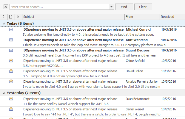
This video walks you through basic Data Grid customization. It begins with an empty Data Grid control with an applied GridView format, which displays records as rows and columns. Then, it shows the main Grid control features: data binding, column creation, sorting, grouping, and filtering data, summaries, access to grid options, in-place editors, etc. Finally, the GridView is converted to the LayoutView format, which displays underlying data as cards instead of rows and columns.
Grid Control’s Views
The WinForms Data Grid control supports multiple data presentation formats.
- Tabular
- Banded tabular
- Cards
- Windows UI-inspired Tiles
- Windows Explorer-inspired UI
The display formats above are encapsulated by Views — visual components that can be embedded in the Data Grid.
Assign an appropriate View to the Grid control to display your data in a specific manner. Use the View’s properties, events, and methods to customize the View’s appearance.
Grid View (GridView class)
 GridView - Data Grouping 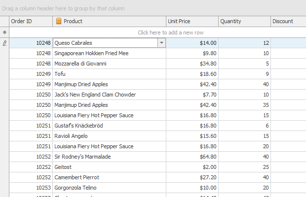 GridView - Two Dimensional Table 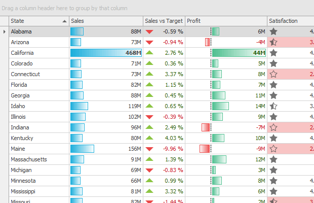 GridView - Conditional Formatting 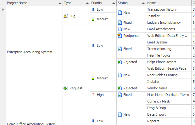 GridView - Cell Merging 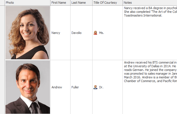 GridView - Row Auto Height | Displays data in a tabular form. Main features:
|
Banded Grid View (BandedGridView class)
 BandedGridView - One Band Level - Row Auto Height  BandedGridView - Nested Bands  BandedGridView - Fixed Bands and Data Grouping | Displays data in a tabular form and organizes columns into bands. The main features of the Banded Grid View match those of the Grid View. The following features are available:
|
Advanced Banded Grid View (AdvBandedGridView class)
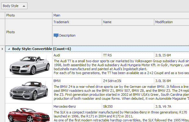 AdvBandedGridView - Data Grouping 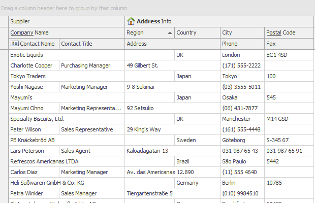 AdvBandedGridView 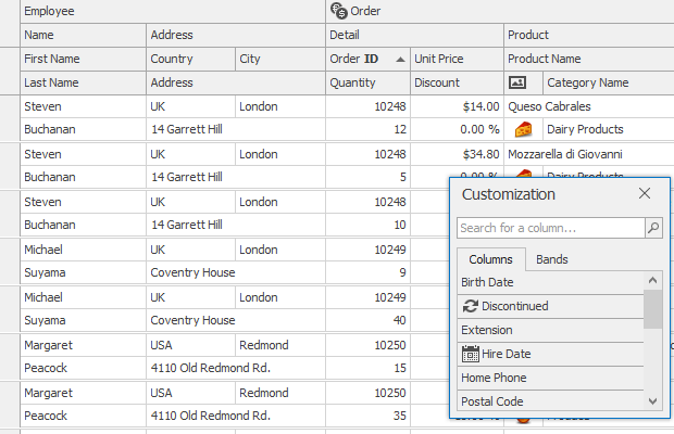 AdvBandedGridView - Customization Form | Displays data in a tabular form and organizes columns into bands. Supports complex data cell arrangements. The main features of the Advanced Banded Grid View match those of the Grid View (except for Cell Merging). The following features are available:
|
Layout View (LayoutView class)
 LayoutView 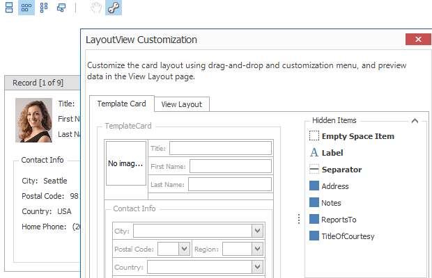 LayoutView - Runtime Customization 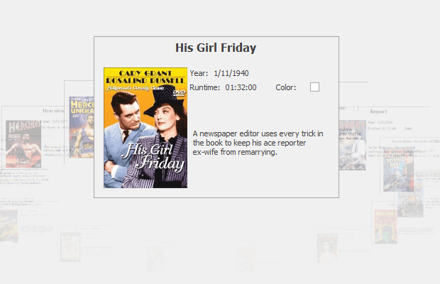 LayoutView - Carousel Mode  LayoutView | Displays records as cards in one or more columns, in one or more rows, in an ellipse (carousel mode), or as a single card at a time. Supports complex card field layouts, built-in groups, tabbed groups, and labels. Main features:
|
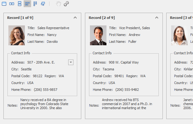
Card View (CardView class)
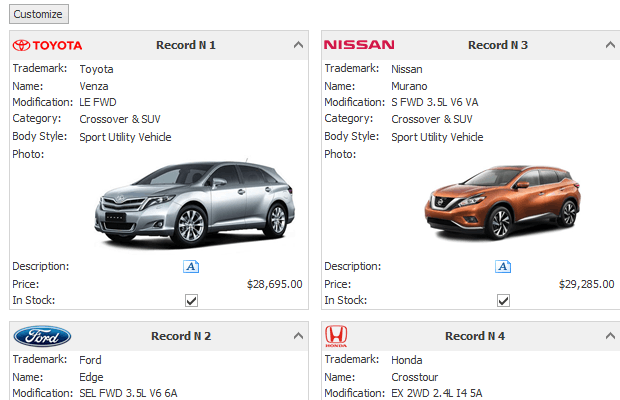 CardView 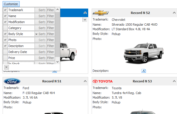 CardView - Runtime Customization | Displays data records as cards, arranged down and then across. Card fields are always arranged in a single column. Main features:
|
WinExplorer View (WinExplorerView class)
 WinExplorerView - Tiles Style 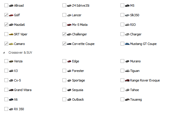 WinExplorerView - Small Style 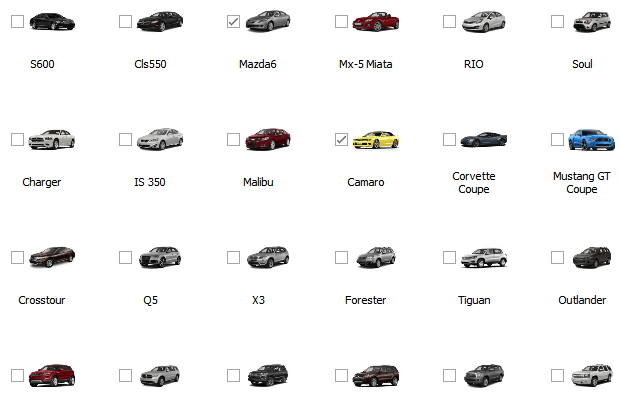 WinExplorerView - Medium Style 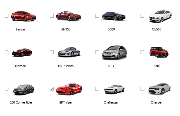 WinExplorerView - Large Style  WinExplorerView - ExtraLarge Style  WinExplorerView - Content Style  WinExplorerView - List Style | Displays records using one of seven styles supported by Microsoft Windows Explorer — Small, Medium, Large, Extra Large, List, Tiles, and Content. Supports HTML-CSS templates that allow you to override the default data presentation in these styles. Main features:
|
Tile View (TileView class)
 TileView  TileView - Grouping | Displays records as read-only tiles, using one of the following layout modes: default (standard table layout), list (tiles have no space between them), and Kanban. This View includes the Tile Template feature, which helps you arrange fields relative to other fields, specify absolute or relative field display bounds, etc. Main features:
|
Select a View
When you drop a GridControl onto the form at design time (or when you create this control in code), it is created with an embedded GridView - a View that presents underlying data as a two-dimensional table.
At design time:
At runtime (after you bind the grid to data and add columns to the GridView):
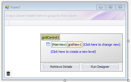
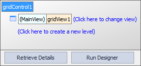
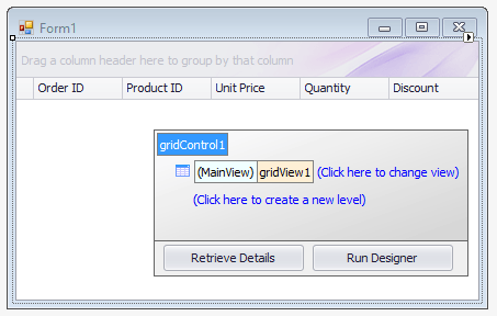
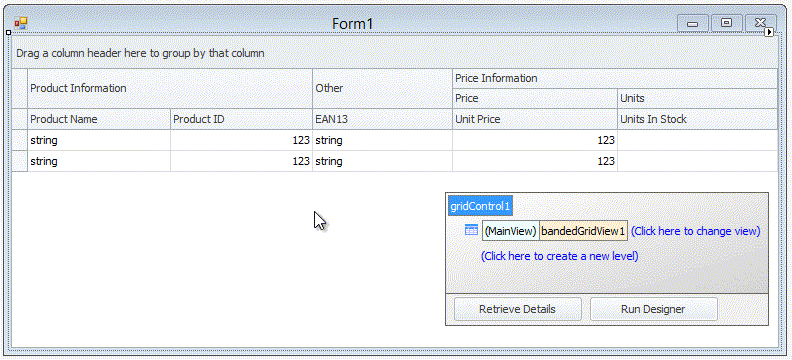
At design time, the data grid displays the Level Designer at the bottom right corner. The Level Designer allows you to access and manipulate (create, delete, and convert) the grid control’s Views, and invoke the data grid’s main Designer.
The  box in the Level Designer identifies the current View, which as the name implies is of the GridView type.
To replace this View, use the (Click here to change view) command.
box in the Level Designer identifies the current View, which as the name implies is of the GridView type.
To replace this View, use the (Click here to change view) command.
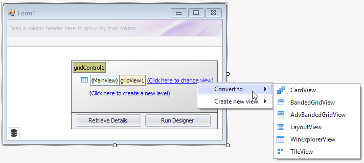
Select one of the following options:
- Convert to — Allows you to convert the clicked View to another type. The conversion transfers columns (if they exist) and appropriate settings from this View to a new View. The old View is then destroyed.
- Create new view — Allows you to select a new View without destroying the old View. You can access the new and old Views later in the Level Designer, the grid control’s Designer, and the GridControl.ViewCollection property in code.
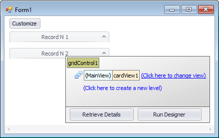
For instance, if you convert the existing GridView to the CardView type, the Level Designer will display the  box.
box.
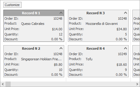
At runtime, you will see the following card UI instead of the default tabular format:
Note
The Grid Control can also display hierarchical data sources, which consist of two or more tables (data lists) linked by master-detail relationships. These relationships are also called one-to-many relationships: each record in a master table corresponds to one or more records in a child (detail) table. With the Level Designer, you can specify the Views that display master and detail tables. To learn more, see the following topic: Master-Detail Relationships.
Supply Data for Views and Populate Column Collection
A View’s data is supplied by the grid control’s bound data source, which is specified by the GridControl.DataSource and GridControl.DataMember properties.
At design time, you can bind the control to data from the data grid’s smart tag.
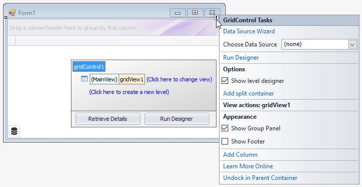
You can do one of the following:
- Select Data Source Wizard to launch the DevExpress Data Source Configuration Wizard, which simplifies binding to various data source types (ADO.NET, SQL data, Entity Framework, etc.).
- Open the drop-down menu next to Choose Data Source to run the Visual Studio Data Source Configuration Wizard.
Refer to the following topic for more information on how to bind to various data source types: Data Binding.
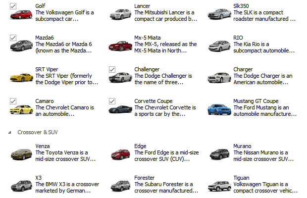
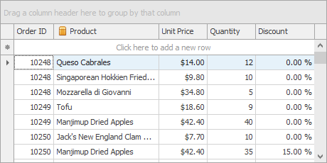
Once you bind the grid control to data, the View automatically creates columns for all fields in the bound data source (if the grid column collection was empty prior to binding). The following image shows a GridView populated with data from a sample data table containing five fields.
You can use the View’s OptionsBehavior.AutoPopulateColumns setting to disable the automatic column population feature.
Unlike other Views, the WinExplorerView and TileView do not automatically show the added columns. For these Views, additional customization is required to set up a layout within items/cards. See the following topics for more information:
Access and Customize Views and Columns at Design Time
Views and their columns have multiple options and events to customize the way underlying data is presented on-screen. You can access and customize their settings in a number of ways.
On-Form Selection and Property Grid
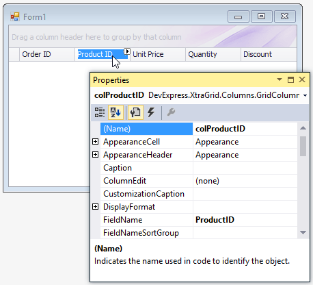
Since View and column objects are visual components, they are accessible from the Visual Studio Property Grid.
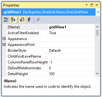
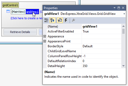
Additionally, the data grid supports design-time on-form selection of Views and columns. To select a View and list its settings in the Property Grid, click the View in the Level Designer.
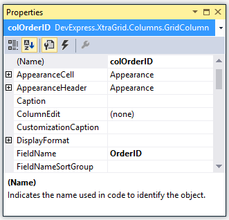
To select a column, click its header directly on the form.
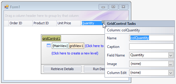
Smart Tags
Smart tags enable you to modify the main column settings for columns in GridViews, Banded GridViews, and Advanced Banded GridViews.
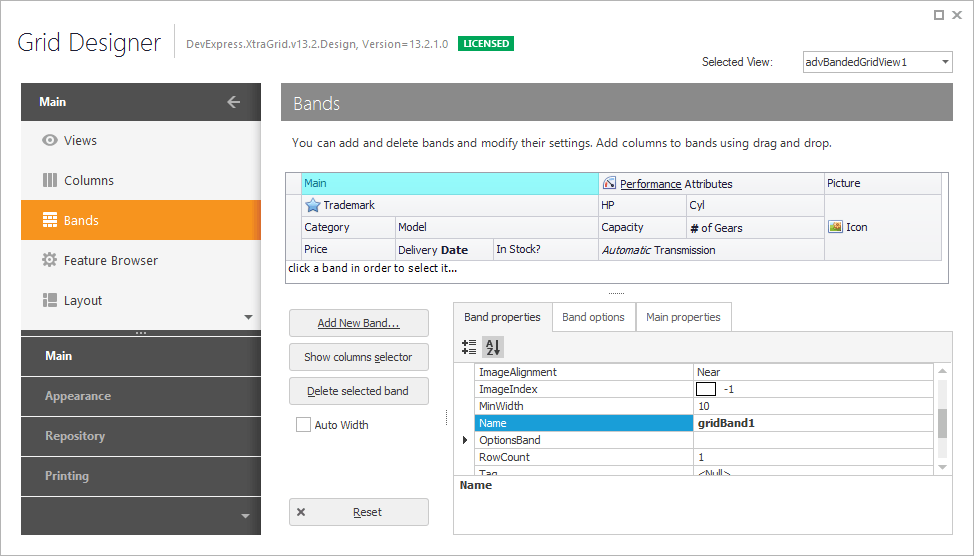
Grid Designer
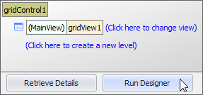
The Grid Designer allows you to manage Views, columns, in-place editors, group summaries, appearance settings, and layout options. It contains the “Feature Browser” page to quickly locate settings related to a specific functionality. To invoke the Grid Designer, you can click the Run Designer button in the Level Designer:
The main Grid Designer has a navigation bar on the left that allows you to select various pages. For instance, the Views page is equivalent to the Level Designer. This page allows you to access the current top level View and nested Views (if any).
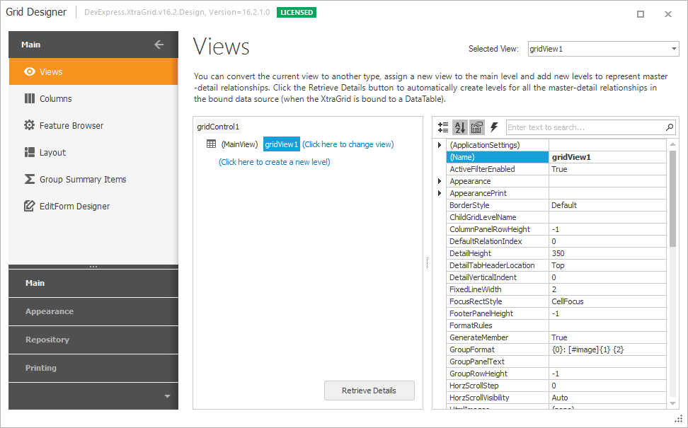
The Columns page shows available data source fields and columns (visible and hidden) that are bound to these fields. You can customize individual columns, clear the column collection, add new columns manually, or populate the View with columns from the bound data source with a single button click.
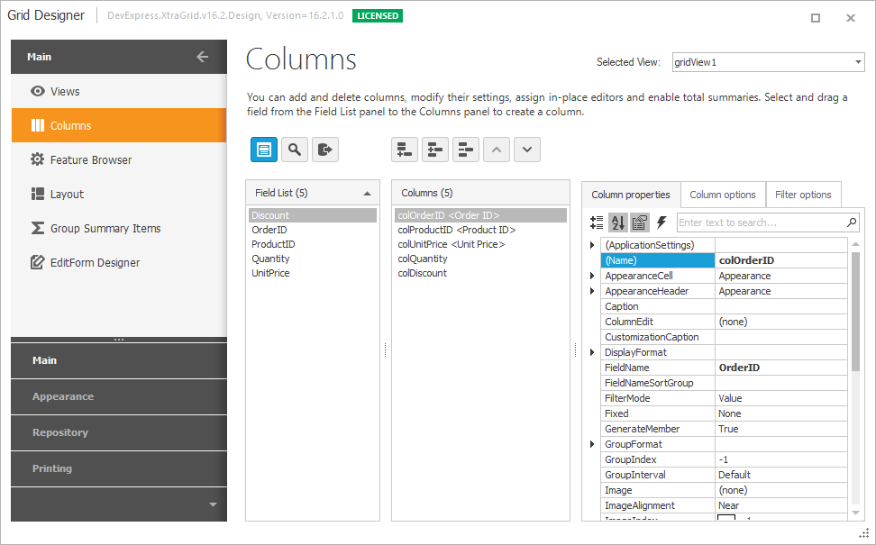
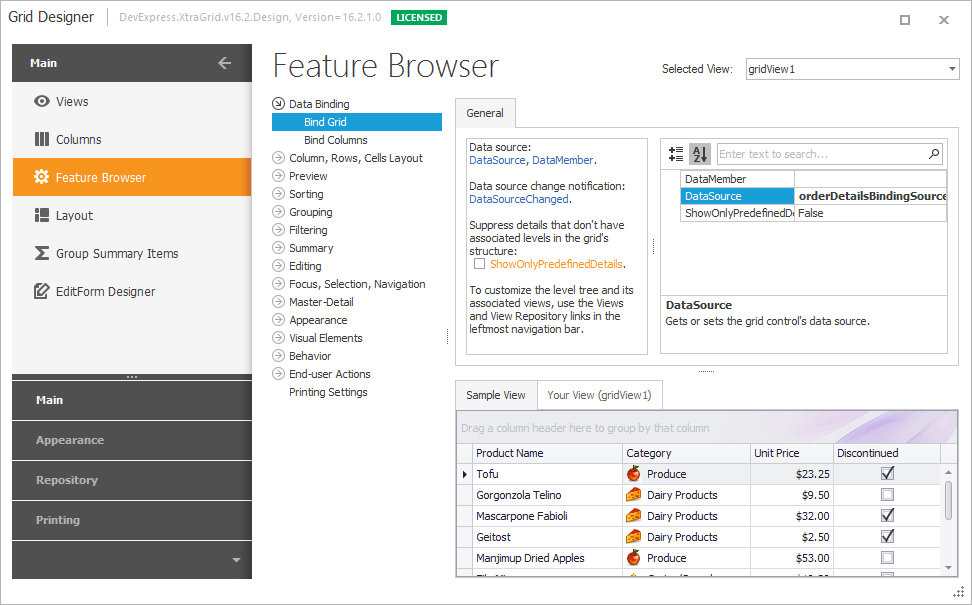
Make a note of the Feature Browser page, which gathers options and events provided by View and column objects into a set of categories (features). This is the best starting point for finding settings and events related to a specific functionality.
Refer to the following topic for more information on the main Designer’s capabilities: Grid Designer.
Access and Customize Views and Columns in Code
A grid control’s View and column objects are components. Thus, when created at design time, you can access them in code by their names.
You can also access the grid control’s top level View with the GridControl.MainView property. But first, you may need to cast this property value to the required View type.
GridView view = gridControl1.MainView as GridView;
if (view != null)
    view.OptionsView.RowAutoHeight = true;
The following example shows how to replace the existing main View with a new LayoutView in code:
You can retrieve individual columns from the View’s ColumnView.Columns collection by the index or field name.
In master-detail mode, the data grid control displays multiple Views at runtime (for each master row its own detail View can be opened). The following properties and methods are helpful when you need to get displayed detail Views:
Refer to the following topic to learn more: Master-Detail Relationships.
Example
The following example replaces the existing top level View with a BandedGridView, and adds a band and column to the View:
using DevExpress.XtraGrid.Views.BandedGrid;

// Dispose of the old view
gridControl1.MainView.Dispose();
// Create a Banded Grid View
BandedGridView bandedView = new BandedGridView(gridControl1);
gridControl1.MainView = bandedView;
// Add one band and one column to the view
GridBand band = bandedView.Bands.AddBand("General");
BandedGridColumn column = (BandedGridColumn)bandedView.Columns.AddField("CustomerID");
column.OwnerBand = band;
column.Visible = true;
Layout of Columns and Bands (in Grid Views and Banded Grid Views)
After grid columns are created, you may want to customize the layout of columns (and bands in Banded Grid Views) in a custom manner. This section describes basic customization capabilities available for Grid View and Banded Grid View types at design time. To replicate these actions in code (if required), adjust the corresponding View and column settings.
Refer to the following topics to learn how to customize other Views:
The GridView, BandedGridView, and AdvBandedGridView support on-form design-time layout customization. You can use drag-and-drop actions to change the layout and visibility of columns and bands. Additionally, you can drag the left border of a column/band to resize it.
You can re-order, resize and hide columns and bands using drag-and-drop.
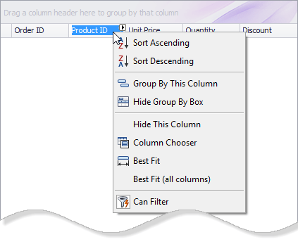
The context menu, invoked on a column header click, allows you to sort and group data against a column, calculate the best column width and show the Column Chooser (Column/Band Chooser in Banded Views) - a floating panel that provides access to hidden columns (and bands in Banded Views). Hidden columns (and bands) can be restored from the Column/Band Chooser back to the View using drag-and-drop.
Alternatively, you can modify the corresponding settings of grid columns and bands in the Visual Studio Property Grid (GridColumn.VisibleIndex, GridBand.VisibleIndex, GridColumn.Width, GridColumn.SortOrder, GridColumn.SortIndex, etc.).
For Banded Views (BandedGridView and AdvBandedGridView), use the Bands page of the Grid Designer to add new bands and rearrange bands and columns. You can also re-arrange bands and columns on the form.
Learn More
See the following topics for more information on the features and related options of Data Grid Views: