Docking Library
- 2 minutes to read
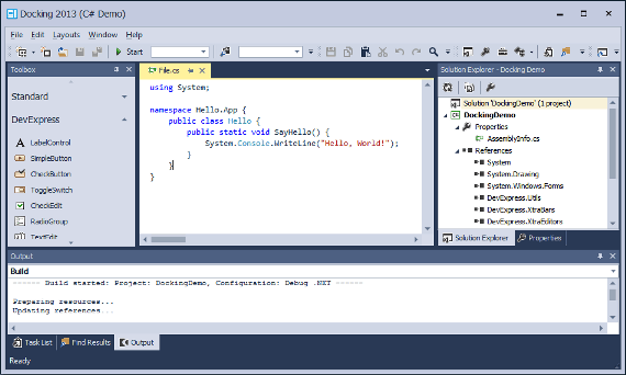
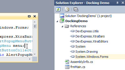
The Docking Library is based on the DockManager component that allows you to create panels which are capable of docking to the form. Panels can be docked to form edges and hosted in panel containers. There are three types of panel containers: tab container, split container and auto-hide container.
At runtime end-users can drag panels, resize them, dock them to required containers, pin panels to make them constantly visible etc. When the DockManager is used together with the Application UI Manager, panels can also reside within the Application UI Manager’s content area where Document objects are hosted.
To learn more about this component, refer to the links below.
Learn the Basics
| Dock Panels |
Panel Header Buttons
| The Header Buttons article describes various types of buttons that can be hosted in header areas of both regular dock panels and panel containers. |
Managing Dock Panels in Code
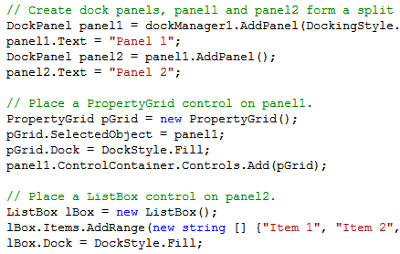
| Articles in this section enumerate public API that allows you to create, relocate and customize dock panels and their containers.
|
Miscellaneous
This section contains examples and additional info regarding the Docking library.
Saving and Restoring the Layout of Dock Panels
Illustrates how to manually save and restore your docking layout.Task-Based Help
Contains various examples that illustrate how to perform specific docking tasks.Interaction with Dock Panels
Demonstrates the Application UI Manager interoperability with the Docking Library.Visual Studio Inspired UI
Learn how to emulate the Visual Studio UI using the Docking Library and other DevExpress components.