Recent Item Control
- 6 minutes to read
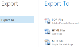
The Recent Item Control component provides various items (pin buttons, labels, separators, etc.) to assist you with efficiently building content for BackstageView Control tabs. A Recent Item Control must be added to the Controls collection of a BackstageView tab’s BackstageViewTabItem.ContentControl object.

Control Regions
The Recent Item Control splits its area into three regions. Each region contains a panel (the RecentStackPanel class object) populated with other Visual Elements.
Main Region
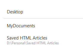
This region occupies the left side of your Recent Item Control. A RecentStackPanel object that represents this area is assigned to the RecentItemControl.MainPanel property. The main region has a title (the RecentItemControl.Title property), which you can hide by disabling the RecentItemControl.ShowTitle property.
Content Region
Occupies the control’s right side. Each tab from main region has an associated RecentStackPanel object. When end-users select tabs, these recent stack panels are assigned to the RecentItemControl.ContentPanel property and end-users are able to see an active tab content.
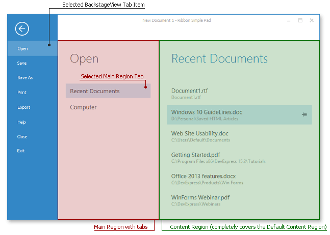
Default Content Region
Before any main region tab is selected, end-users can see a content of a RecentStackPanel object assigned to the RecentItemControl.DefaultContentPanel property.
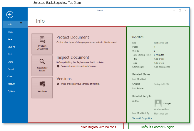
A splitter separates the main region and the content region. End-users can drag this splitter to resize these main and content areas. You can set the initial size ratio through the RecentItemControl.SplitterPosition property or disable the splitter by setting the RecentItemControl.ShowSplitter property to false.
A stack panel in each region has a header that displays a caption (the RecentPanelBase.Caption property) and an image (the RecentPanelBase.Glyph property). To hide panel headers, disable the RecentPanelBase.ShowCaption property.
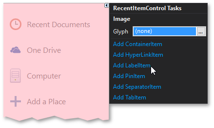
To populate a panel with Visual Elements, use the panel smart-tag (see below) or add the required elements to the RecentPanelBase.Items collection manually.
Panel Elements
RecentStackPanel objects can host the following elements.
Buttons | |
| Regular clickable buttons represented by the RecentButtonItem class instances. These elements display text and images (the RecentTextGlyphItemBase.Caption and RecentTextGlyphItemBase.Glyph properties), as well as raise the RecentItemBase.ItemClick event on clicking. To align the image relatively to the text block, use the RecentButtonItem.Orientation property. You can also turn off the RecentButtonItem.AutoSize property to manually size your button as needed. |
Tabs | |
| Objects of the RecentTabItem class that support selected states. When selected, a tab displays the RecentStackPanel object assigned with its RecentTabItem.TabPanel property in the control’s content region. A currently selected tab can be set by using the RecentItemControl.SelectedTab property. When you add tabs at design time, each tab automatically receives a related recent panel. When you add tabs in code, recent panels must be created manually. Important Tab items can be hosted only within the main region’s panel. |
Labels | |
| Labels are instances of the RecentLabelItem class. These items display static content, assigned to their RecentTextGlyphItemBase.Caption and RecentTextGlyphItemBase.Glyph properties. The RecentLabelItem.Style property allows you choose between small, medium and large label styles. Mixing labels of different styles allows you to implement complex blocks with titles, sub-titles and regular text. If the RecentLabelItem.AllowSelect property is set to DefaultBoolean.True, labels become selectable and start supporting the hovered state. Regardless of this setting, every label raises the RecentItemBase.ItemClick and RecentItemBase.ItemPressed events when clicked. |
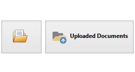
Pin Items | |
| These are advanced labels that are represented by the RecentPinItem class. Pin items display captions, descriptions and icons. At the element’s right edge, there is a pin button that depending on the RecentPinItem.PinButtonVisibility property value can always be visible, always hidden or visible only on hover (default behavior). End-users can click this pin button at runtime, which fires the RecentPinItem.PinButtonCheckedChanged event and toggles the boolean RecentPinItem.PinButtonChecked property. You can use these members to implement your own pin item functionality in case you have a custom scenario. The default behavior on clicking pin icons emulates that seen in Microsoft Office applications. When a user pins a Pin Item, the item moves up through regular (unpinned) Pin Items and separators. When the item meets any other element (a label, a button, a pinned Pin Item, etc.), it stops. To turn this default behavior off, set the RecentPanelBase.MovePinnedItemsUp property to false.” |
Hyperlinks | |
| The RecentHyperlinkItem objects that display their captions as links. They provide the RecentHyperlinkItem.Link property, whose value is used to create a new instance of the System.Diagnostics.Process class that implements the hyperlink’s functionality. |
Separators | |
| Solid thin horizontal lines that visually delimit neighboring UI elements. Represented by the RecentSeparatorItem class objects. |
Content Containers | |
| Content containers are objects of the RecentControlContainerItem type that display any custom control within. Each content container hosts a RecentControlItemControlContainer that provides the Controls collection. This collection stores all controls displayed by this content container. If the RecentControlContainerItem.FillSpace property equals true, the container occupies all available space below itself. Otherwise, the height is specified by the RecentControlContainerItem.ClientHeight property. |
Example
This code sample illustrates how to initialize and populate a sample RecentItemControl in code. You can view and download this example from GitHub.
DevExpress.XtraBars.Ribbon.RecentItemControl recentItemControl = new DevExpress.XtraBars.Ribbon.RecentItemControl();
recentItemControl.BorderStyle = DevExpress.XtraEditors.Controls.BorderStyles.NoBorder; //to hide border
recentItemControl.Dock = System.Windows.Forms.DockStyle.Fill;
recentItemControl.Name = "recentItemControl";
recentItemControl.Title = "RecentControl Main Title";

//create the mandatory right panel for tab items' content
DevExpress.XtraBars.Ribbon.RecentStackPanel recentStackPanelRight = new DevExpress.XtraBars.Ribbon.RecentStackPanel();
recentStackPanelRight.Name = "recentStackPanelRight";
recentStackPanelRight.SelectedItem = null;
recentItemControl.DefaultContentPanel = recentStackPanelRight;

SimpleButton simpleButton = new SimpleButton();
simpleButton.Dock = System.Windows.Forms.DockStyle.Fill;
simpleButton.Name = "simpleButton";
simpleButton.Text = "Simple Button";

//should be added to the RecentItemControl.Controls collection
DevExpress.XtraBars.Ribbon.RecentControlItemControlContainer recentControlItemControlContainer = new DevExpress.XtraBars.Ribbon.RecentControlItemControlContainer();
recentControlItemControlContainer.Controls.Add(simpleButton);
recentControlItemControlContainer.Name = "recentControlItemControlContainer";
recentControlItemControlContainer.Size = new System.Drawing.Size(267, 40);
recentItemControl.Controls.Add(recentControlItemControlContainer);

//create container item, should have a parent RecentControlItemControlContainer
DevExpress.XtraBars.Ribbon.RecentControlContainerItem recentControlContainerItem = new DevExpress.XtraBars.Ribbon.RecentControlContainerItem();
recentControlContainerItem.ClientHeight = 40;
recentControlContainerItem.ControlContainer = recentControlItemControlContainer;
recentControlContainerItem.Name = "recentControlContainerItem";

DevExpress.XtraBars.Ribbon.RecentLabelItem recentLabelItem = new DevExpress.XtraBars.Ribbon.RecentLabelItem();
recentLabelItem.Caption = "RecentControl Label";
recentLabelItem.Name = "recentLabelItem";

//create the right panel for the tab item
DevExpress.XtraBars.Ribbon.RecentStackPanel recentStackPanell = new DevExpress.XtraBars.Ribbon.RecentStackPanel();
recentStackPanell.Caption = "RecentControl Stack Panel";
//add items to the right panel
recentStackPanell.Items.AddRange(new DevExpress.XtraBars.Ribbon.RecentItemBase[] {
recentLabelItem});
recentStackPanell.Name = "recentStackPanell";
recentStackPanell.SelectedItem = null;

//the element of the main panel
DevExpress.XtraBars.Ribbon.RecentTabItem recentTabItem1 = new DevExpress.XtraBars.Ribbon.RecentTabItem();
recentTabItem1.Caption = "RecentControl Tab Item";
recentTabItem1.Name = "recentTabIteml";
recentTabItem1.TabPanel = recentStackPanell;

//create the mandatory main panel
DevExpress.XtraBars.Ribbon.RecentStackPanel recentStackPanelMain = new DevExpress.XtraBars.Ribbon.RecentStackPanel();
//add elements to the main panel
recentStackPanelMain.Items.AddRange(new DevExpress.XtraBars.Ribbon.RecentItemBase[] {
 recentTabItem1,
 recentControlContainerItem
});
recentStackPanelMain.Name = "mainPanel1";
recentStackPanelMain.SelectedItem = recentTabItem1;
recentItemControl.MainPanel = recentStackPanelMain;