Accessibility Support
- 4 minutes to read
This topic describes how to enable UI Automation-based accessibility features in DevExpress WPF Controls, and apply the accessible DevExpress application theme to your application.
DevExpress WPF Controls comply with Section 508, WCAG 2.0, and EN 301 549.
UI Automation-based Accessibility Features
UI Automation-based Accessibility Features (such as Screen readers) use Microsoft UI Automation framework to get information about UI elements. To obtain the information, the framework requires that controls include UI Automation peers and raise UI Automation events.
Enable UI Automation-based Accessibility Features
UI Automation peers and events are removed in DevExpress WPF Controls. This allows our controls to avoid an impact on performance in applications that do not rely on UI Automation. To support UI Automation-based Windows features, enable UI Automation peers and events in one of the following ways:
Launch a screen reading app (such as Windows Narrator) before you start your application.
Set the Screen Reader Parameter to
trueon application startup.Set the ClearAutomationEventsHelper.IsEnabled property to
false.
Enable Validation Support
Set the ValidationService.AllowAccessibilityAlerts attached property to true to inform the user of validation errors in the focused editors and data cells.
You can enable the AllowAccessibilityAlerts option for a container to send validation alerts for its child elements:
<dxg:GridControl dxe:ValidationService.AllowAccessibilityAlerts="True" .../>
<StackPanel
    dxe:ValidationService.IsValidationContainer="True"
    dxe:ValidationService.AllowAccessibilityAlerts="True">
    <GroupBox>
        <Grid>
            <dxe:TextEdit .../>
            <dxe:TextEdit .../>
        </Grid>
    </GroupBox>
    <GroupBox>
        <dxe:SpinEdit  .../>
        <dxe:ComboBoxEdit .../>
    </GroupBox>
</StackPanel>
Validation alerts are updated in the UI Automation framework when users perform the following actions:
- Focus an editor that has validation errors.
- Select a cell that has validation errors in a GridControl, TreeListControl, or a PropertyGridControl.
- Change a correct value to an incorrect one or vice versa. The alert is only sent after input validation. If the ValidateOnTextInput property is set to true, input validation occurs on every character change, but the user only receives a single alert when validation passes or fails.
- Invoke a tooltip that has an error message.
- Attempt to switch focus from the editor that has validation errors when the InvalidValueBehavior property is set to WaitForValidValue.
Screen Reader App Limitation
The following DevExpress WPF controls do not allow the UI Automation framework to access their embedded documents, graphic canvases, or designer surfaces:
This limitation does not apply to any shell UI integrated into these controls: Ribbon, Toolbars, or Tool Windows.
Themes
High Contrast Theme
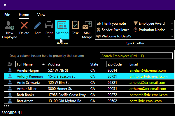
You can apply the Office 2019 High Contrast theme to DevExpress WPF Controls.

Refer to the following documentation topic for more information on how to apply a DevExpress theme: Apply a DevExpress theme.
Enhanced Contrast Predefined Palette
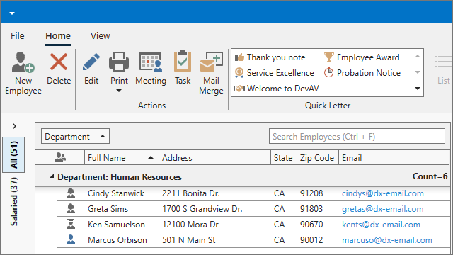
The Enhanced Contrast predefined palette uses color combinations that help users with vision impairment distinguish text, borders, selection states, and other visual elements.

You can use the predefined Contrast palette with the Office 2016 SE, Office 2019, Visual Studio 2017, and Visual Studio 2019 themes.
.NET 6 Tooltips
The behavior of all tooltips displayed by DevExpress WPF Controls in .NET 6 conforms to WCAG 2.1 accessibility requirements:
- Dismissable. Users can press the Ctrl key to hide a tooltip shown after keyboard navigation.
- Hoverable. Tooltips remain visible when hovered.
- Persistent. Tooltips remain visible until dismissed by the user (by moving the cursor or pressing Ctrl).
Tooltips are opened when the parent element gets the keyboard focus. To open a tooltip for the focused item, users can press the Ctrl+Shift+F10 key combination.
Tip
To prevent tooltips from being shown on keyboard focus, set the standard ShowsToolTipOnKeyboardFocus attached property to false. This property is only in effect for the control to which it is applied and not the control’s child elements.
To disable tooltips on keyboard focus for the GridControl, PivotGridControl, and their descendants, specify the InplaceBaseEdit style as follows:
<Style TargetType="dxe:InplaceBaseEdit">
    <Setter Property="ToolTipService.ShowsToolTipOnKeyboardFocus" Value="False"/>
</Style>