Theme Palettes in the DevExpress Design System
- 3 minutes to read
The DevExpress Design System organizes theme palette colors into groups (primary, secondary, info, and so on) to simplify color management across different components and platforms. This topic describes the theme palette structure and scale principles.
Important
Applicable to DevExpress Blazor suite only.
Theme Palette Structure
Each theme palette in the DevExpress Design System includes the following color groups:
- Primary
- Main brand or accent color. Used for highlighted actions (for example, primary buttons), branding elements, and selected states.
- Secondary
- An additional accent color used in secondary elements.
- Info
- Feedback palette used for informational messages.
- Success
- Feedback palette used for success states.
- Warning
- Feedback palette used for warning states.
- Danger
- Feedback palette used for error states.
- Neutral
- Grayscale palette used throughout the interface for backgrounds, surfaces, dividers, text (light/dark variants), and UI chrome.
Theme palettes remain unchanged regardless of the color mode (Light or Dark).
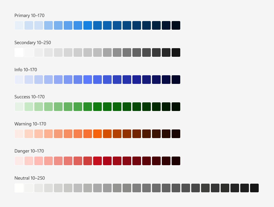
The image below demonstrates the color palette used in the Fluent Blue theme:
Numeric Scale Basics
Each color group is a scale of shades from the lightest to the darkest built from incremental steps:
- 17 steps for Primary, Secondary, Info, Success, Warning, and Danger color groups (from 10 to 170)
- 25 steps for the Neutral color group (from 10 to 250)
A numeric scale forms a continuous tonal range where a number (10–170/250) reflects relative luminance. Tone usage depends on the active color mode:
- Low values (10–40)
- Light tints used for surfaces/subtle accents in Light mode and text/icons/emphasis in Dark mode.
- Mid values (50–110)
- Mode-adaptive mid-tones used for component backgrounds and interactive elements.
- High values (120–250)
- Dark tints used for text, icons, and emphasis in Light mode and surfaces/subtle accents in Dark mode.
This scale system ensures:
- Predictable color relationships
- Design and accessibility flexibility
- Consistent use across interactive states (hover, active, disabled)
CSS Variables
Each color scale corresponds to a dedicated group of CSS variables. Variable values depend on the theme. This structure ensures that DevExpress components always reference the same variables, while application appearance adapts dynamically to the active theme.
The following table lists palette color groups and corresponding CSS variables:
| Color Group | CSS Variables |
|---|---|
| Primary | --dxds-primary-10…--dxds-primary-170 |
| Secondary | --dxds-secondary-10…--dxds-secondary-170 |
| Info | --dxds-info-10…--dxds-info-170 |
| Success | --dxds-success-10…--dxds-success-170 |
| Warning | --dxds-warning-10…--dxds-warning-170 |
| Danger | --dxds-danger-10…--dxds-danger-170 |
| Neutral | --dxds-neutral-10…--dxds-neutral-250 |
The Blazor suite allows developers to apply one of the predefined primary colors or set a custom color programmatically. Alternatively, developers can override the Primary CSS variable group with custom values.
To see the full list of palette CSS variables and associated color values in Fluent themes, refer to the following help topic: Fluent Theme Palette.