Blazor Button
The DevExpress Button component for Blazor (DxButton) supports nine pre-defined styles and has three render modes to suit various scenarios.
Get Started Video
API Reference
Refer to the following list for the component API reference: DxButton Members.
Features
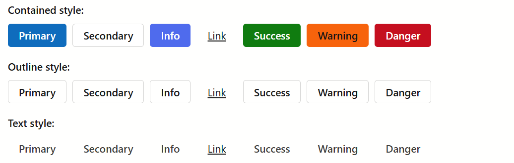
Pre-Defined Styles
The Button component can include a Text label and an icon. You can use the IconPosition property to position the icon relative to the text. Specify RenderStyle and RenderStyleMode properties to choose one of the pre-defined appearance styles and fillings.
Custom Content
<DxButton> supports custom content as its ChildContent. You can add any content and implement any custom logic in this render fragment.
Click Event Handling
You can react to a button click in the following ways:
- If the button is in a form, you can submit this form. Set the SubmitFormOnClick property to
true. - Navigate to an URL. Use the NavigateUrl property to specify this URL.
- Implement custom logic in the Click event handler.