Chart Designer
- 2 minutes to read
This topic describes how to invoke the Chart Designer, and explains its structure. The topic consists of the following sections.
Overview
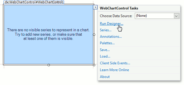
Click the ChartControl’s smart tag, and in the invoked Tasks menu, click Run Designer….
Note
The Chart Designer is automatically invoked when the WebChartControl is dropped onto a form and the “Display a wizard every time a new chart is added” check box at the bottom of the Chart Designer is enabled.
The Chart Designer is organized into three main areas, as shown below.

Chart Elements Tree
The Chart Elements Tree allows you to quickly select chart elements, change the structure of a chart (add or delete elements and change their visibility) and also display a chart’s structure. When you locate an element in the tree, it is highlighted in the central area. If you click the element, then its settings will be displayed in the Customization Tabs area.

Chart Control Appearance
The Chart Control Appearance area allows you to see how the chart looks. Moreover, it allows you to select an item, whose settings will be displayed in the Customization Tabs area.

Customization Tabs
The Customization Tabs area allows you to customize chart element settings. Settings are separated by three tabs.
The Options Tab contains commonly used element settings.

The Properties Tab contains all settings of a chart element.

The Data Tab contains settings that allow you to specify data binding or other data settings of a chart element (for example, series point property values).

Note
Some chart elements may not display all tabs from the Tabs list in the Customization Tabs area.