Reference (Foreign Key, Complex Type) Properties
- 12 minutes to read
A reference property’s type is a business class (whether persistent or non-persistent). XAF adds reference properties to the Application Model. Reference properties and Collection Properties define relationships between business objects. XAF can display reference properties as follows:
- A lookup control.
- A set of editors. Each editor displays an individual referenced object property.
- A Detail Property Editor that is the referenced object’s Detail View.
- A button editor that expands a referenced object Detail View in a separate modal window (typically used for aggregated objects).
Note
Refer to the Property Editors | Reference Properties section in the Feature Center demo installed with XAF to see Reference Property Editors in action. The default location of the application is %PUBLIC%\Documents\DevExpress Demos 26.1\Components\XAF\FeatureCenter.NET.XPO.
Examples
UI-Independent Property Editors for Reference Properties
DetailPropertyEditor
The DetailPropertyEditor creates a Template that serves as a Frame and contains a Detail View. The Detail View is determined automatically according to the object type and displays the object that the reference property specifies. To specify a custom Detail View, use the IModelMemberViewItem.View property in the Model Editor.
The following controls visualize the DetailPropertyEditor:
| Platform | Control |
|---|---|
| WinForms | NestedFrameTemplateV2 |
| ASP.NET Core Blazor | The ViewItem.Control property returns NestedFrameTemplate. The Blazor component is NestedFrameTemplateComponent. |
ASP.NET Core Blazor
In ASP.NET Core Blazor, the ViewItem.Control property returns an IComponentContentHolder descendant. The following table lists components and IComponentContentHolder descendants for editors:
| Editor | Component Model | Component |
|---|---|---|
| DevExpress.ExpressApp.Blazor.Editors.ObjectPropertyEditor | DevExpress.ExpressApp.Blazor.Components.Models.ObjectComponentModel | DevExpress.ExpressApp.Blazor.Components.ObjectComponent |
| DevExpress.ExpressApp.Blazor.Editors.LookupPropertyEditor | DevExpress.ExpressApp.Blazor.Components.Models.DxComboBoxModel<TData, TValue> | DxComboBox<TData, TValue> |
ObjectPropertyEditor

An ObjectPropertyEditor displays reference properties that are marked with the following attributes:
Click the editor button to invoke the Detail View. You can modify the referenced object in this Detail View and click OK to save changes.
Customize the Pop-up Detail View of ObjectPropertyEditor
ObjectPropertyEditor implements the following methods that allow you to customize the pop-up Detail View before and after its initialization:
CustomCreateDetailVieweventAllows you to make the following customizations before the Detail View is created:
- Create a new object (
CurrentObject) that will be shown in the pop-up Detail View and assigned to the source object’s property. - Specify a custom
ObjectSpacefor the pop-pup Detail View. - Specify a custom
ViewIdfor the pop-up DetailView (see the following example). - Create a custom Detail View.
File: SolutionName.Blazor.Server/Controllers/SetViewIdController.cs
using DevExpress.ExpressApp; using DevExpress.ExpressApp.Blazor.Editors; using DevExpress.ExpressApp.Editors; using SolutionName.Module.BusinessObjects; namespace SolutionName.Blazor.Server.Controllers; public class SetViewIdController : ObjectViewController<DetailView, Resume> { private ObjectPropertyEditor editor; protected override void OnActivated() { base.OnActivated(); View.CustomizeViewItemControl<ObjectPropertyEditor>(this, CustomizeObjectPropertyEditor, nameof(DemoTask.AssignedTo)); } private void CustomizeObjectPropertyEditor(ObjectPropertyEditor editor) { this.editor = editor; editor.CustomCreateDetailView += Editor_OnCustomCreateDetailView; } private void Editor_OnCustomCreateDetailView(object sender, CustomCreateDetailViewEventArgs e) { e.ViewId = "MyTasks_DetailView_Simple"; } protected override void OnDeactivated() { if(editor is not null) { editor.CustomCreateDetailView -= Editor_OnCustomCreateDetailView; } base.OnDeactivated(); } }- Create a new object (
DetailViewCreatedeventAllows you to customize the pop-up Detail View after it has been created. For example, you can specify values or interact with the fully initialized View.
The following code snippet accesses the object and changes its property before XAF displays it in the Detail View.
File: SolutionName.Blazor.Server/Controllers/ModifyCurrentObjectController.cs
using DevExpress.ExpressApp;
using DevExpress.ExpressApp.Blazor.Editors;
using DevExpress.ExpressApp.Editors;
using SolutionName.Module.BusinessObjects;

namespace SolutionName.Blazor.Server.Controllers;

public class ModifyCurrentObjectController : ObjectViewController<DetailView, Resume> {
    private ObjectPropertyEditor editor;
    protected override void OnActivated() {
        base.OnActivated();
        View.CustomizeViewItemControl<ObjectPropertyEditor>(this, CustomizeObjectPropertyEditor, nameof(DemoTask.AssignedTo));
    }
    private void CustomizeObjectPropertyEditor(ObjectPropertyEditor editor) {
        this.editor = editor;
        editor.DetailViewCreated += Editor_OnDetailViewCreated;
    }
    private void Editor_OnDetailViewCreated(object sender, DetailViewCreatedEventArgs e) {
        DetailView detailView = e.View;
        if(detailView.ObjectSpace.IsNewObject(detailView.CurrentObject)) {
            ((PortfolioFileData)detailView.CurrentObject).Description = "Default File Description";
        }
    }
    protected override void OnDeactivated() {
        if(editor is not null) {
            editor.DetailViewCreated -= Editor_OnDetailViewCreated;
        }
        base.OnDeactivated();
    }
}
LookupPropertyEditor

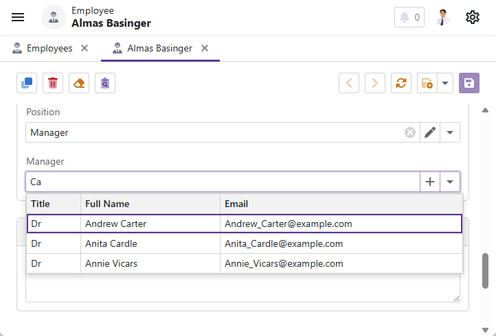
LookupPropertyEditor displays non-aggregated reference properties and shows a drop-down list with objects. You can choose an object from this list and assign it to the current reference property.
Button Visibility in LookupPropertyEditor
Use the following approaches to hide buttons in a LookupPropertyEditor.
- Clear
- In the Model Editor, set the IModelCommonMemberViewItem.AllowClear property to
false. - Edit
- In the Model Editor, set the IModelCommonMemberViewItem.AllowEdit property to
false. Alternatively, call theHideEditButtonmethod from theLookupPropertyEditorinstance. For more information, refer to the following help topic: Manage Button Visibility in a Blazor Lookup Property Editor. - New
- Call the
HideNewButtonmethod from theLookupPropertyEditorinstance. For more information, refer to the following help topic: Manage Button Visibility in a Blazor Lookup Property Editor.
Tip
If a user does not have permission to create a new object, XAF does not render the New button.
Filtering in LookupPropertyEditor
You can filter the LookupPropertyEditor‘s List View. For more information, refer to the following help topic: How to: Implement Cascading Filtering for Lookup List Views.
Simple Type Values in a LookupPropertyEditor
A LookupPropertyEditor allows users to select a property value of a simple type (string, integer, enumeration, and so on). For more information, refer to the following help topic: How to: Display and Edit Simple Type Values in a Lookup Property Editor.
Multiple Columns in LookupPropertyEditor
To display multiple columns in a LookupPropertyEditor, open the corresponding List View’s Columns node in the Model Editor (for example, View | <Class>_LookupListView | Columns) and modify the column list.

Multi-column Lookup Property Editors do not support data grouping and sorting.
Format Display Value in a LookupPropertyEditor
Use the IModelCommonMemberViewItem.DisplayFormat property to control the text that XAF displays in each LookupPropertyEditor column. You can access this property in the Model Editor: View | <Class>_LookupListView | Columns | <Property>.
When you set the display value format, you can use format specifiers and property names. For example:
- {0:FirstName}
- {0:Birthday:MM.yyyy}
- {0:Manager.Birthday}
Search in LookupPropertyEditor
The search mechanism in a LookupPropertyEditor depends on the specified DefaultLookupEditorMode.
- Auto, AllItems
DxComboBox<TData, TValue>‘s native search functionality is available out of the box. Search operations scan all visible columns. You can exclude a specific column in code:
File: SolutionName.Blazor.Server/Controllers/CustomizeLookupEditorSearchController.cs
using DevExpress.ExpressApp;
using DevExpress.ExpressApp.Blazor.Editors;
using SolutionName.Module.BusinessObjects;

namespace SolutionName.Blazor.Server.Controllers;

public class CustomizeLookupEditorSearchController : ObjectViewController<DetailView, Employee> {
    protected override void OnActivated() {
        base.OnActivated();
        View.CustomizeViewItemControl<LookupPropertyEditor>(this, lookup => {
            var column = lookup.ColumnModels.FirstOrDefault(col => col.FieldName == nameof(Employee.TitleOfCourtesy));
            if (column is not null) {
                column.SearchEnabled = false;
            }
        }, nameof(Employee.Manager));
    }
}
DxComboBox<TData, TValue> component’s
DisplayFormatandEditFormatproperties depend on the IModelCommonMemberViewItem.DisplayFormat property value. The property determines which lookup columns supply data for incremental filtering (search-as-you-type). In multicolumn mode, the editor cannot filter items if the search value contains the space symbol.- Search, AllItemsWithSearch


For more information on how to enable the Search functionality in a LookupPropertyEditor, refer to the following help topic: How to: Add Search Action to Lookup Property Editors and Link Pop-up Windows.
Actions in the Lookup Search List View that depend on selection (for example, Clone Object Action), affect the current object of the root view.
LookupPropertyEditor’s View Mode (for DetailView Only)
Enable View Mode for Lookup Property Editors in AllItems mode to avoid initial load of large datasets. In View mode, XAF displays the Lookup Property Editor as a Text Box. Click the Edit button to switch to a ComboBox.
In XAF v26.1+, View mode is enabled in all projects created with Template Kit.
If you work with an existing application, change the editor mode as illustrated in the following code sample. The code accesses the Employee Detail View enables the View mode in the specified Property Editor:
File: SolutionName.Blazor.Server\Controllers\LookupPropertyViewModeController.cs
using DevExpress.ExpressApp;
using DevExpress.ExpressApp.Blazor.Editors;
using SolutionName.Module.BusinessObjects;

namespace SolutionName.Blazor.Server.Controllers {
    public class LookupPropertyViewModeController : ObjectViewController<DetailView, Employee> {
        protected override void OnActivated() {
            base.OnActivated();
            if(View.FindItem(nameof(Employee.Position)) is LookupPropertyEditor editor) {
                editor.UseViewMode = true;
            }
        }
    }
}
To enable View mode globally, set the DefaultUseViewMode static flag to true in the SolutionNameModule.Setup() method:
File: SolutionName.Blazor.Server\SolutionNameBlazorModule.cs
using DevExpress.ExpressApp;
using DevExpress.ExpressApp.Blazor.Editors;
using DevExpress.ExpressApp.DC;
using DevExpress.Persistent.BaseImpl.EF;

namespace SolutionName.Blazor.Server;

public sealed class SolutionNameBlazorModule : ModuleBase {
    public SolutionNameBlazorModule() { }

    public override void Setup(XafApplication application) {
        base.Setup(application);
        LookupPropertyEditor.DefaultUseViewMode = true;
    }
}
Access the LookupPropertyEditor’s Inner Controls
The following code snippet sets the DropDownDirection property for the inner ComboBox control:
File: SolutionName.Blazor.Server/Controllers/CustomizeLookupPropertyEditorController.cs
using DevExpress.Blazor;
using DevExpress.ExpressApp;
using DevExpress.ExpressApp.Blazor.Components.Models;
using DevExpress.ExpressApp.Blazor.Editors;
using DevExpress.ExpressApp.Blazor.Utils;
using SolutionName.Module.BusinessObjects;

namespace SolutionName.Blazor.Server.Controllers;
public class CustomizeLookupPropertyEditorController : ObjectViewController<ListView, Employee> {
    protected override void OnActivated() {
        base.OnActivated();
        View.CustomizeViewItemControl<LookupPropertyEditor>(this, editor => {
            if (editor.ComponentModel is DxComboBoxModel comboBoxModel) {
                comboBoxModel.DropDownDirection = DropDownDirection.Up;
            }
        }, nameof(Employee.Manager));
    }
}
Hide Hyperlinks in Lookup Controls
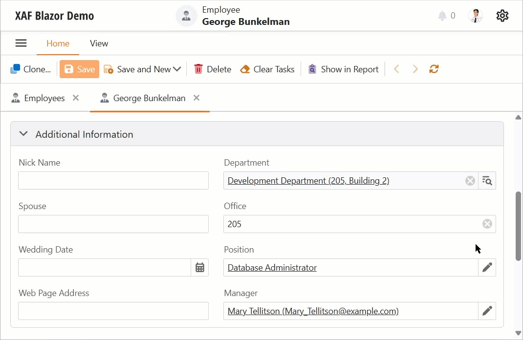
In XAF ASP.NET Core Blazor applications, the Edit button in a LookupPropertyEditor/ObjectPropertyEditor acts as a clickable link. To open the referenced object in a new browser tab, use Ctrl + mouse click or click the middle mouse button. XAF also displays referenced objects as clickable links inside a List Editor.
To disable clickable links, add the following controller to your application:
File: SolutionName.Blazor.Server/Controllers/DisableObjectLinksController.cs
using DevExpress.ExpressApp.Blazor.Editors;
using DevExpress.ExpressApp;

namespace SolutionName.Blazor.Server.Controllers {
    public class DisableObjectLinksController : ViewController {
        protected override void OnActivated() {
            base.OnActivated();
            if (View is DetailView detailView) {
                // Disable links in Detail Views.
                DisableLinks(detailView.Items);
            }
        }
        protected override void OnViewControlsCreated() {
            base.OnViewControlsCreated();
            if (View is ListView { Editor: DxGridListEditorbase dxGridListEditor }) {
                // Disable links in List Views.
                DisableLinks(dxGridListEditor.PropertyEditors);
            }
        }
        private void DisableLinks(IEnumerable<ViewItem> viewItems) {
            foreach(var viewItem in viewItems) {
                if(viewItem is LookupPropertyEditor lookupPropertyEditor) {
                    lookupPropertyEditor.ShowLink = false;
                }
                else if(viewItem is ObjectPropertyEditor objectPropertyEditor) {
                    objectPropertyEditor.ShowLink = false;
                }
            }
        }
    }
}
WinForms

Each Windows Forms Property Editor is available in two forms:
- A standalone control (displays property value in a Detail View)
- A repository item (displays property value in a List Editor that supports in-place editing)
| Editor | Control | Repository Item |
|---|---|---|
| ObjectPropertyEditor | ObjectEdit - a ButtonEdit editor descendant the IntegerPropertyEditor uses. | RepositoryItemObjectEdit - a descendant of the XtraEditors Library’s RepositoryItemButtonEdit item. |
| LookupPropertyEditor | LookupEdit - a descendant of the XtraEditors Library’s PopupContainerEdit editor. | RepositoryItemLookupEdit - a descendant of the XtraEditors Library’s RepositoryItemPopupContainerEdit item. |
ObjectPropertyEditor
The ObjectPropertyEditor displays reference properties that are marked with Aggregated and ExpandObjectMembers(ExpandObjectMembers.Never) attributes. To invoke the Detail View, users can click the editor’s button, double-click the editor, or press the Space key. You can modify the referenced object in this Detail View and click OK to save changes. Refer to the Add Actions to a Popup Window and Dialog Controller help topics for details on how to customize this window.
Tip
Focus the ObjectPropertyEditor and press the Space or Enter key to invoke the ObjectPropertyEditor‘s Detail View.
Customize the Pop-up Detail View of ObjectPropertyEditor
ObjectPropertyEditor implements the following methods that allow you to customize the pop-up Detail View before and after its initialization:
CustomCreateDetailVieweventAllows you to make the following customizations before the Detail View is created:
- Create a new object (
CurrentObject) that will be shown in the pop-up Detail View and assigned to the source object’s property. - Specify a custom
ObjectSpacefor the pop-pup Detail View. - Specify a custom
ViewIdfor the pop-up DetailView (see the following example). - Create a custom Detail View.
File: SolutionName.Win/Controllers/SetSimpleViewController.cs
using DevExpress.ExpressApp; using DevExpress.ExpressApp.Editors; using DevExpress.ExpressApp.Win.Editors; using SolutionName.Module.BusinessObjects; namespace SolutionName.Win.Controllers { public class SetSimpleViewController : ObjectViewController<DetailView, Customer> { private ObjectPropertyEditor editor; protected override void OnActivated() { base.OnActivated(); View.CustomizeViewItemControl<ObjectPropertyEditor>(this, CustomizeObjectPropertyEditor, nameof(Address)); } private void CustomizeObjectPropertyEditor(ObjectPropertyEditor editor) { this.editor = editor; editor.CustomCreateDetailView += Editor_OnCustomCreateDetailView; } private void Editor_OnCustomCreateDetailView(object sender, CustomCreateDetailViewEventArgs e) { e.ViewId = "Address_DetailView_Simple"; } protected override void OnDeactivated() { if(editor is not null) { editor.CustomCreateDetailView -= Editor_OnCustomCreateDetailView; } base.OnDeactivated(); } } }- Create a new object (
DetailViewCreatedeventAllows you to customize the pop-up Detail View after it has been created. For instance, you can specify values or interact with the fully initialized View.
The following code snippet accesses an object and changes its properties before XAF shows the object in the Detail View.
File: SolutionName.Win/Controllers/ModifyCurrentObjectController.cs
using DevExpress.ExpressApp;
using DevExpress.ExpressApp.Win.Editors;
using SolutionName.Module.BusinessObjects;

namespace SolutionName.Win.Controllers {
    public class ModifyCurrentObjectController : ObjectViewController<DetailView, Customer> {
        private ObjectPropertyEditor editor;
        protected override void OnActivated() {
            base.OnActivated();
            View.CustomizeViewItemControl<ObjectPropertyEditor>(this, CustomizeObjectPropertyEditor, nameof(Address));
        }
        private void CustomizeObjectPropertyEditor(ObjectPropertyEditor editor) {
            this.editor = editor;
            editor.DetailViewCreated += Editor_OnDetailViewCreated;
        }
        private void Editor_OnDetailViewCreated(object sender, DetailViewCreatedEventArgs e) {
            DetailView detailView = e.View;
            if(detailView.ObjectSpace.IsNewObject(detailView.CurrentObject)) {
                ((Address)detailView.CurrentObject).CustomerRelatedData = ViewCurrentObject.ContactName;
            }
        }
        protected override void OnDeactivated() {
            if(editor is not null) {
                editor.DetailViewCreated -= Editor_OnDetailViewCreated;
            }
            base.OnDeactivated();
        }
    }
}
LookupPropertyEditor
A LookupPropertyEditor displays non-aggregated reference properties and generates a drop-down list based on the LookupControlTemplate Template. You can choose an object from this list and assign it to the current reference property.
Button Visibility in LookupPropertyEditor
| Button | Disable Visibility |
|---|---|
| Clear | In the Model Editor, set the IModelCommonMemberViewItem.AllowClear property to false. |
Filtering in LookupPropertyEditor
You can filter the LookupPropertyEditor‘s List View. For more information, refer to the following help topic: How to: Implement Cascading Filtering for Lookup List Views.
Simple Type Values in a LookupPropertyEditor
A LookupPropertyEditor allows users to select a property value of a simple type (string, integer, enumeration, and so on). For more information, refer to the following help topic: How to: Display and Edit Simple Type Values in a Lookup Property Editor.
Search in LookupPropertyEditor
The search mechanism used in a LookupPropertyEditor depends on the specified DefaultLookupEditorMode.
For more information about the Search functionality, refer to the following help topic: How to: Add Search Action to Lookup Property Editors and Link Pop-up Windows
LookupPropertyEditor Hotkeys
| Hotkey | Description |
|---|---|
| Alt + Down Arrow | Expands the drop-down list. |
| Ctrl + Shift + mouse click | Invokes a Detail View for the selected object in the drop-down list. |
Create Alternative Data Representations for Reference Properties
You can customize Lookup Property Editor behavior in the Controller code or implement custom Property Editors based on lookup controls. The following topics describe how to customize built-in Property Editors:
- How to use a custom Lookup Property Editor control for reference properties (WinForms)
- How to: Customize a Built-in Property Editor (ASP.NET Core Blazor).