ThemeBase.NewItemRowCustomizer Property
Customizes the New Item Row.
Namespace: DevExpress.Mobile.DataGrid.Theme
Assembly: DevExpress.Mobile.Grid.v18.2.dll
#Declaration
public INewItemRowCustomizer NewItemRowCustomizer { get; set; }#Property Value
| Type | Description |
|---|---|
| INew |
An object of the type which implements the INew |
#Remarks
Important
This documentation topic describes legacy technology. We no longer develop new functionality for the Grid
To enable the New Item Row feature, follow the steps from the Lesson 3 - Add New Item Row document. After this functionality is added to a grid, you can customize the displayed panel using the NewItemRowCustomizer property.
GridControl provides you with two predefined themes - Light and Dark. The Default theme depends on the mobile platform. For iOS applications, the Default theme is Light, for Android - is Dark. To apply another theme to a grid, use the ThemeManager.ThemeName property. Then, you can customize the applied theme (if needed). For more information, see the How to: Customize Themes document.
#Example
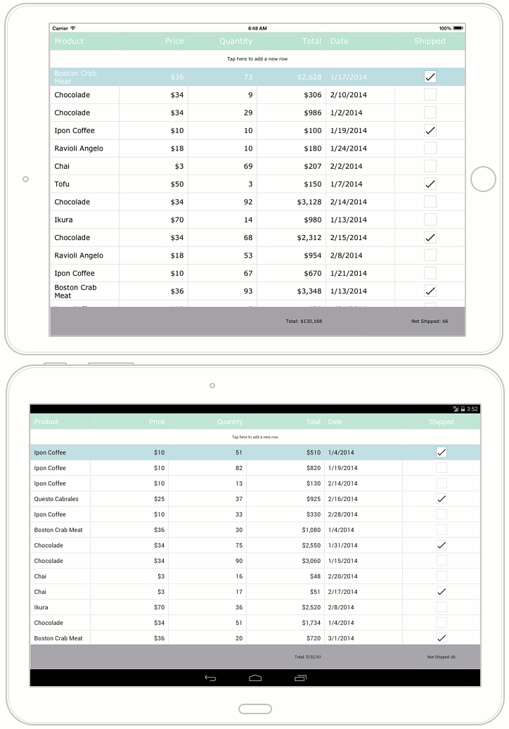
This example demonstrates how to customize a theme used to paint a GridControl.
To apply a theme to a GridControl, assign its name to the ThemeManager.ThemeName property. The Themes class stores available theme names.
The ThemeBase class’s properties provide access to different customizers, which you can adjust to change appearance settings (for example, font attributes, border and background colors, etc.) of the grid’s corresponding visual elements (such as data cells, group rows, filter panel, etc.). In this example, the following customizers are used.
- ThemeBase.HeaderCustomizer
- ThemeBase.CellCustomizer
- ThemeBase.TotalSummaryCustomizer
ThemeBase.NewItemRowCustomizer
Important
To apply the customization, call the Theme
This example customizes the Light theme as it is shown in the image below.