Themes Class
Contains the available GridControl theme names.
Namespace: DevExpress.Mobile.DataGrid.Theme
Assembly: DevExpress.Mobile.Grid.v18.2.dll
#Declaration
#Remarks
Important
This documentation topic describes legacy technology. We no longer develop new functionality for the Grid
The Themes class provides fields containing theme names (e.g. Light, Dark), which correspond to the predefined grid themes. To enable any of these themes, set the appropriate field value to the ThemeManager.ThemeName property.
The Default theme depends on the current mobile platform. For iOS applications, the Default theme is Light; for Android applications - Dark.
#Example
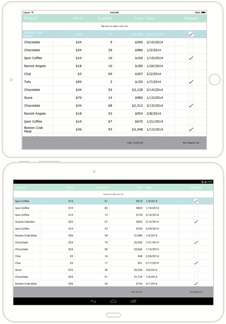
This example demonstrates how to customize a theme used to paint a GridControl.
To apply a theme to a GridControl, assign its name to the ThemeManager.ThemeName property. The Themes class stores available theme names.
The ThemeBase class’s properties provide access to different customizers, which you can adjust to change appearance settings (for example, font attributes, border and background colors, etc.) of the grid’s corresponding visual elements (such as data cells, group rows, filter panel, etc.). In this example, the following customizers are used.
- ThemeBase.HeaderCustomizer
- ThemeBase.CellCustomizer
- ThemeBase.TotalSummaryCustomizer
- ThemeBase.NewItemRowCustomizer
Important
To apply the customization, call the Theme
This example customizes the Light theme as it is shown in the image below.