Setting ToolTips for Third-Party Controls
- 2 minutes to read
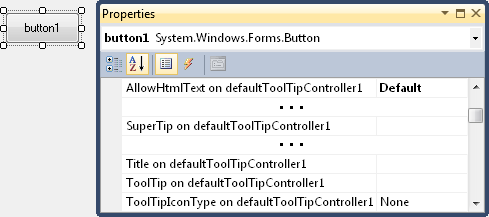
With the ToolTipController component you can set tooltips for any control. At design time, when a ToolTipController is added to a form, all third-party controls publish five new properties. For instance, when a DefaultToolTipController component is added to the form, the following properties appear in the Properties grid.
- ToolTip on defaultToolTipController1 - Specifies the main text for the control’s regular tooltip.
- Title on defaultToolTipController1 - Specifies a title for the control’s regular tooltip.
- ToolTipIconType on defaultToolTipController1 - Allows you to display an icon in the control’s regular tooltip.
- AllowHtmlText on defaultToolTipController1 (if this option is set to True, HTML tags can be used to format text in regular tooltips).
- SuperTip on defaultToolTipController1 - Specifies a SuperToolTip, which is an extended version of a tooltip, as it allows you to provide multiple text and image regions in the tooltip.
You can use the specified ToolTipController’s properties and events to customize content, appearance and behavior settings of tooltips that are set via these properties.
To set tooltips for third-party controls in code, use the following methods.
- DefaultToolTipController.SetToolTip
- DefaultToolTipController.SetTitle
- DefaultToolTipController.SetToolTipIconType
- DefaultToolTipController.SetAllowHtmlText
- DefaultToolTipController.SetSuperTip
If you are using a standalone ToolTipController component, use the following methods instead.
- ToolTipController.SetToolTip
- ToolTipController.SetTitle
- ToolTipController.SetToolTipIconType
- ToolTipController.SetAllowHtmlText
- ToolTipController.SetSuperTip
It is quite easy to set a regular tooltip for a control. You simply need to specify the text to be displayed within the title and content regions, and the required icon type. Unlike a regular tooltip, a SuperToolTip is represented by a SuperToolTip object. At design time, use the SuperToolTip Editor to create and initialize a SuperToolTip. In code, you need to create a SuperToolTip object manually. Refer to the Creating SuperToolTips topic for more details.