HTML-inspired Text Formatting
- 11 minutes to read
Certain controls allow you to format display text using a simplified HyperText Markup Language (HTML). HTML formatted text contains markup tags, which define text appearance. This document lists the controls that support HTML text formatting, describes the available HTML formatting tags, and provides an example of this feature.
Note
When the HTML Text Formatting feature is enabled for a certain control or its visual element, its text is painted in left-to-right mode, regardless of the RightToLeft option.
Supported Controls
Currently, HTML formatting is supported by the controls listed in the table below. Note that in order for some controls to allow HTML formatting, a corresponding Boolean property must be enabled.
Suite/Controls | HTML formatting is supported for… | Property that enables HTML formatting |
|---|---|---|
text in a Title (Title.Text) and TextAnnotation (TextAnnotation.Text and TextAnnotation.Lines). | n/a | |
Editors Library | text in a LabelControl (LabelControl.Text). | |
text in the CheckEdit and ToggleSwitch controls. | ||
text in the SimpleButton control (SimpleButton.Text). | ||
text in ButtonEdit descendants (when RepositoryItemButtonEdit.TextEditStyle is set to TextEditStyles.DisableTextEditor). | ||
text displayed in embedded buttons within ButtonEdit descendants. | ||
items in the ListBoxControl and CheckedListBoxControl controls. | ||
items in the ComboBoxEdit, ImageComboBoxEdit and CheckedComboBoxEdit controls. | ||
the GroupControl‘s text (GroupControl.Text). | ||
the RatingControl‘s text (RatingControl.Text) | ||
column captions (GridColumn.Caption). | ||
band captions (GridBand.Caption). | ||
text within cells. HTML tags can be incorporated into cells in the following ways.
| Use RepositoryItemHypertextLabel as an in-place editor. This editor has the HTML text formatting feature enabled by default (see RepositoryItem.AllowHtmlDraw). Text editing is disabled. | |
text within group rows. HTML tags can be incorporated into group rows via the GridView.CustomDrawGroupRow event. | ||
column captions in the TileView‘s Edit Form (GridColumn.Caption) | ||
text of items in the WinExplorerView | ||
column and band captions (TreeListColumn.Caption, TreeListBand.Caption). | ||
text within cells. HTML tags can be incorporated into cells in the following ways.
| Use RepositoryItemHypertextLabel as an in-place editor. This editor has the HTML text formatting feature enabled by default (see RepositoryItem.AllowHtmlDraw). Text editing is disabled. | |
text in the field headers - use the PivotGridFieldBase.Caption property | ||
text in the field values - handle the PivotGridControl.FieldValueDisplayText event and use the PivotFieldDisplayTextEventArgs.DisplayText property. | ||
row captions. | BaseOptionsView.AllowHtmlText, VGridOptionsRow.AllowHtmlText, CustomDrawRowHeaderCellEventArgs.AllowHtmlText | |
text within cells. HTML tags can be incorporated into cells in the following ways.
| Use RepositoryItemHypertextLabel as an in-place editor. This editor has the HTML text formatting feature enabled by default (see RepositoryItem.AllowHtmlDraw). Text editing is disabled. | |
item captions (BaseLayoutItem.Text). | ||
tooltips for items in the Layout Control | BaseLayoutItemOptionsToolTip.AllowHtmlString, BaseLayoutItemOptionsToolTip.IconAllowHtmlString, ToolTipController.AllowHtmlText | |
RibbonControl, Menus (BarManager) and Docking Library (DockManager) | the captions of Bar, Menu and Ribbon elements (BarItem.Caption, BarItem.Description) | BarItem.AllowHtmlText, BarItemLink.AllowHtmlText, BarManager.AllowHtmlText, RibbonControl.AllowHtmlText |
the captions and text of alert windows implemented via the AlertControl component. | ||
item captions in the BackstageViewControl (BackstageViewItem.Caption). | ||
item captions in the OfficeNavigationBar (NavigationBarItem.Text). | ||
text of gallery items and gallery item groups (GalleryItem.Caption, GalleryItemGroup.Caption) | ||
Windows UI and App UI Manager (DocumentManager) | WindowsUIButton‘s caption (WindowsUIButton.Caption) | |
Document headers (BaseDocument.Header). | ||
Document captions (BaseDocument.Caption). | ||
A Flyout’s caption and description (UIActionPropertiesCore.Caption, UIActionPropertiesCore.Description). | IFlyoutDefaultProperties.AllowHtmlDraw, IFlyoutProperties.AllowHtmlDraw | |
Tile elements | ||
Overview screens of content containers | ||
text in tiles | ||
text of items and groups (NavElement.Caption) | ||
|
and Navigation Pane controls | NavigationPage captions (NavigationPageBase.Caption) and tab headers (NavigationPageBase.Text) | NavigationPageDefaultProperties.AllowHtmlDraw |
element header text (AccordionControlElementBase.Text). | ||
text of labels. | ||
text of MapCallout or MapCustomElement. | ||
the captions of the XtraDialog and XtraMessageBox | ||
text in the WizardControl‘s pages | ||
All Controls | regular tooltips and SuperToolTips for controls. | ToolTipController.AllowHtmlText, SuperToolTip.AllowHtmlText, ToolTipItem.AllowHtmlText |
regular tooltips (BaseControl.ToolTip) for BaseControl descendants. | ||
the caption of an XtraForm. | n/a Use the XtraForm.HtmlText property to format a form’s caption using HTML tags. | |
the ContextButton‘s text (ContextButtonBase.Caption). | ||
the ValidationHint‘s text (ValidationHintBaseDefaultProperties.Text, ValidationHintBaseProperties.Text). | ValidationHintBaseDefaultProperties.AllowHtmlDrawText, ValidationHintBaseProperties.AllowHtmlDrawText |
Supported Tags
Tags are enclosed with the ‘<‘ and ‘>‘ symbols, and typically have a corresponding end tag. If a tag is not matched by its ending counterpart, all text that follows the tag will be formatted accordingly.
The following tags are supported:
Tag | End Tag | Description |
|---|---|---|
<br> | - | Inserts a single line break. To use this tag, you should enable word wrapping via the TextOptions.WordWrap option of a corresponding appearance object. To use this tag in a GridControl, enable word wrapping via the GridViewAppearances.HeaderPanel object, GridColumn.AppearanceHeader object, BandedViewAppearances.BandPanel object or GridBand.AppearanceHeader object. To use this tag in a TreeList, enable word wrapping via the TreeListAppearanceCollection.HeaderPanel object or TreeListColumn.AppearanceHeader object. To use this tag in a LabelControl, enable word wrapping via the LabelControl.Appearance object. To use this tag in a CheckEdit control, enable word wrapping via the CheckEdit.Properties.Appearance object (RepositoryItem.Appearance). To use this tag in layout item captions, enable word wrapping via the item’s or layout group’s BaseLayoutItem.AppearanceItemCaption object. |
<color=value> Examples: <color=red> <color=0,255,0> <color=255,0,255,0> <color=#0000FF> | </color> | Specifies the text color. |
<backcolor=value> Examples: <backcolor=red> <backcolor=0,255,0> <backcolor=255,0,255,0> <backcolor=#0000FF> | </backcolor> | Specifies the background color. |
<size=value> Examples: <size=10> <size=+4> <size=-4> | </size> | Specifies the font size. |
<b> | </b> | Defines bold text. |
<i> | </i> | Defines italic text. |
<s> | </s> | Defines strikethrough text. |
<u> | </u> | Defines underlined text. |
<image=value> Examples: <image=UpArrow.png> <image=#LeftArrow> <image=DownArrow.png;size=20,20;align=top> | - | Inserts an image from a bound image collection or from project resources. To insert an image from project resources, the image’s name must be preceded with the ‘#’ character. The image referenced from project resources will not appear at design time, but will appear at runtime. Note Project resource images can only be loaded from the Entry Assembly (the startup executable). Thus, if you define images in the resources of your additional class library, these images cannot be loaded using the image tag, even from this library code. If the image’s name is not preceded with ‘#’, it is implied that the image should be loaded by its name from a bound image collection. Use the control’s HtmlImages property to provide an image collection (ImageCollection or SvgImageCollection ). The following attributes for the image tag are supported. size - sets the display size of the image. align - specifies the vertical alignment of the image relative to the text. Possible values: top, bottom and center. Attributes must be specified after the tag’s value, followed by the “;” character. They must be separated with “;”, and specified without spaces. Controls and components that accept the image tag and provide the HtmlImages property are listed below.
|
<href=value> Example: <href=www.devexpress.com>Our web site</href> | </href> | Displays a hyperlink. The value string specifies the hyperlink source, and the string between the opening and closing tags is the text to be displayed. For controls capable of displaying hyperlinks via this tag, clicking a hyperlink fires the HyperlinkClick event. |
<nbsp> | - | Inserts a non-breaking space character (0xA0). |
Note
Note that if you need to use angle brackets (‘<’ and ‘>’) in the text of the controls that support HTML text formatting, you need to use an additional ‘<’ bracket at the beginning. For example, to get “<some text>” you should assign “<<some text>” to the corresponding property.
Example 1
The following example shows how to format a LabelControl‘s text using HTML tags. HTML formatting is enabled via the LabelControl.AllowHtmlString property. To respond to an end-user clicking the hyperlink, the LabelControl.HyperlinkClick event is handled. The image below shows the result:
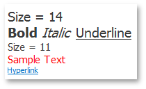
labelControl1.Text = "<size=14>Size = 14<br>" +
                     "<b>Bold</b> <i>Italic</i> <u>Underline</u><br>" +
                     "<size=11>Size = 11<br>" +
                     "<color=255, 0, 0>Sample Text</color></size>" +
                     "<href=www.devexpress.com>Hyperlink</href>";
labelControl1.AllowHtmlString = true;
labelControl1.Appearance.TextOptions.WordWrap = DevExpress.Utils.WordWrap.Wrap;
labelControl1.Appearance.Options.UseTextOptions = true;
labelControl1.AutoSizeMode = DevExpress.XtraEditors.LabelAutoSizeMode.Vertical;

private void labelControl1_HyperlinkClick(object sender, DevExpress.Utils.HyperlinkClickEventArgs e) {
    System.Diagnostics.Process.Start(e.Link);
}
Example 2
This example shows how to create a SuperToolTip containing a hyperlink for a SimpleButton.
The SimpleButton control provides the BaseControl.SuperTip inherited property that allows you to set a tooltip. To enable use of the <href> tag and other HTML text formatting tags in tooltips, activate the HTML Text Formatting feature (for instance, via the SuperToolTip.AllowHtmlText property). To respond to clicking a hyperlink, handle the ToolTipController.HyperlinkClick event.
The code that creates a SuperToolTip for a button is shown at the end of this section. At design time, you can create a SuperToolTip for a button as shown below. In this case, you still need to implement the HyperlinkClick event in code.
At design time, select the SimpleButton control and click the ellipses button within the SuperTip row in the Properties window:

This invokes the SuperToolTip Editor, which allows you to set the tooltip content and activate the HTML formatting feature:

When you run the application, the result will be as follows:

using DevExpress.Utils;
using System.Diagnostics;

private void Form1_Load(object sender, EventArgs e) {
    // Access the controller that manages tooltips for all controls:
    ToolTipController defaultTooltipController = DevExpress.Utils.ToolTipController.DefaultController;

    // Create and customize a SuperToolTip:
    SuperToolTip sTooltip = new SuperToolTip();
    SuperToolTipSetupArgs args = new SuperToolTipSetupArgs();
    args.Title.Text = "Header";
    args.Contents.Text = "This tooltip contains a hyperlink. Visit the <href=http://help.devexpress.com>DevExpress Knowledge Center</href> to learn more.";
    args.ShowFooterSeparator = true;
    args.Footer.Text = "Footer";
    sTooltip.Setup(args);
    // Enable HTML Text Formatting for the created SuperToolTip:
    sTooltip.AllowHtmlText = DefaultBoolean.True;
    //..or enable this feature for all tooltips:
    //defaultTooltipController.AllowHtmlText = true;

    // Respond to clicking hyperlinks in tooltips:
    defaultTooltipController.HyperlinkClick += defaultTooltipController_HyperlinkClick;

    // Assign a SuperToolTip to the button:
    simpleButton1.SuperTip = sTooltip;
}

void defaultTooltipController_HyperlinkClick(object sender, HyperlinkClickEventArgs e) {
    Process process = new Process();
    process.StartInfo.FileName = (e.Link);
    process.StartInfo.Verb = "open";
    process.StartInfo.WindowStyle = ProcessWindowStyle.Normal;
    try {
        process.Start();
    }
    catch { }
}