Creating SuperToolTips
- 2 minutes to read
Creating SuperToolTips at Design Time
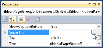
For controls/components that support SuperToolTips, you can easily edit tooltips via a specially designed Editor. To open this editor, select the control/component that provides a SuperToolTip property, then switch to this property and click the ellipsis button (…) in the Properties grid.
This opens the SuperToolTip Editor, which allows you to edit a tooltip.
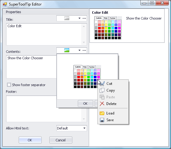
Using this editor, you can create a SuperToolTip consisting of up to three text/image regions (Header, Content and Footer). However, when building a SuperToolTip in code, you can create any number of regions. See the section below for more information.
The SuperToolTip Editor provides a preview pane with which you can see the results of your customization immediately.
If the Allow Html Text option is enabled, you can use a set of HTML tags to format tooltip text. This feature can also be enabled in code via the SuperToolTip.AllowHtmlText property.
After a SuperToolTip has been specified, you can customize additional tooltip settings (for instance, padding and distance between regions, etc.). Simply expand the SuperToolTip property in the Properties grid and set the settings appropriately.
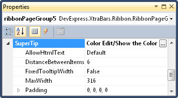
It is not possible to modify the appearance of individual regions at design time. You can only do this in code.
Creating SuperToolTips at Runtime
When creating a SuperToolTip in code, you need to create and initialize a SuperToolTip object.
Structurally, a SuperToolTip consists of regions that are represented by specific tooltip Items. So to construct a SuperToolTip, you should create tooltip Items and add them to the SuperToolTip.Items collection.
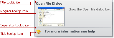
There are three tooltip Items that you can use to construct SuperToolTips.
- A regular tooltip item (ToolTipItem) allows some text and image to be displayed. The image can be positioned at the left or right edge of the item’s text.
- A title tooltip item (DevExpress.Utils.ToolTipTitleItem) is designed to represent headers and footers within a tooltip window. This item is similar to a regular tooltip item. The only difference is in the default appearance and indentation settings used to paint the item.
- A separator tooltip item (DevExpress.Utils.ToolTipSeparatorItem) represents a separator line.
The following image identifies the tooltip Items for a sample SuperToolTip.
Tooltip Items can be created directly using their constructors or indirectly via the SuperToolTip.Setup method. The following example demonstrates these two approaches: How to: Create SuperToolTips In Code.