Split Presentation
- 2 minutes to read
The Split Presentation feature allows you to split the grid into two independently scrollable panes to facilitate browsing and analyzing large data portions. You can split the grid vertically and edit the last grid row in one pane, while simultaneously looking at the first grid row in another pane. The same applies to columns when the View is split horizontally. |
Note
The Master-Detail mode is not supported while the Split Presentation feature is in use.
Split Container and Accessing Grids
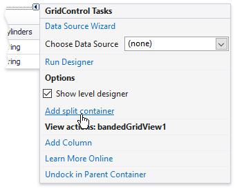
The Data Grid supports Split Presentation only when hosted inside a GridSplitContainer control. If you just started to build an application, you can drop this container from the Visual Studio Toolbox. Otherwise, when you already have a Data Grid on a form, invoke the Grid smart tag and click “Add split container”.
When Split Presentation is active, data is shown in two separate Data Grid controls simultaneously. You can access both through the split container API.
- GridSplitContainer.Grid - returns the primary Data Grid (the one you initially had).
- GridSplitContainer.SplitChildGrid - returns the secondary Data Grid that has been automatically generated.
Split Data Grid at Runtime
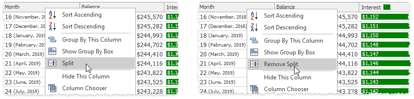
Enable the GridOptionsMenu.ShowSplitItem property to allow end-users to split data at runtime by right-clicking column headers and utilizing the “Split”/“Remove Split” commands.
Enable Split Presentation Manually
To turn split presentation on and off in code, call the GridSplitContainer.ShowSplitView and GridSplitContainer.HideSplitView methods. Set the GridSplitContainer.SplitterPosition property to move a splitter.
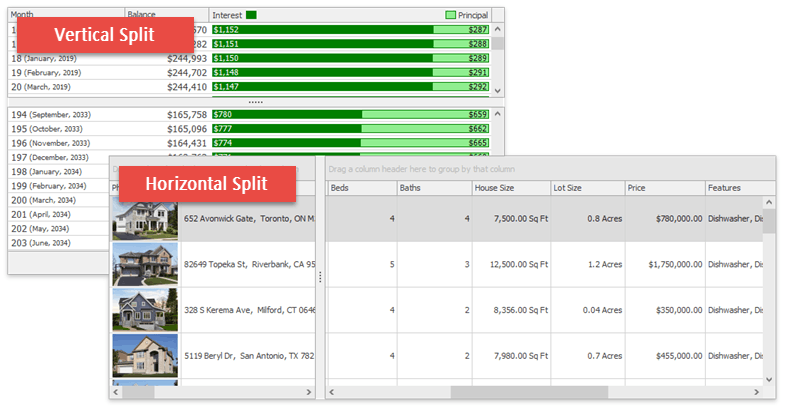
Horizontal Split
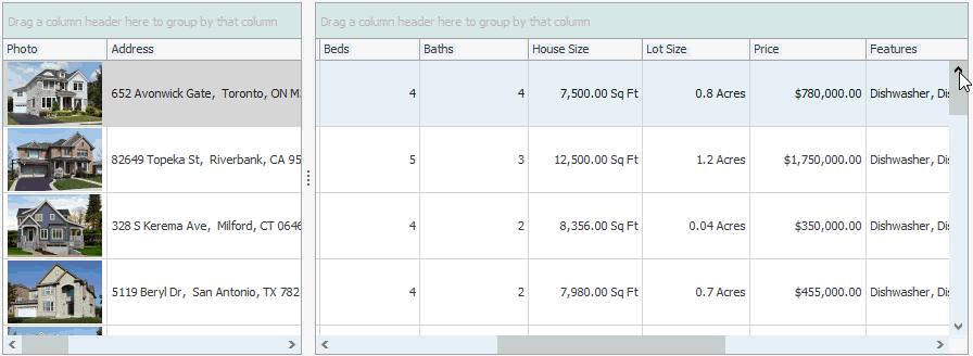
The Data Grid splits its client area vertically by default, meaning that the secondary Data Grid is placed below the primary one. Enable the GridSplitContainer.Horizontal setting to split a Data Grid horizontally.
Synchronization Settings
Split containers provide a number of settings to synchronize master and child Data Grids.
GridSplitContainer.SynchronizeFocusedRow
Enable to allow a Data Grid to automatically select the same row that is selected in a paired Data Grid.
GridSplitContainer.SynchronizeScrolling
If this setting is enabled, grid scroll bars affect both Data Grid controls simultaneously.
GridSplitContainer.SynchronizeViews
Turn this setting on to share appearance, view, sort, group and filter settings between both Data Grids.
GridSplitContainer.SynchronizeExpandCollapse
Gets or sets whether or not expanding/collapsing a group in one Data Grid should expand/collapse this group in another one.