PieChart Class
The Pie Chart control to plot series of data points on a pie chart area.
Namespace: DevExpress.WinUI.Charts
Assembly: DevExpress.WinUI.Charts.v22.1.dll
NuGet Package: DevExpress.WinUI
Declaration
[ContentProperty(Name = "Series")]
[ToolboxTabName("DX.22.1: Visualization")]
public class PieChart :
    ChartBase,
IChartViewHolderRemarks
Get Started
Read the following topic for a step-by-step guide on how to create a chart-based application with a pie:
Series and Series Views
The PieChart control can only display series of the PieSeries type. To access series view settings, set the View property of a series to a PieSeriesView object. PieSeriesView allows you to access series label, appearance, tooltip settings, and so on.
<Window ...
    xmlns:Charts="using:DevExpress.WinUI.Charts">
    <Grid>
        <Charts:PieChart>
                <Charts:PieSeries>
                    <Charts:PieSeries.View>
                        <Charts:PieSeriesView>
                            <!--...-->
                        </Charts:PieSeriesView>
                    </Charts:PieSeries.View>
                </Charts:PieSeries>
            </Charts:PieChart.Series>
        </Charts:PieChart>
    </Grid>
</Window>
Populate the Chart with Data
You can create pie series and add them to the PieChart.Series collection. Then, you can manually populate each series with points, or connect series to a data source and create points based on data source fields. Series can also be generated based on a template from a ViewModel.
For more information on how to populate a chart with data, refer to the following help topic: Load Chart Data.
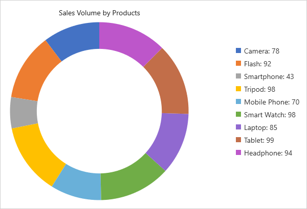
Donut
Enable the PieSeriesView.ShowDonut property to show a pie series as a donut. To specify the radius of the donut center hole, set the PieSeriesView.DonutHoleRadiusPercent property to a value from 0 to 100.
<Charts:PieSeriesView ShowDonut="True"
                      DonutHoleRadiusPercent="70">
    <!--...-->
</Charts:PieSeriesView>
Nested Donut
Multiple donuts are displayed nested if they have the same PieSeriesView.DonutGroup property value. Specify the PieSeriesView.DonutGroupInnerIndent property to define the gap between two nested donuts. To control the thickness of donuts, specify the PieSeriesView.DonutGroupWeight property.
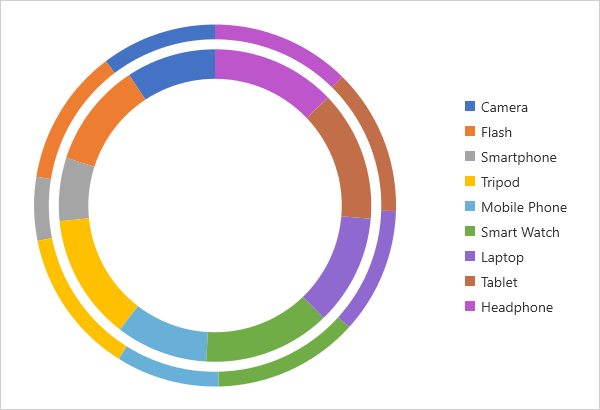
The following markup adds two donut series, and displays the second series as a nested donut:
<Charts:PieChart x:Name="chart">
    <Charts:PieChart.Series>
        <Charts:PieSeries x:Name="series1">
            <Charts:PieSeries.View>
                <Charts:PieSeriesView ShowDonut="True"
                                      DonutHoleRadiusPercent="70"
                                      DonutGroup="0"
                                      DonutGroupWeight="1"
                                      DonutGroupInnerIndent="10"
                                      LegendPointPattern="{}{A}"/>
            </Charts:PieSeries.View>
            <Charts:PieSeries.Data>
                <Charts:DataSource .../>
            </Charts:PieSeries.Data>
        </Charts:PieSeries>
        <Charts:PieSeries x:Name="series2" ShowInLegend="False">
            <Charts:PieSeries.View>
                <Charts:PieSeriesView ShowDonut="True"
                                      DonutHoleRadiusPercent="70"
                                      DonutGroup="0"
                                      DonutGroupWeight="2"/>
            </Charts:PieSeries.View>
            <Charts:PieSeries.Data>
                <Charts:DataSource .../>
            </Charts:PieSeries.Data>
        </Charts:PieSeries>
    </Charts:PieChart.Series>
</Charts:PieChart>
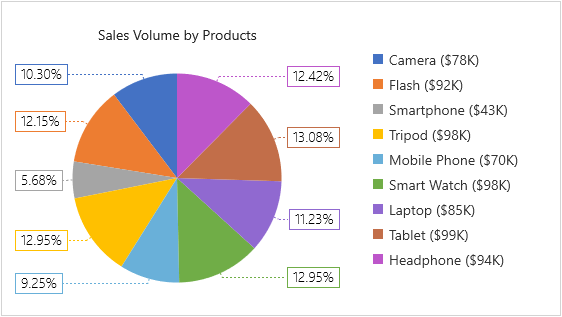
Labels
Labels can contain any kind of supplementary information for pie sectors. Enable the SeriesView.ShowLabels property to show labels for pie sectors. To format label text, specify the SeriesView.LabelPattern property. Define the SeriesView.LabelTemplate property to apply a custom appearance to labels.
The following markup customizes series labels for a Pie series:
<Window ...
        xmlns:Charts="using:DevExpress.WinUI.Charts"
        xmlns:dx="using:DevExpress.WinUI.Drawing">
        <Charts:PieChart x:Name="chart" ToolTipEnabled="True">
            <!--...-->
            <Charts:PieChart.Series>
                <Charts:PieSeries x:Name="series">
                    <Charts:PieSeries.View>
                        <Charts:PieSeriesView ShowLabels="True"
                                              LabelPattern="{}{VP:p}"
                                              LabelPosition="TwoColumns"
                                              ShowLabelConnectors="True"
                                              LegendPointPattern="{}{A} (${V}K)">
                            <Charts:PieSeriesView.LabelTemplate>
                                <DataTemplate>
                                    <Border BorderThickness="1"
                                            Opacity="1.0"
                                            BorderBrush="{Binding Path=PointColorBrush}">
                                        <Border.Background>
                                            <SolidColorBrush Color="White"/>
                                        </Border.Background>
                                        <TextBlock Text="{Binding Path=Text}"
                                                   Padding="5,1"
                                                   Foreground="Black"
                                                   FontFamily="SegoeUI"
                                                   FontStyle="Normal"
                                                   FontSize="14"
                                                   FontWeight="Light"
                                                   FontStretch="Normal"/>
                                    </Border>
                                </DataTemplate>
                            </Charts:PieSeriesView.LabelTemplate>
                            <Charts:PieSeriesView.LabelConnectorStrokeStyle>
                                <dx:StrokeStyle DashArray="2 2"/>
                            </Charts:PieSeriesView.LabelConnectorStrokeStyle>
                        </Charts:PieSeriesView>
                    </Charts:PieSeries.View>
                    <Charts:PieSeries.Data>
                        <!--...-->
                    </Charts:PieSeries.Data>
                </Charts:PieSeries>
            </Charts:PieChart.Series>
        </Charts:PieChart>
    </Grid>
</Window>
Legend
Set the ChartBase.Legend property to a Legend object to add the legend to the chart. To format text displayed in the legend for pie sectors, specify the SeriesView.LegendPointPattern property.
<Charts:PieChart.Legend>
    <Charts:Legend HorizontalPosition="RightOutside"
                   VerticalPosition="Center"
                   Orientation="Horizontal"
                   MaximumRowsOrColumns="1"/>
</Charts:PieChart.Legend>
<Charts:PieChart.Series>
    <Charts:PieSeries>
        <Charts:PieSeries.View>
            <Charts:PieSeriesView LegendPointPattern="{}{A} (${V}K)"/>
        </Charts:PieSeries.View>
    </Charts:PieSeries>
<Charts:PieChart.Series>
Series Title
Each pie series can have an individual title. To add a title, specify the PieSeriesView.Title property.
<Charts:PieSeriesView.Title>
    <TextBlock Text="Sales Volume by Products"
               Margin="10"/>
</Charts:PieSeriesView.Title>
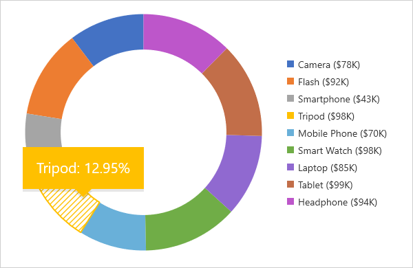
Tooltips
Turn on the ChartBase.ToolTipEnabled property to allow users to click pie sectors to show hints. Specify the SeriesView.ToolTipPointPattern property to format tooltip text.
<Charts:PieChart ToolTipEnabled="True">
    <Charts:PieChart.Series>
        <Charts:PieSeries>
            <Charts:PieSeries.View>
                <Charts:PieSeriesView ToolTipPointPattern="{}{A}: {VP:p}"/>
            </Charts:PieSeries.View>
        </Charts:PieSeries>
    </Charts:PieChart.Series>
</Charts:PieChart>
Selection
Users can click pie sectors to select them. To enable selection and choose a selection mode, specify the ChartBase.SelectionMode property. To respond to user selection actions, handle the ChartBase.SelectionChanged event. Use the SeriesView.SelectedItem and SeriesView.SelectedItems properties to access selected pie sectors. Specify the SeriesView.SelectedItemBrush property to set the color of selected sectors.
Learn more: Selection.
Layout
Enable the PieChart.EqualPieSize property to make all pies in the chart equal.
To set the distance between pies, specify the PieChart.MinIndentBetweenSeries property.
Colorization
The chart uses colors from the palette to color pie sectors. If you want to apply an individual palette to a pie in a multi-pie chart, use the SeriesView.Palette property for each pie series.
Animations
The Chart can automatically start series animation when the chart is loaded and/or when series data changes. Use the ChartBase.AnimateOnLoading and SeriesView.DataChangingAnimationMode properties to control the automatic animation behavior.
Use the PieSeriesView.SeriesAnimation and PieSeriesView.PointAnimation properties to select the animation type for series and points and configure animation settings.
You can call the ChartBase.Animate (or SeriesView.Animate) method for an individual series to start an animation at a specific time.
<Charts:PieChart AnimateOnLoading="True">
    <Charts:PieChart.Series>
        <Charts:PieSeries>
            <Charts:PieSeries.View>
                <Charts:PieSeriesView ...>
                    <Charts:PieSeriesView.SeriesAnimation>
                        <Charts:PieSpinAnimation/>
                    </Charts:PieSeriesView.SeriesAnimation>
                    <Charts:PieSeriesView.PointAnimation>
                        <Charts:PieFlyInAnimation BeginTime="00:00:01"
                                                  Duration="00:00:00.500"
                                                  PointDelay="00:00:01"/>
                    </Charts:PieSeriesView.PointAnimation>
                </Charts:PieSeriesView>
            </Charts:PieSeries.View>
            <!--...-->
        </Charts:PieSeries>
    </Charts:PieChart.Series>
</Charts:PieChart>
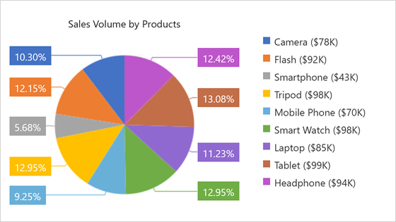
Example
The following example demonstrates how to create a simple Pie Chart with one series.
<Window
    x:Class="PieChartSample.MainWindow"
    xmlns="http://schemas.microsoft.com/winfx/2006/xaml/presentation"
    xmlns:x="http://schemas.microsoft.com/winfx/2006/xaml"
    xmlns:local="using:PieChartSample"
    xmlns:d="http://schemas.microsoft.com/expression/blend/2008"
    xmlns:mc="http://schemas.openxmlformats.org/markup-compatibility/2006"
    xmlns:Charts="using:DevExpress.WinUI.Charts"
    mc:Ignorable="d">
    <Grid>
        <Grid.DataContext>
            <local:ChartViewModel/>
        </Grid.DataContext>
        <Charts:PieChart x:Name="chart" ToolTipEnabled="True">
            <Charts:PieChart.Legend>
                <Charts:Legend HorizontalPosition="RightOutside"
                               VerticalPosition="Center"
                               Orientation="Horizontal"
                               MaximumRowsOrColumns="1"/>
            </Charts:PieChart.Legend>
            <Charts:PieChart.Series>
                <Charts:PieSeries x:Name="series">
                    <Charts:PieSeries.View>
                        <Charts:PieSeriesView ToolTipPointPattern="{}{A}: {VP:p}"
                                              LegendPointPattern="{}{A} (${V}K)"
                                              ShowLabels="True"
                                              LabelPattern="{}{VP:p}"
                                              LabelPosition="TwoColumns">
                            <Charts:PieSeriesView.Title>
                                <TextBlock Text="Sales Volume by Products" Margin="10"/>
                            </Charts:PieSeriesView.Title>
                        </Charts:PieSeriesView>
                    </Charts:PieSeries.View>
                    <Charts:PieSeries.Data>
                        <Charts:DataSource PointSource="{Binding DataPoints}"
                                           ArgumentDataMember="Product"
                                           ArgumentScaleType="Qualitative"
                                           ValueDataMember="Income"
                                           ValueScaleType="Numerical"/>
                    </Charts:PieSeries.Data>
                </Charts:PieSeries>
            </Charts:PieChart.Series>
        </Charts:PieChart>
    </Grid>
</Window>
using DevExpress.Mvvm;
using Microsoft.UI.Xaml;
using System.Collections.Generic;

namespace PieChartSample {
    public sealed partial class MainWindow : Window {
        public MainWindow() {
            this.InitializeComponent();
        }
    }
    public class DataPoint {
        public string Product { get; set; }
        public double Income { get; set; }
    }
    public class ChartViewModel : ViewModelBase {
        public ChartViewModel() {
            List<DataPoint> dataPoints = new List<DataPoint> {
                new DataPoint() { Product = "Camera", Income = 78 },
                new DataPoint() { Product = "Flash", Income = 92 },
                new DataPoint() { Product = "Smartphone", Income = 43 },
                new DataPoint() { Product = "Tripod", Income = 98 },
                new DataPoint() { Product = "Mobile Phone", Income = 70 },
                new DataPoint() { Product = "Smart Watch", Income = 98 },
                new DataPoint() { Product = "Laptop", Income = 85 },
                new DataPoint() { Product = "Tablet", Income = 99 },
                new DataPoint() { Product = "Headphone", Income = 94 }
            };
            DataPoints = dataPoints;
        }
        public List<DataPoint> DataPoints { get; }
    }
}
For step-by-step instructions on how to create a Pie chart, refer to the following help topic: Lesson 2 - Create a Pie Chart.