CartesianChart Class
The Cartesian Chart control to plot series of data points on an XY Cartesian diagram.
Namespace: DevExpress.WinUI.Charts
Assembly: DevExpress.WinUI.Charts.v22.1.dll
NuGet Package: DevExpress.WinUI
Declaration
[ContentProperty(Name = "Series")]
[ToolboxTabName("DX.22.1: Visualization")]
public class CartesianChart :
    ChartBase,
    IChartViewHolder,
IRangeControlSupportRelated API Members
The following members return CartesianChart objects:
Remarks
Get Started
Read the following topic for a step-by-step guide on how to create a chart-based application with a Cartesian Chart:
Series and Series Views
The CartesianChart control can contain series that are descendants of the CartesianSeries type. To access series view settings, set a series’ View property to a descendant of the CartesianSeriesView type. A series view controls series label, appearance, tooltip settings, and so on.
The following markup creates a Cartesian chart and adds a common XY-series (one value per argument) of the Line view type:
<Charts:CartesianChart>
    <Charts:Series>
        <Charts:Series.View>
            <Charts:LineSeriesView/>
        </Charts:Series.View>
        <Charts:Series.Data>
            <!-- Configure the series' data source here. -->
        </Charts:Series.Data>
    </Charts:Series>
</Charts:CartesianChart>
The following list contains all series view types you can display in the Cartesian Chart:
For more information about the Point, Series and View terms, refer to the following help topic: Data Points, Series and Series Views.
Populate the Chart with Data
You can create series and add them to the CartesianChart.Series collection. Then, you can manually populate each series with points, or connect series to a data source and create points based on data source fields. Series can also be generated based on a template from a ViewModel.
For more information on how to populate a chart with data, refer to the following help topic: Load Chart Data.
Axes
The CartesianChart control uses axes to manage its coordinate space. Axes also contain elements (for example, tickmarks and grid lines) that improve a chart’s readability .
Use the CartesianChart.AxisX and CartesianChart.AxisY properties to configure axis options, such as labels, grid spacing, ranges, strips, and so on.
<Charts:CartesianChart.AxisX>
    <Charts:AxisX ShowLine="True"/>
</Charts:CartesianChart.AxisX>
<Charts:CartesianChart.AxisY>
    <Charts:AxisY ShowLine="True"/>
</Charts:CartesianChart.AxisY>
For more information about axes, refer to the following topic in the API Reference section: AxisBase.
Legend
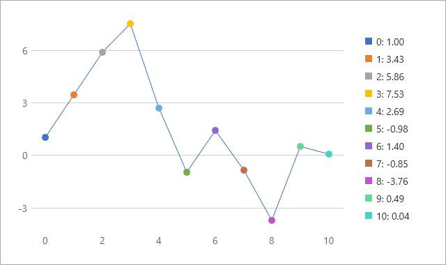
A legend allows you to distinguish series or points on a chart. To add the legend, initialize the chart’s Legend property with a Legend object.
Use the following properties to compose text for legend items:
- LegendPattern
- Use this property when the legend displays series names (the default mode for Cartesian charts).
- LegendPointPattern
- Use this property when the legend shows series points. To show points in the legend, enable the CartesianSeriesView.ColorEach property.
To position the legend, specify its HorizontalPosition and VerticalPosition properties.
The following example formats legend item text and configures legend position:
<Charts:Series>
    <Charts:Series.View>
        <Charts:LineSeriesView ColorEach="True"
                               ShowMarkers="True"
                               LegendPointPattern="{}{A}: {V:f2}"/>
    </Charts:Series.View>
</Charts:Series>
<Charts:CartesianChart.Legend>
    <Charts:Legend HorizontalPosition="RightOutside"
                   VerticalPosition="Top"
                   BorderBrush="Transparent"
                   Orientation="Vertical"/>
</Charts:CartesianChart.Legend>
Use the MaximumRowsOrColumns, Orientation and ReverseItems properties to align items within the legend.
Enable the Legend.IsMovableInsideDiagram property to allow users to move a legend within the CartesianChart control.
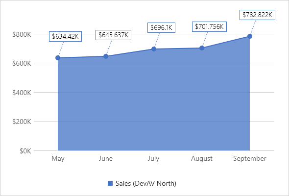
Labels
Labels can contain any kind of supplementary information for series points. Enable the SeriesView.ShowLabels property to display point labels. To format label text, specify the SeriesView.LabelPattern property. Define the SeriesView.LabelTemplate property to apply a custom appearance to labels.
The following example customizes the appearance of area series labels:
<Charts:AreaSeriesView ShowMarkers="True"
                       ShowContour="True"
                       ShowLabels="True"
                       LabelAngle="20"
                       LabelIndent="30"
                       LabelPattern="{}${V}K">
    <Charts:AreaSeriesView.LabelConnectorStrokeStyle>
        <dxd:StrokeStyle DashArray="2 2" Thickness="1"/>
    </Charts:AreaSeriesView.LabelConnectorStrokeStyle>
    <Charts:AreaSeriesView.LabelTemplate>
        <DataTemplate>
            <Border BorderThickness="1"
                    Opacity="1.0"
                    BorderBrush="{Binding Path=PointColorBrush}">
                <Border.Background>
                    <SolidColorBrush Color="White"/>
                </Border.Background>
                <TextBlock Text="{Binding Path=Text}"
                           Padding="5,1"
                           Foreground="Black"
                           FontFamily="SegoeUI"
                           FontStyle="Normal"
                           FontSize="14"
                           FontWeight="Light"
                           FontStretch="Normal"/>
            </Border>
        </DataTemplate>
    </Charts:AreaSeriesView.LabelTemplate>
</Charts:AreaSeriesView>
Zoom and Scroll
You can pan and zoom a chart vertically or/and horizontally. Set the CartesianChart.AllowAxisXZoomScroll and CartesianChart.AllowAxisYZoomScroll properties to true to enable the zoom and scroll functionality for the CartesianChart control.
For more information, refer to the following help topic: Zoom and Scroll a Chart.
Selection
Users can click series points to select them. To enable selection and choose a selection mode, specify the ChartBase.SelectionMode property. To respond to user selection actions, handle the ChartBase.SelectionChanged event. Use the SeriesView.SelectedItem and SeriesView.SelectedItems properties to access selected points. Specify the SeriesView.SelectedItemBrush property to set a color of selected sectors.
For more information, refer to the following help topic: Selection.
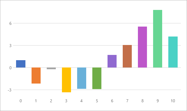
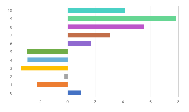
Rotate the Chart
Use the chart’s Rotated property to rotate the diagram. When the Rotated property is set to true, the x-axis is displayed vertically, and the y-axis is displayed horizontally.
| Rotated = false | Rotated = true |
|---|---|
 |
 |
The following markup rotates a Cartesian chart:
<Charts:CartesianChart Rotated="True">
    <!--...-->
</Charts:CartesianChart>
Tooltips
Turn on the ChartBase.ToolTipEnabled property to allow users to click series or series points to show hints. Specify the SeriesView.ToolTipSeriesPattern and SeriesView.ToolTipPointPattern properties to format tooltip text.
<Charts:CartesianChart ToolTipEnabled="True">
    <Charts:Series DisplayName="Series">
        <Charts:Series.View>
            <Charts:LineSeriesView ShowMarkers="True"
                                   ToolTipPointPattern="{}{A}: {V:f2}"
                                   ToolTipSeriesPattern="{}{S}"/>
        </Charts:Series.View>
    </Charts:Series>
</Charts:CartesianChart>
Colorization
The chart uses colors from the palette to paint chart points and series. If you want to apply an individual palette to a series, use the SeriesView.Palette property for each separate series. The series palette is used to color points when the CartesianSeriesView.ColorEach property is enabled.
Specify the CartesianSeriesView.Brush property to specify the color of an individual series.
Animations
The Chart can automatically start series animation when the chart is loaded and/or when series data changes. Use the AnimateOnLoading and DataChangingAnimationMode properties to control automatic animation behavior.
Continuous series (lines and areas) support animation for the series itself and for points. Use the LineSeriesViewBase.SeriesAnimation (or AreaSeriesView.SeriesAnimation) property to animate series; use the MarkerSeriesView.PointAnimation property to animate line and area series markers (to show markers, enable the LineSeriesViewBase.ShowMarkers (or AreaSeriesView.ShowMarkers) property. To select an animation type for bars, specify the BarSeriesView.PointAnimation property.
You can call the ChartBase.Animate (or SeriesView.Animate) method for an individual series to start animation at a specific time.
The following example animates a line series and point markers:
<Charts:Series>
    <Charts:Series.View>
        <Charts:LineSeriesView x:Name="view" ShowMarkers="True">
            <Charts:LineSeriesView.SeriesAnimation>
                <Charts:LineSlideFromLeftAnimation BeginTime="00:00:00"
                                                   Duration="00:00:03"
                                                   Enable="True">
                    <Charts:LineSlideFromLeftAnimation.EasingFunction>
                        <ExponentialEase EasingMode="EaseIn"/>
                    </Charts:LineSlideFromLeftAnimation.EasingFunction>
                </Charts:LineSlideFromLeftAnimation>
            </Charts:LineSeriesView.SeriesAnimation>
            <Charts:LineSeriesView.PointAnimation>
                <Charts:MarkerSlideFromRightAnimation BeginTime="00:00:02"
                                                      Duration="00:00:02"
                                                      PointOrder="Straight"
                                                      PointDelay="00:00:00.5">
                    <Charts:MarkerSlideFromRightAnimation.EasingFunction>
                        <BounceEase/>
                    </Charts:MarkerSlideFromRightAnimation.EasingFunction>
                </Charts:MarkerSlideFromRightAnimation>
            </Charts:LineSeriesView.PointAnimation>
        </Charts:LineSeriesView>
    </Charts:Series.View>
    <!-...-->
</Charts:Series>
Example
The following example demonstrates how to bind a chart to data from a ViewModel.
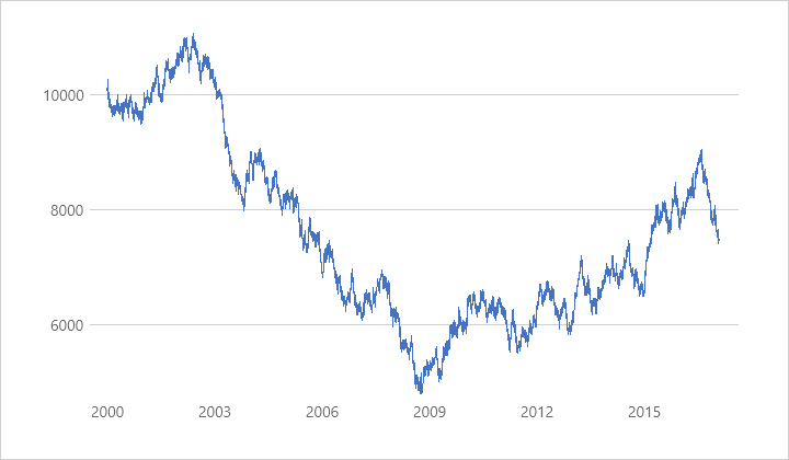
To do this, it is necessary to assign the DataSource object to the Series.Data property and specify the data source for the adapter in its DataSource.PointSource property.
<Window
    x:Class="DataSourceExample.MainWindow"
    xmlns="http://schemas.microsoft.com/winfx/2006/xaml/presentation"
    xmlns:x="http://schemas.microsoft.com/winfx/2006/xaml"
    xmlns:local="using:DataSourceExample"
    xmlns:d="http://schemas.microsoft.com/expression/blend/2008"
    xmlns:mc="http://schemas.openxmlformats.org/markup-compatibility/2006"
    xmlns:Charts="using:DevExpress.WinUI.Charts"
    mc:Ignorable="d">

    <Grid>
        <Charts:CartesianChart x:Name="chart">
            <Charts:Series>
                <Charts:Series.View>
                    <Charts:LineSeriesView/>
                </Charts:Series.View>
                <Charts:Series.Data>
                    <Charts:DataSource PointSource="{Binding ItemsSource}"
                                       ArgumentDataMember="PointArgument"
                                       ValueDataMember="PointValue"/>
                </Charts:Series.Data>
            </Charts:Series>
            <Charts:CartesianChart.AxisX>
                <Charts:AxisX DateTimeGridAlignment="Year"
                              DateTimeMeasureUnit="Hour"
                              LabelPattern="{}{V:yyyy}"/>
            </Charts:CartesianChart.AxisX>
        </Charts:CartesianChart>
    </Grid>
</Window>
using Microsoft.UI.Xaml;
using System;
using System.Collections;
using System.Collections.Generic;

namespace DataSourceExample {

    public sealed partial class MainWindow : Window {
        public MainWindow() {
            this.InitializeComponent();
            chart.DataContext = new ViewModel() {
                Start = 10000,
                Count = 50000,
                Step = TimeSpan.FromHours(3),
            };
        }
    }
    public class DateTimeDataPoint {
        public DateTime PointArgument { get; set; }
        public double PointValue { get; set; }
    }

    public class ViewModel {
        DateTime start = new DateTime(2000, 1, 1);
        IEnumerable itemsSource;
        readonly Random random = new Random();


        public TimeSpan Step { get; set; }
        public int Count { get; set; }
        public double Start { get; set; }
        public IEnumerable ItemsSource {
            get { return itemsSource ??= CreateItemsSource(Count); }
        }

        protected IEnumerable CreateItemsSource(int count) {
            var points = new List<DateTimeDataPoint>();

            double value = GenerateStartValue(random);
            points.Add(new DateTimeDataPoint() { PointArgument = start, PointValue = value });
            for (int i = 1; i < count; i++) {
                value += GenerateAddition(random);
                start += Step;
                points.Add(new DateTimeDataPoint() { PointArgument = start, PointValue = value });
            }
            return points;
        }

        protected double GenerateStartValue(Random random) {
            return Start + random.NextDouble() * 100;
        }

        protected double GenerateAddition(Random random) {
            double factor = random.NextDouble();
            if (factor == 1)
                factor = 50;
            else if (factor == 0)
                factor = -50;
            return (factor - 0.5) * 50;
        }
    }
}