SeriesView.LabelTemplate Property
Specifies a template that defines a custom appearance and look-and-feel for labels.
Namespace: DevExpress.WinUI.Charts
Assembly: DevExpress.WinUI.Charts.v22.1.dll
NuGet Package: DevExpress.WinUI
Declaration
[DP(null, Handler = "UpdateActualStyleSettings")]
public DataTemplate LabelTemplate { get; set; }Property Value
| Type | Description |
|---|---|
| DataTemplate | A data template. |
Example
The following example customizes the appearance of area series labels:
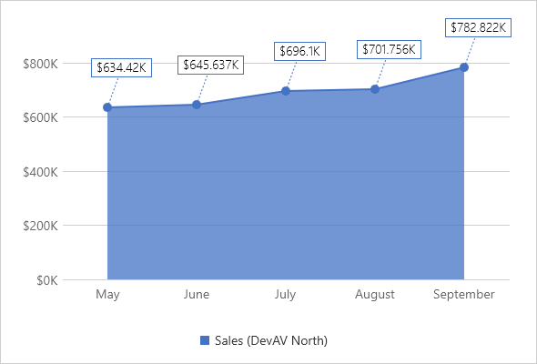
<Charts:AreaSeriesView ShowMarkers="True"
                       ShowContour="True"
                       ShowLabels="True"
                       LabelAngle="20"
                       LabelIndent="30"
                       LabelPattern="{}${V}K">
    <Charts:AreaSeriesView.LabelConnectorStrokeStyle>
        <dxd:StrokeStyle DashArray="2 2" Thickness="1"/>
    </Charts:AreaSeriesView.LabelConnectorStrokeStyle>
    <Charts:AreaSeriesView.LabelTemplate>
        <DataTemplate>
            <Border BorderThickness="1"
                    Opacity="1.0"
                    BorderBrush="{Binding Path=PointColorBrush}">
                <Border.Background>
                    <SolidColorBrush Color="White"/>
                </Border.Background>
                <TextBlock Text="{Binding Path=Text}"
                           Padding="5,1"
                           Foreground="Black"
                           FontFamily="SegoeUI"
                           FontStyle="Normal"
                           FontSize="14"
                           FontWeight="Light"
                           FontStretch="Normal"/>
            </Border>
        </DataTemplate>
    </Charts:AreaSeriesView.LabelTemplate>
</Charts:AreaSeriesView>
See Also