TreeViewControl Class
The TreeView control.
Namespace: DevExpress.Xpf.Grid
Assembly: DevExpress.Xpf.Grid.v20.2.dll
NuGet Packages: DevExpress.WindowsDesktop.Wpf.Grid.Core, DevExpress.Wpf.Grid.Core
Declaration
Remarks
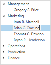
The TreeViewControl is a navigation single-column control that displays self-referenced and hierarchical data.
More information: TreeView - Get Started
Tip
If you want to display multi-column data, use the TreeListControl.
Bind to Data
The TreeViewControl can display information in a tree from a self-referential (flat) or hierarchical data structure.
| API | Description |
|---|---|
| TreeViewFieldName | Gets or sets the name of a data source field assigned to the TreeViewControl. This is a dependency property. |
| TreeDerivationMode | Gets or sets the tree derivation mode. This is a dependency property. |
| KeyFieldName | Gets or sets the name of the service field in a data source that contains unique values. This is a dependency property. |
| ParentFieldName | Gets or sets the name of the service field in a data source that contains parent node values. This is a dependency property. |
| RootValue | Gets or sets the value that root nodes contain in the field specified by the ParentFieldName property. |
| ChildNodesPath | Gets or sets the name of the field that contains child nodes. This is a dependency property. |
| ChildNodesSelector | Gets or sets a selector that returns the list of child nodes for the processed node. This is a dependency property. |
| EnableDynamicLoading | Gets or sets whether to create nodes dynamically when you expand their parent node. This is a dependency property. |
| TotalNodesCount | Gets the total number of nodes stored in the TreeViewControl. |
| VisibleNodeCount | Gets the total number of nodes displayed in the TreeViewControl. |
Edit Data
The TreeViewControl uses an in-place editor that depends on its content.
| API | Description |
|---|---|
| AllowEditing | Gets or sets whether users can edit node values. This is a dependency property. |
| EditSettings | Gets or sets an object that contains the TreeViewControl editor’s settings. This is a dependency property. |
| AllowLeaveInvalidEditor | Gets or sets whether an editor that did not pass validation can lose focus. This is a dependency property. |
| ValidateNode | Allows you to validate the focused node’s data and specify whether to close the node’s editor. |
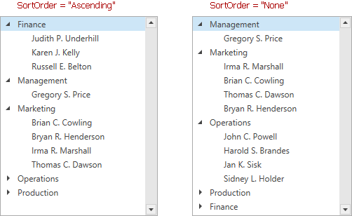
Sort Nodes
| API | Description |
|---|---|
| SortOrder | Gets or sets the TreeViewControl‘s sort order. This is a dependency property. |
| SortFieldName | Gets or sets the field in a data source by which the TreeViewControl sorts its data. |
| SortMode | Gets or sets how the TreeViewControl sorts its data. This is a dependency property. |
| StartSorting | Occurs before the TreeViewControl starts a sort operation. |
| EndSorting | Occurs after the TreeViewControl has completed a sort operation. |
| CustomNodeSort | Allows you to use custom rules to sort data. |
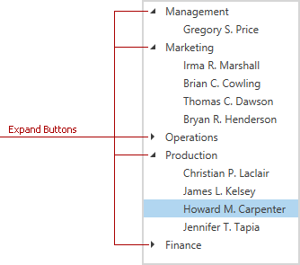
Expand and Collapse Nodes
The TreeViewControl allows users to expand/collapse parent nodes to show/hide their children.
| API | Description |
|---|---|
| ShowExpandButtons | Gets or sets whether to show expand buttons. This is a dependency property. |
| AutoExpandAllNodes | Gets or sets whether to expand all nodes when the TreeViewControl is loaded. This is a dependency property. |
| ExpandNodesOnFiltering | Gets or sets whether to expand a node if its child nodes contain the search text. This is a dependency property. |
| ExpandStateFieldName | Gets or sets the field name in a data source that specifies expanded nodes. This is a dependency property. |
| ExpandStateBinding | Gets or sets the binding that specifies that nodes are expanded. |
| ExpandAllNodes() / CollapseAllNodes() | Expands/collapses all nodes. |
| ChangeNodeExpanded(Int32, Boolean) | Specifies the expanded state of a node. |
| ExpandNode(Int32) / CollapseNode(Int32) | Expands/collapses the specified node. |
| ExpandToLevel(Int32) | Expands the parent nodes down to the specified nesting level. |
| NodeExpanding / NodeExpanded | Occurs before/after a node is expanded. |
| NodeCollapsing / NodeCollapsed | Occurs before/after a node is collapsed. |
Scroll Nodes
| API | Description |
|---|---|
| AllowPerPixelScrolling | Gets or sets whether per-pixel scrolling is enabled. This is a dependency property. |
| AllowScrollAnimation | Gets or sets whether to enable scroll animation. This is a dependency property. |
| ScrollAnimationMode | Gets or sets the scroll animation mode. This is a dependency property. |
| AutoScrollCurrentNode | Gets or sets whether to horizontally scroll the view when a user focuses a node that does not fit the TreeViewControl. This is a dependency property. |
| ScrollIntoView(TreeListNode) | Scrolls the view to the specified node. |
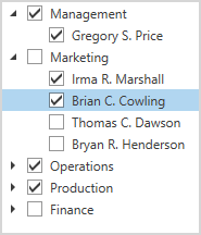
Check Nodes
You can embed check boxes into nodes and allow an end user to check/uncheck them.
| API | Description |
|---|---|
| ShowCheckboxes | Gets or sets whether to display node check boxes. This is a dependency property. |
| CheckBoxFieldName | Gets or sets the name of a field in a data source to which check boxes are bound. This is a dependency property. |
| CheckBoxValueConverter | Gets or sets a converter that specifies a checkbox value. This is a dependency property. |
| AllowIndeterminateCheckState | Gets or sets whether a user can set the node’s check boxes to three states (checked, unchecked and indeterminate). This is a dependency property. |
| AllowRecursiveNodeChecking | Gets or sets whether recursive check box selection is enabled. This is a dependency property. |
| IsCheckBoxEnabledBinding | Gets or sets the binding that determines whether a node’s check box is enabled. |
| CheckAllNodes() / UncheckAllNodes() | Checks/unchecks all nodes. |
| ChangeNodeCheckState(Int32, Nullable<Boolean>) | Changes the specified node’s check state. |
| NodeCheckStateChanged | Occurs when a node’s check box value is changed. |
Appearance Customization
The TreeViewControl allows you to customize appearance of its elements.
| API | Description |
|---|---|
| NodeStyle | Gets or sets the style applied to data nodes. This is a dependency property. |
| NodeTemplate | Gets or sets the template that defines the node appearance. This is a dependency property. |
| NodeTemplateSelector | Gets or sets an object that chooses a template for data nodes based on custom logic. This is a dependency property. |
| NodeIndent | Gets or sets the node indent’s width. |
| ShowRootIndent | Gets or sets whether to show an indent for the root node. |
| TreeLineStyle | Gets or sets whether to display tree lines that connect nodes. This is a dependency property. |
| UseEvenRowBackground | Specifies whether to use a theme-dependent brush to highlight even nodes. This is a dependency property. |
| EvenRowBackground | Gets or sets a theme-dependent brush that highlights even nodes. This is a dependency property. |
| HighlightItemOnHover | Gets or sets whether to highlight a node on hover. |
Images
You can embed images into nodes.
| API | Description |
|---|---|
| ShowNodeImages | Gets or sets whether to display node images. This is a dependency property. |
| NodeImageSize | Gets or sets the size of the node images. This is a dependency property |
| ImageFieldName | Gets or sets the field name in a data source that contains node images. This is a dependency property. |
| NodeImageSelector | Gets or sets a selector that chooses a node image based on custom logic. This is a dependency property. |
| RefreshNodeImage(TreeListNode) | Reloads the image for the specified node. |
Select, Focus, and Navigate
| API | Description |
|---|---|
| SelectionMode | Gets or sets whether multiple row/cell selection is enabled. This is a dependency property. |
| SelectedItem | Gets or sets the focused data row (if row multi-selection is disabled); or the row that was selected first (if row multi-selection is enabled). |
| SelectedItems | Gets or sets a list of data objects that correspond to rows/nodes selected within a View. |
| CurrentNode | Gets or sets the currently focused node. |
| SelectAll() / UnselectAll() | Selects/unselects all nodes. |
| BeginSelection() | Prevents selection updates until the DataControlBase.EndSelection method is called. |
| EndSelection() | Enables selection updates after calling the DataControlBase.BeginSelection method, and forces an immediate update. |
| SelectItem(TreeListNode) / UnselectItem(TreeListNode) | Selects the specified node. |
| SelectRange(TreeListNode, TreeListNode) | Selects multiple nodes, while preserving the current selection (if any). |
| GetSelectedNodes() | Returns selected nodes. |
| IsNodeSelected(TreeListNode) | Indicates whether the specified node is selected. |
| SelectionChanged | Occurs after treelist’s selection has been changed. |
| CurrentNodeChanged | Occurs after the focused node has been changed. |
| CanSelectNode | Occurs when a user tries to select a node and allows you to control whether a user can select a particular node. |
| CanUnselectNode | Occurs when a user tries to unselect a node and allows you to control whether a user can unselect a particular node. |
| NodeDoubleClick | Occurs when a user double-clicks a node. |
Drag & Drop
| API | Description |
|---|---|
| AllowDragDrop | Gets or sets whether a user can drag and drop nodes. This is a dependency property. |
| AutoExpandOnDrag | Gets or sets whether to expand a collapsed group when a user drags a record over this group. This is a dependency property. |
| AllowScrollingOnDrag | Gets or sets whether to scroll the view when users drag nodes to its edges. This is a dependency property. |
| ShowDragDropHint | Gets or sets whether to display the drag-and-drop hint when a user drags a record. This is a dependency property. |
| DragDropHintTemplate | Gets or sets the template that defines the drag-and-drop hint’s appearance. This is a dependency property. |
| DropMarkerTemplate | Gets or sets the template that defines the drop marker’s appearance. This is a dependency property. |
| StartRecordDrag | Occurs when a drag-and-drop operation is started. |
| DragRecordOver | Occurs continuously while a drag-and-drop operation is in progress. |
| DropRecord | Occurs when a user drops a record on the drop target element. |
| CompleteRecordDragDrop | Occurs when a drag-and-drop operation is completed. |
Context Menu
| API | Description |
|---|---|
| NodeMenuCustomizations | Allows you to customize the node’s context menu. You can add new menu items or remove existing items. |
| IsNodeMenuEnabled | Gets or sets whether a user can right-click a node to access its context menu. This is a dependency property. |
Related GitHub Examples
The following code snippet (auto-collected from DevExpress Examples) contains a reference to the TreeViewControl class.
Note
The algorithm used to collect these code examples remains a work in progress. Accordingly, the links and snippets below may produce inaccurate results. If you encounter an issue with code examples below, please use the feedback form on this page to report the issue.