TrackBarZoomStyleSettings.DecrementButtonStyle Property
Gets or sets the TrackBarEdit‘s decrement button style. This is a dependency property.
Namespace: DevExpress.Xpf.Editors
Assembly: DevExpress.Xpf.Core.v20.2.dll
NuGet Packages: DevExpress.WindowsDesktop.Wpf.Core, DevExpress.Wpf.Core
Declaration
Property Value
| Type | Description |
|---|---|
| Style | The TrackBarEdit’s track bar decrement button style. |
Remarks
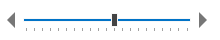
The following code sample specifies the DecrementButtonStyle, IncrementButtonStyle, ThumbStyle, and NearTrackStyle properties:
<Window ...
    xmlns:dxe="http://schemas.devexpress.com/winfx/2008/xaml/editors">
    <StackPanel HorizontalAlignment="Center" VerticalAlignment="Center" Width="200" Height="30">
        <StackPanel.Resources>
            <Style x:Key="decrementButtonStyle" TargetType="RepeatButton">
                <Setter Property="Template">
                    <Setter.Value>
                        <ControlTemplate TargetType="RepeatButton">
                            <Grid>
                                <Path Data="F1 M 0,8 8,0 8,16 0,8 Z "
                                      HorizontalAlignment="Center" VerticalAlignment="Center"
                                      Margin="0,0,8,0" x:Name="path" Fill="#FF777777" />
                            </Grid>
                            <ControlTemplate.Triggers>
                                <Trigger Property="IsMouseOver" Value="True">
                                    <Setter Property="Fill" TargetName="path" Value="#FF6200EE" />
                                </Trigger>
                                <Trigger Property="IsPressed" Value="True">
                                    <Setter Property="Fill" TargetName="path" Value="#FFDABEFC" />
                                </Trigger>
                            </ControlTemplate.Triggers>
                        </ControlTemplate>
                    </Setter.Value>
                </Setter>
            </Style>
            <Style x:Key="incrementButtonStyle" TargetType="RepeatButton">
                <Setter Property="Template">
                    <Setter.Value>
                        <ControlTemplate TargetType="RepeatButton">
                            <Grid>
                                <Path Data="F1 M 0,0 0,16 8,8 0,0 Z "
                                      HorizontalAlignment="Center" VerticalAlignment="Center"
                                      Margin="8,0,0,0" x:Name="path" Fill="#FF777777" />
                            </Grid>
                            <ControlTemplate.Triggers>
                                <Trigger Property="IsMouseOver" Value="True">
                                    <Setter Property="Fill" TargetName="path" Value="#FF6200EE" />
                                </Trigger>
                                <Trigger Property="IsPressed" Value="True">
                                    <Setter Property="Fill" TargetName="path" Value="#FFDABEFC" />
                                </Trigger>
                            </ControlTemplate.Triggers>
                        </ControlTemplate>
                    </Setter.Value>
                </Setter>
            </Style>
        </StackPanel.Resources>
        <dxe:TrackBarEdit Minimum="0" Maximum="100" Value="50">
            <dxe:TrackBarEdit.StyleSettings>
                <dxe:TrackBarZoomStyleSettings DecrementButtonStyle="{StaticResource decrementButtonStyle}"
                                               IncrementButtonStyle="{StaticResource incrementButtonStyle}" />
                </dxe:TrackBarEdit.StyleSettings>
            </dxe:TrackBarEdit>
    </StackPanel>
</Window>
Note
The property is supported in the following DevExpress themes:
| Theme Family | Themes |
|---|---|
| Windows 10 | Light |
| Office 2019 | Black, Colorful, Dark Gray, White, HighContrast |
| Visual Studio 2019 | Blue, Dark, Light |
| Office 2016 SE | Black, Colorful, Dark Gray, White |
| Visual Studio 2017 | Blue, Dark, Light |
See Also