TrackBarEdit Class
A track bar.
Namespace: DevExpress.Xpf.Editors
Assembly: DevExpress.Xpf.Core.v20.2.dll
NuGet Packages: DevExpress.WindowsDesktop.Wpf.Core, DevExpress.Wpf.Core
Declaration
public class TrackBarEdit :
    RangeBaseEdit,
    ITrackBarExportSettings,
    ITextExportSettings,
IExportSettingsRemarks
The TrackBarEdit control is an editor that allows users to select a numeric value. The current value changes when users move a thumb along the scale.
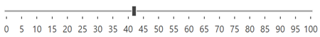
Create a TrackBar
You can specify the track bar editor’s value via the RangeBaseEdit.Value or BaseEdit.EditValue property.
<Window ...
    xmlns:dxe="http://schemas.devexpress.com/winfx/2008/xaml/editors">

<!-- Creates a default track bar with possible values from 0 to 100.
    Use the RangeBaseEdit.Value property to specify the editor's value. -->
<dxe:TrackBarEdit
    Value="42"
    TickItemDisplayMode="TickAndText"
    TickPlacement="BottomRight"/>
To respond to the editor’s value changes, handle the BaseEdit.EditValueChanged event. To check the new value’s validity, handle the BaseEdit.Validate event.
Track Bar Operation Modes
Use the BaseEdit.StyleSettings property to change the track bar editor’s operation mode. Assign this property to one of the objects listed in the table below.
Operation Mode | Settings object | Description |
|---|---|---|
Default | A scrollable control that allows end users to select a numeric value. End users can slide a small thumb along the scale, press left and right (or up and down) arrows, or rotate a mouse wheel when the editor is focused to select a new value.
| |
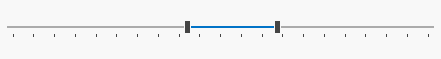
Range | A range track bar that allows end users to specify a range of values.
| |
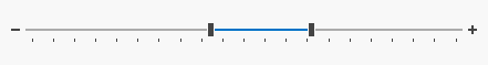
Zoom | A track bar with increment/decrement buttons.
| |
Zoom and Range | A range track bar with increment/decrement buttons.
|

Customizable Value Range
Use the TrackBarEdit‘s RangeBaseEdit.Minimum and RangeBaseEdit.Maximum properties to limit the range of accepted values.
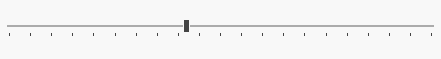
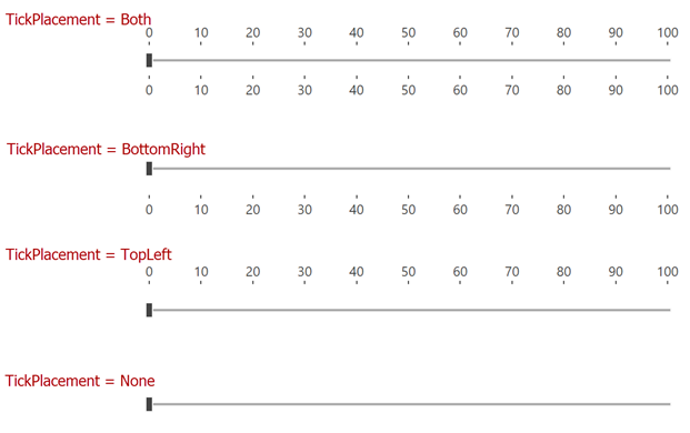
Scale Customization
Use the TrackBarEdit.TickPlacement property to specify the tick position. The TrackBarEdit.TickFrequency property specifies the distance between ticks.
The TrackBarEdit control can display a custom set of ticks and steps. You can define custom ticks and steps with the TrackBarEdit.Ticks and TrackBarEdit.Steps properties.
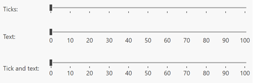
Tick Item Customization
Use the TickItemDisplayMode property to specify how track bar ticks are displayed: as text, a tick, or a tick with text:
You can apply a format string to the text displayed within ticks with the TickItemStringFormat property.
To change the tick appearance, use the following API:
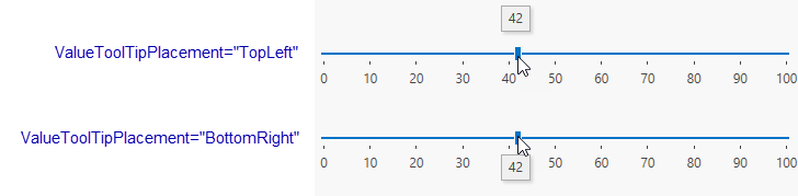
Value Tooltip
If the ValueToolTipPlacement property is set to TopLeft or BottomRight, the value tooltip is displayed when an end user moves the track bar thumb (the user drags the thumb with a mouse pointer or presses the right or left arrow key).
To disable value tooltips, set the ValueToolTipPlacement property to None.
The ValueToolTipContentTemplate property allows you to specify the value tooltip’s content template.
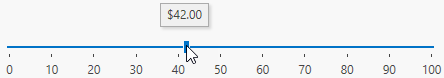
Format Value Tooltip
To format the text displayed within the value tooltip, use the ValueToolTipStringFormat property.
<dxe:TrackBarEdit
    TickFrequency="10"
    TickItemDisplayMode="TickAndText"
    ValueToolTipPlacement="TopLeft"
    ValueToolTipStringFormat="c2"/>
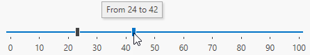
To format the range tooltip, you can use the ValueToolTipContentTemplate property. When the track bar is in the Range edit mode, the ValueToolTipContentTemplate‘s data context is an object of the TrackBarEditRange type.
The code sample below demonstrates how to format the tooltip that displays the selected range:
<dxe:TrackBarEdit
    TickFrequency="10"
    TickItemDisplayMode="TickAndText"
    ValueToolTipPlacement="TopLeft">
    <dxe:TrackBarEdit.ValueToolTipContentTemplate>
        <!-- The data context is an object of DevExpress.Xpf.Editors.TrackBarEditRange type. -->
        <DataTemplate>
            <TextBlock Text="{DXBinding '`From ` + SelectionStart + ` to ` + SelectionEnd'}" />
        </DataTemplate>
    </dxe:TrackBarEdit.ValueToolTipContentTemplate>
    <dxe:TrackBarEdit.StyleSettings>
        <dxe:TrackBarRangeStyleSettings />
    </dxe:TrackBarEdit.StyleSettings>
</dxe:TrackBarEdit>
Tip
The code sample above uses DXBinding.
Appearance Customization
Track Height/Width
Use the TrackHeight property to specify the TrackBar height when the TrackBar’s Orientation is Horizontal.
Use the TrackWidth property to specify the TrackBar width when the TrackBar’s Orientation is Vertical.
Track and Thumb
Use the following properties to specify the TrackBarEdit appearance:
| Property | Description |
|---|---|
| NearTrackStyle | Track bar style on the left side of the TrackBar thumb. |
| FarTrackStyle | Track bar style on the right side of the TrackBar thumb. |
| ThumbStyle | Thumb style. |

Range Mode TrackBar
Use the following properties to specify the TrackBarEdit appearance when the TrackBarEdit is in the Range Mode:
| Property | Description |
|---|---|
| TrackBarRangeStyleSettings.NearThumbStyle | TrackBarEdit’s left thumb style. |
| TrackBarRangeStyleSettings.FarThumbStyle | TrackBarEdit’s right thumb style. |
| TrackBarRangeStyleSettings.SelectedRangeBackgroundStyle | TrackBarEdit’s selected range style. |

Zoom Mode TrackBar
Use the following properties to specify the TrackBarEdit appearance when the TrackBarEdit is in the Zoom Mode:
| Property | Description |
|---|---|
| TrackBarZoomStyleSettings.DecrementButtonStyle | TrackBarEdit’s decrement button style. |
| TrackBarZoomStyleSettings.IncrementButtonStyle | TrackBarEdit’s increment button style. |
TrackBar Zoom Range Mode
Use the following properties to specify the TrackBarEdit appearance when the TrackBarEdit is in the Zoom and Range Mode:
| Property | Description |
|---|---|
| TrackBarZoomRangeStyleSettings.DecrementButtonStyle | TrackBarEdit’s decrement button style. |
| TrackBarZoomRangeStyleSettings.IncrementButtonStyle | TrackBarEdit’s increment button style. |
| TrackBarEdit.ThumbStyle | TrackBarEdit’s thumb style. |

Related GitHub Examples
The following code snippets (auto-collected from DevExpress Examples) contain references to the TrackBarEdit class.
Note
The algorithm used to collect these code examples remains a work in progress. Accordingly, the links and snippets below may produce inaccurate results. If you encounter an issue with code examples below, please use the feedback form on this page to report the issue.