DateEdit Class
A date editor with a dropdown calendar.
Namespace: DevExpress.Xpf.Editors
Assembly: DevExpress.Xpf.Core.v20.2.dll
NuGet Packages: DevExpress.WindowsDesktop.Wpf.Core, DevExpress.Wpf.Core
Declaration
Remarks
The DateEdit‘s drop-down window displays a single-month calendar that allows end users to select dates, and navigate through months and years. Use a drop-down editor to select a date, or enter the date into the text box to change the editor’s edit value.
Tip
The CheckEdit class inherits its features from the PopupBaseEdit class.
Refer to the PopupBaseEdit class description for information on derived features and API.
Create a DateEdit
Drag a DateEdit from the Toolbox to add a standalone DateEdit to a Window.
The following sample creates a DateEdit with XAML markup:
<Window ...
  xmlns:dxe="http://schemas.devexpress.com/winfx/2008/xaml/editors">
  <Grid>
    <dxe:DateEdit>
      <dxe:DateEdit.StyleSettings>
        <dxe:DateEditNavigatorStyleSettings/>
      </dxe:DateEdit.StyleSettings>
    </dxe:DateEdit>
  </Grid>
</Window>
Editor Value
Use the DateEdit.DateTime (and the editor’s BaseEdit.EditValue) property to specify the selected date. When you change the property, the BaseEdit.EditValueChanged event is raised. You can specify the minimal and maximal allowed dates with the DateEdit.MinValue and DateEdit.MaxValue properties.
Tip
Use the editor’s BaseEdit.EditValue property to get or set the editor value instead of the DateEdit.DateTime property when you need to set the editor value to null or validate the editor value.
DateEdit Modes
The DateEdit supports the following operation modes.
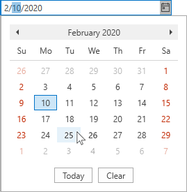
Calendar
A standard calendar date editor.
Settings object: DateEditCalendarStyleSettings
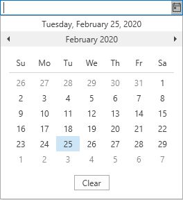
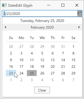
Date Navigator (Outlook-Inspired)
An Outlook-inspired calendar date editor. This is the default mode.
Settings object: DateEditNavigatorStyleSettings
Date Picker
A date picker inspired by Windows Store applications.
Settings object: DateEditPickerStyleSettings

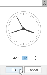
Time Editor
A date edit with a time picker.
Settings object: DateEditTimePickerStyleSettings
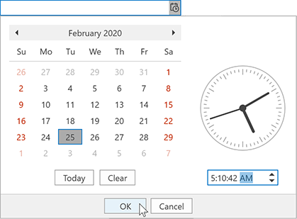
Date and Time Editor
A date edit with an Outlook-inspired calendar and a time picker.
Settings object: DateEditNavigatorWithTimePickerStyleSettings
Drop-Down Button Glyph
Each DateEdit Mode has a predefined drop-down button glyph. Use the DateEditStyleSettingsBase.GlyphKind property to choose a drop-down button glyph.
Tip
The Date, DateAndTime, and Time predefined button glyphs are available only in the following themes:
The Arrow predefined button glyph is available in all DevExpress Themes.
Calendar Appearance
You can use the following properties to specify whether the element is displayed in the popup calendar:

| Item | Property |
|---|---|
| Clear Button | ShowClearButton |
| Today Button | ShowToday |
| Week Numbers | ShowWeekNumbers |
Optimized for In-Place Editing
You can use the DateEdit control as an in-place editor nested in a container control. Use the DateEditSettings class to embed a DateEdit into a container control.
Refer to the Assign Editors to Cells topic for more information.
Related GitHub Examples
The following code snippets (auto-collected from DevExpress Examples) contain references to the DateEdit class.
Note
The algorithm used to collect these code examples remains a work in progress. Accordingly, the links and snippets below may produce inaccurate results. If you encounter an issue with code examples below, please use the feedback form on this page to report the issue.