Column Header Customization
- 3 minutes to read
A column header identifies a column, displays the column’s caption and enables an end-user to move and resize the column, apply sorting and filtering, etc.
Specify the DataViewBase.ShowColumnHeaders property to show/hide column headers in the current GridControl’s view.
This topic consists of the following sections:
- Customize Header Elements
- Specify Header Style
- Customize Header Layout
- Printing Styles And Templates
- Examples
Customize Header Elements
The image below shows elements that a column header can contain:
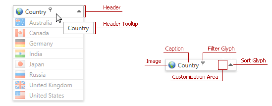
The following table lists column header’s elements and contains the corresponding references to customization approaches:
| Header Element | Description | Customization |
|---|---|---|
| Header Caption | Identifies column content. | Header Content Customization |
| Header Image | Provides graphical information about column content. | Header Image Customization |
| Customization Area | Allows you to display custom content within a column header. | Using Customization Area |
| Header Tooltip | Displayed when an end-user hovers the mouse pointer over the column header. | Header Tooltip Customization |
| Filter and Sort Glyphs | Enable end-users to filter and sort column values. | Inner Column Header Template Customization |
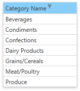
Specify Header Style
This section describes how to customize column header’s appearance. For instance, the following image shows a grid column whose header is blue and the filter button is always shown:
Use the BaseColumn.HeaderStyle property to specify a header style. The target element for this style is the BaseGridHeader class. The code sample below demonstrates how to use this style:
<dxg:GridColumn FieldName="CategoryName">
   <dxg:GridColumn.HeaderStyle>
      <Style TargetType="dxg:BaseGridHeader">
         <Setter Property="dxg:BaseGridColumnHeader.ShowFilterButtonOnHover" Value="False" />
         <Setter Property="Background" Value="LightSkyBlue" />
      </Style>
   </dxg:GridColumn.HeaderStyle>
</dxg:GridColumn>
The following code shows how to specify the style for all column headers within the current GridControl’s view:
<dx:ThemedWindow.Resources>
   <Style TargetType="dxg:GridColumnHeader">
      <Setter Property="dxg:BaseGridColumnHeader.ShowFilterButtonOnHover" Value="False" />
      <Setter Property="Background" Value="LightSkyBlue" />
   </Style>
</dx:ThemedWindow.Resources>
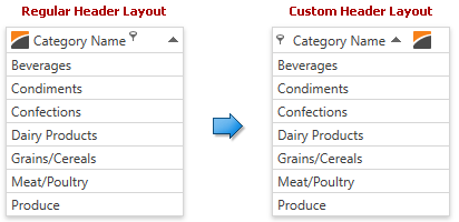
Customize Header Layout
You can customize a column header layout to rearrange its elements. The following image shows a layout change:
The following code sample demonstrates how to rearrange column header elements as shown in the image above:
<dx:ThemedWindow.Resources>
   <ControlTemplate x:Key="{dxgt:GridColumnHeaderThemeKey ResourceKey=Layout, IsThemeIndependent=True}">
      <Grid>
         <Grid.ColumnDefinitions>
            <ColumnDefinition Width="*"></ColumnDefinition>
            <ColumnDefinition Width="4"></ColumnDefinition>
         </Grid.ColumnDefinitions>
         <StackPanel Orientation="Horizontal">
            <ContentControl Name="PART_Filter" VerticalAlignment="Center" />
            <ContentControl Name="PART_Content" VerticalAlignment="Center" Margin="5,0,0,0" />
            <dxg:SortIndicatorControl Name="PART_SortIndicator" Visibility="Collapsed" />
            <Image Source="{Binding Image}" Margin="10,4,0,4" />
         </StackPanel>
         <dxg:GridThumb Name="PART_Thumb" Cursor="SizeWE" />
      </Grid>
   </ControlTemplate>
</dx:ThemedWindow.Resources>
Perform the following steps to customize a column header layout:
Specify a theme resource value manually by adding a template with the corresponding key to resources (the data context for this template is the BaseColumn class):
<dx:ThemedWindow.Resources>
   <ControlTemplate x:Key="{dxgt:GridColumnHeaderThemeKey ResourceKey=Layout, IsThemeIndependent=True}">
      <!---->
   </ControlTemplate>
</dx:ThemedWindow.Resources>
To specify individual themes’ appearance, create templates for each theme and set each template’s ThemeName property accordingly:
<ControlTemplate x:Key="{dxgt:GridColumnHeaderThemeKey ResourceKey=Layout,ThemeName=Office2016}">
   <!---->
</ControlTemplate>
<ControlTemplate x:Key="{dxgt:GridColumnHeaderThemeKey ResourceKey=Layout,ThemeName=MetropolisDark}">
   <!---->
</ControlTemplate>
Specify the required column header layout using panel elements (for example, StackPanel, DockPanel, Grid, etc.):
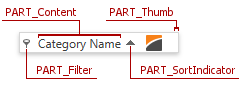
<ControlTemplate x:Key="{dxgt:GridColumnHeaderThemeKey ResourceKey=Layout, IsThemeIndependent=True}">
   <Grid>
      <!---->
   </Grid>
</ControlTemplate>
Add the required elements to the specified layout. You can use predefined elements with the following names:
- PART_Content - a column header content.
- PART_Filter - a filter button.
- PART_SortIndicator - a sort glyph.
- PART_Thumb - a thumb that is used to resize columns.
Printing Styles And Templates
Use the following printing styles and templates to customize a column header when the GridControl is printed:
- ColumnBase.PrintColumnHeaderStyle, TableView.PrintColumnHeaderStyle (or TreeListView.PrintColumnHeaderStyle)
- DataViewBase.PrintHeaderTemplate
See the How to: Use Custom Printing Templates example to learn more.