BaseColumn.HeaderStyle Property
Gets or sets the column header style. This is a dependency property.
Namespace: DevExpress.Xpf.Grid
Assembly: DevExpress.Xpf.Grid.v18.2.Core.dll
Declaration
Property Value
| Type | Description |
|---|---|
| Style | A Style object that represents the style of the column header. |
Remarks
Target Type: BaseGridHeader
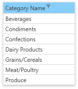
The following image shows a grid column whose header is blue and the filter button is always shown:
Use the HeaderStyle property to specify a header style. The code sample below demonstrates how to use this style:
<dxg:GridColumn FieldName="CategoryName">
   <dxg:GridColumn.HeaderStyle>
      <Style TargetType="dxg:BaseGridHeader">
         <Setter Property="dxg:BaseGridColumnHeader.ShowFilterButtonOnHover" Value="False" />
         <Setter Property="Background" Value="LightSkyBlue" />
      </Style>
   </dxg:GridColumn.HeaderStyle>
</dxg:GridColumn>
The following code shows how to specify the style for all column headers within the current GridControl’s view:
<dx:DXWindow.Resources>
   <Style TargetType="dxg:GridColumnHeader">
      <Setter Property="dxg:BaseGridColumnHeader.ShowFilterButtonOnHover" Value="False" />
      <Setter Property="Background" Value="LightSkyBlue" />
   </Style>
</dx:DXWindow.Resources>
See Also