DevExpress Presentation API: Chart Axes
- 14 minutes to read
Charts API automatically creates chart axis objects once you add a series to the chart Series collection.
Most charts have two primary axes: the argument axis (X-axis)—usually displayed horizontally at the bottom of the plot area, and the value axis (Y-axis)—usually displayed vertically on the left side of the plot area. You can also add secondary axes. Secondary axes are useful when series data ranges differ significantly.
Additionally, 3D charts include a depth axis—also called the series axis—that displays series names. Chart types, such as pie and doughnut charts, do not have axes.
To access the chart axes, use the following properties:
- Chart.ArgumentAxis
- Chart.SecondaryArgumentAxis
- Chart.ValueAxis
- Chart.SecondaryValueAxis
- Chart.SeriesAxis
If you add series before axes, the first series in the collection determines the axis type. For example, if the first series is a Bar series, the API creates a CategoryAxis object for the ArgumentAxis property. If the first series is a Scatter series, the API creates a ValueAxis object for the ArgumentAxis property.
The following table outlines the compatibility between series types and axis types:
| Series type | ArgumentAxis type | ValueAxis type | SeriesAxis |
|---|---|---|---|
| Bar, Line, Area, Column | CategoryAxis or DateAxis | ValueAxis | – |
| Scatter, Bubble | ValueAxis | ValueAxis | – |
| Surface, Bar3D | CategoryAxis or DateAxis | ValueAxis | SeriesAxis |
| Pie, Doughnut, Pie3D | – | – | – |
If you add axes before series, ensure that the series types and axis types are compatible. Otherwise, adding a series to the chart throws an InvalidOperationException.
Manage Axis Scale
Use the Axis.Scaling property to configure axis scale parameters. This property returns an AxisScaling object that provides the following scale options:
- LogBase
- Specifies the logarithmic base for the axis scale. This property is ignored if the LogScale property is set to
false. - Min | Max
- Specifies minimum and maximum values for the axis scale. Use point indexes starting with 1 for category axes and actual values for value axes.
- Orientation
- Specifies the orientation of the axis scale. Possible values:
MinMax,MaxMin.
The following code snippet specifies the minimum and maximum values for the argument axis:
using DevExpress.Docs.Presentation;
using DevExpress.Docs.Office;
//...
    CategoryAxis? axis = chart.ArgumentAxis as CategoryAxis;
    if (axis != null) {
        axis.Scaling = new AxisScaling { Min = 1, Max = 3 };
    }
Specify Tick Mark Frequency
Use CategoryAxis.TickMarkSkip/SeriesAxis.TickMarkSkip to change the interval between axis tick marks. To display a tick mark for every second or third category (or data series), set TickMarkSkip to 2 or 3, respectively. If TickMarkSkip is set to 1, the axis displays tick marks for all categories or data series.
Add Secondary Axes
If series data ranges differ significantly, you can add secondary axes to the chart and assign series to them.
Use the series AxisGroup property to assign a series to the primary or secondary axes. This property accepts values from the ChartAxisGroupType enumeration: Primary and Secondary. Multiple series of the same type in the same axis group share a single view. The Chart API creates an additional view for series assigned to the secondary axes.
The following code snippet adds two line series to the primary axes and one line series to the secondary axes:

using DevExpress.Docs.Office;
using DevExpress.Docs.Presentation;

namespace PresentationApiSample;

public class Program {
    public static async Task Main(string[] _) {

        Presentation presentation = new Presentation();

        presentation.Slides.Clear();

        Slide slide = new Slide(SlideLayoutType.Blank);
        presentation.Slides.Add(slide);

        Chart chart = new Chart();
        slide.Shapes.Add(chart);

        chart.Width = presentation.SlideSize.Width;
        chart.Height = presentation.SlideSize.Height;

        // Specify data for the chart.
        chart.Data[0, "A1"].NumericValue = 120;
        chart.Data[0, "A2"].NumericValue = 95;
        chart.Data[0, "A3"].NumericValue = 140;
        chart.Data[0, "A4"].NumericValue = 100;
        chart.Data[0, "A5"].NumericValue = 80;
        chart.Data[0, "B1"].NumericValue = 10;
        chart.Data[0, "B2"].NumericValue = 20;
        chart.Data[0, "B3"].NumericValue = 30;
        chart.Data[0, "B4"].NumericValue = 40;
        chart.Data[0, "B5"].NumericValue = 50;

        chart.Data[0, "C1"].NumericValue = 6000;
        chart.Data[0, "C2"].NumericValue = 10500;
        chart.Data[0, "C3"].NumericValue = 10000;
        chart.Data[0, "C4"].NumericValue = 7000;
        chart.Data[0, "C5"].NumericValue = 9500;

        chart.Data[0, "D1"].NumericValue = 180;
        chart.Data[0, "D2"].NumericValue = 95;
        chart.Data[0, "D3"].NumericValue = 120;
        chart.Data[0, "D4"].NumericValue = 80;
        chart.Data[0, "D5"].NumericValue = 130;

        // Add the first series to the chart.
        LineSeries series1 = new LineSeries();
        series1.Values = new ChartDataReference(sheetIndex: 0, fromCellReference: "A1", toCellReference: "A5");
        series1.Arguments = new ChartDataReference(sheetIndex: 0, fromCellReference: "B1", toCellReference: "B5");
        chart.Series.Add(series1);

        // Add the second series to the chart.
        LineSeries series2 = new LineSeries();
        series2.Values = new ChartDataReference(sheetIndex: 0, fromCellReference: "D1", toCellReference: "D5");
        series2.Arguments = new ChartDataReference(sheetIndex: 0, fromCellReference: "B1", toCellReference: "B5");
        chart.Series.Add(series2);

        // Add the third series to the chart and assign it to the secondary axes.
        LineSeries series3 = new LineSeries();
        series3.Values = new ChartDataReference(sheetIndex: 0, fromCellReference: "C1", toCellReference: "C5");
        series3.Arguments = new ChartDataReference(sheetIndex: 0, fromCellReference: "B1", toCellReference: "B5");
        series3.AxisGroup = ChartAxisGroupType.Secondary;
        chart.Series.Add(series3);

        // Remove the legend.
        chart.Legend = null;

        // Customize the primary argument axis.
        CategoryAxis? xAxis = chart.ArgumentAxis as CategoryAxis;
        if (xAxis != null) {
            xAxis.MajorTickMark = AxisTickMarkType.Cross;
            xAxis.MinorTickMark = AxisTickMarkType.Inside;
            xAxis.LabelTextProperties = new TextProperties { FontSize = 30 };
        }
        // Customize the primary value axis.
        ValueAxis? yAxis = chart.ValueAxis;
        if (yAxis != null) {
            yAxis.CrossPositionType = AxisCrossPositionType.OnTickMarks;
            yAxis.LabelTextProperties = new TextProperties { FontSize = 30 };
        }
        // Hide the secondary argument axis.
        chart.SecondaryArgumentAxis.Visible = false;

        // Customize the secondary value axis.
        ValueAxis? secYAxis = chart.SecondaryValueAxis;
        if (secYAxis != null) {
            secYAxis.Position = AxisPositionType.Right;
            secYAxis.LabelTextProperties = new TextProperties { FontSize = 30 };

        }
        // Customize data labels for the first two series.
        LineChartView lineView1 = (LineChartView)chart.Views[0];
        lineView1.DataLabels.ShowCategoryName = true;
        lineView1.DataLabels.ShowValue = true;

        // Customize data labels for the third series.
        LineChartView lineView2 = (LineChartView)chart.Views[1];
        lineView2.DataLabels.ShowValue = true;
    }
}
Customize Axis Labels
Use the axis LabelTextProperties property to customize axis label text appearance. To specify a label’s background, use the axis Fill property.
To format axis labels, initialize the axis NumberFormat property with a NumberFormatOptions object and specify the required formatting options:
If you want to keep source data formatting, set NumberFormatOptions.IsSourceLinked to
true. In this case, the API uses a cell format set by the CellValue.NumberFormat property in the underlying spreadsheet.If you want to specify a custom format, set the NumberFormatOptions.FormatCode property to a format code string. For example, use the
"$0"format code to display values as currency without decimal places.
The following code snippet formats value axis labels as currency, sets the font color to green, and changes the font size:

using DevExpress.Docs.Office;
using System.Drawing;

    ValueAxis? yAxis = chart.ValueAxis;
    if (yAxis != null) {
        //...
        yAxis.LabelTextProperties = new TextProperties { FontSize = 24, Fill = new SolidFill(Color.DarkGreen), Bold = true };
        yAxis.Fill = new SolidFill(Color.Wheat);
        yAxis.NumberFormat = new NumberFormatOptions { FormatCode = "$0" };
    }
Add and Customize Axis Titles
Use the Axis.Title property to specify the axis title. This property returns a ChartTitleOptions object that contains options used to customize the title appearance:
using DevExpress.Docs.Presentation;
using DevExpress.Docs.Office;
//...
    chart.ChartData["A1"].TextValue = "Arguments";

    CategoryAxis? axis = chart.ArgumentAxis as CategoryAxis;
    if (axis != null) {

        axis.Title = new ChartTitleOptions(new TextArea("Arguments") { Level1ParagraphProperties = new TextParagraphProperties { TextProperties = new TextProperties { Fill = new SolidFill(Color.Magenta) } } });

        // For presentation viewers other than PowerPoint,
        // you might need to specify ParagraphProperties to customize text.
        axis.Title = new ChartTitleOptions(new TextArea("Arguments") { ParagraphProperties = new TextParagraphProperties { TextProperties = new TextProperties { Fill = new SolidFill(Color.Magenta) } } });

        // If you get text from an underlying spreadsheet, use TextProperies to customize text appearance.
        axis.Title = new ChartTitleOptions(new ChartDataReference("A1"), new TextProperties { Fill = new SolidFill(Color.Magenta) });
    }
Configure Axis Position
Specify the Axis.Position property to set how the axis is aligned relative to the chart. Use AxisPositionType‘s Top and Bottom values to position horizontal axes and Left and Right values to position vertical axes.
Set Custom Axis Position
Set the Axis.CrossType property to Custom and use the Axis.CrossesAt property to specify the crossing point on the axis perpendicular to the current axis:

using DevExpress.Docs.Office;

    CategoryAxis? axis = chart.ArgumentAxis as CategoryAxis;
    if (axis != null) {
        axis.CrossType = AxisCrossType.Custom;
        axis.CrossesAt = 8;
    }
Customize Tick Marks
Use the Axis.MajorTickMark and Axis.MinorTickMark properties to specify the tick mark type for major and minor ticks. Possible values are None, Inside, Outside, and Cross:
using DevExpress.Docs.Office;

    CategoryAxis? xAxis = chart.ArgumentAxis as CategoryAxis;
    if (xAxis != null) {
        xAxis.MajorTickMark = AxisTickMarkType.Cross;
        xAxis.MinorTickMark = AxisTickMarkType.Inside;
    }
Customize Gridlines
Use an axis MajorGridlines and MinorGridlines properties to customize major and minor gridlines:
using DevExpress.Docs.Presentation;
using DevExpress.Docs.Office;

    ValueAxis? yAxis = chart.ValueAxis;
    if (yAxis != null) {
        yAxis.MajorGridlines = new ChartLineOptions { OutlineStyle = new OutlineStyle { Fill = new SolidFill(Color.DarkMagenta) } };
        yAxis.MinorGridlines = new ChartLineOptions { OutlineStyle = new OutlineStyle { Fill = new SolidFill(Color.Magenta) } };
    }
Customize Axis Style
Use the axis OutlineStyle property to customize the appearance of axis lines:
using DevExpress.Docs.Office;
using System.Drawing;

    CategoryAxis? xAxis = chart.ArgumentAxis as CategoryAxis;
    if (xAxis != null) {
        xAxis.OutlineStyle = new OutlineStyle() { Fill = new SolidFill(Color.Orange), Width = 10, DashType = LineDashType.DashDot };
    }
Display a Multilevel Category Axis
To display a multilevel category axis, specify category names for each level in the series Arguments property. The following code snippet creates a multilevel category axis with two levels:
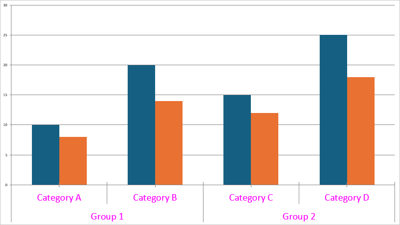
Chart chart = new Chart(0, 0, presentation.SlideSize.Width, presentation.SlideSize.Height);
slide.Shapes.Add(chart);

// Column A contains group labels (x-axis lower label row)
chart.Data[0, "A2"].TextValue = "Group 1";
// chart.Data[0, "A3"].TextValue = "Group 1";
chart.Data[0, "A4"].TextValue = "Group 2";
// chart.Data[0, "A5"].TextValue = "Group 2";

// Column B contains category labels (x-axis top label row)
chart.Data[0, "B2"].TextValue = "Category A";
chart.Data[0, "B3"].TextValue = "Category B";
chart.Data[0, "B4"].TextValue = "Category C";
chart.Data[0, "B5"].TextValue = "Category D";

// Series 1 values
chart.Data[0, "C2"].NumericValue = 10;
chart.Data[0, "C3"].NumericValue = 20;
chart.Data[0, "C4"].NumericValue = 15;
chart.Data[0, "C5"].NumericValue = 25;

// Series 2 values
chart.Data[0, "D2"].NumericValue = 8;
chart.Data[0, "D3"].NumericValue = 14;
chart.Data[0, "D4"].NumericValue = 12;
chart.Data[0, "D5"].NumericValue = 18;

// The rectangular A2:B5 cell range is used to display multi-level categories
ChartDataReference categoryRef = new ChartDataReference(0, "A2", "B5");

BarSeries series1 = new BarSeries {
    Text = "Series 1",
    Arguments = categoryRef,
    Values = new ChartDataReference(0, "C2", "C5"),
};
BarSeries series2 = new BarSeries {
    Text = "Series 2",
    Arguments = categoryRef,
    Values = new ChartDataReference(0, "D2", "D5"),
};
chart.Series.Add(series1);
chart.Series.Add(series2);

CategoryAxis categoryAxis = new CategoryAxis {
    Auto = true,
    LabelOffset = 100,
    LabelTextProperties = new TextProperties {
        FontSize = 24, Fill = new SolidFill(Color.Magenta)
    }
};
chart.ArgumentAxis = categoryAxis;