Coloring
- 4 minutes to read
The Dashboard Designer associates dimension values and measures with colors and styles to paint dashboard item elements. This topic describes how to configure color settings in the WinForms Designer.
Coloring Basics
The following concepts are common to both Desktop and Web Dashboard controls:
- Dashboard palettes
- Color Modes
- Color Schemes
- Supported Dashboard Items
- Dashboard palettes
Refer to the following topic for more information about common concepts: Coloring Basics.
Predefined Dashboard Palettes
The following palettes are available:
| Palette | Description |
|---|---|
| Default | The default palette used to color dashboard item elements. |
| Bright | Bright color accents. Optimized for users with deuteranopia and protanopia. |
| High Contrast | High visual contrast. Suitable for grayscale rendering, monochrome vision, and users with deuteranopia, protanopia, and tritanopia. |
| Warm Gradient | A Yellow-Orange-Brown palette. Optimized for grayscale rendering and users with deuteranopia, protanopia, and tritanopia. |
| Sunset | Warm sunset tones intended for values between two extremes. Optimized for users with deuteranopia and protanopia. |
| Vibrant | Vivid color contrast. Optimized for users with deuteranopia and protanopia. |
Hatch and Line Styles
For each color, you can also specify a hatch style and line style to distinguish data serieswithout relying on color:
- Line Styles
Use line styles for Chart and Range Filter dashboard items with line series.
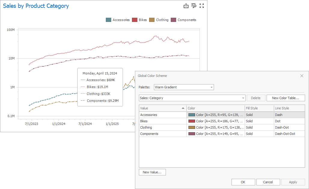
- Fill Style
Use a solid or hatch fill style for Chart dashboard items with bar and bubble series, Range Filter dashboard items with bar series, Pie, Scatter Chart, and Pie Map dashboard items.
Hatch and line styles apply only to the dashboard items and series types listed above.
Note
The dashboard uses colors from predefined palettes. For more information about changing default colors or creating a new color table, see Customizing a Color Scheme. If necessary, you can handle one of the following events to replace a palette:
Color Mode: None
You can disable default color variation for dashboard item elements.
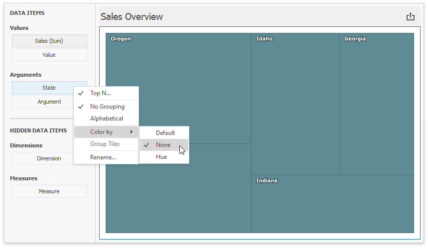
If you add a Treemap to a dashboard, individual elements (tiles) use different colors:
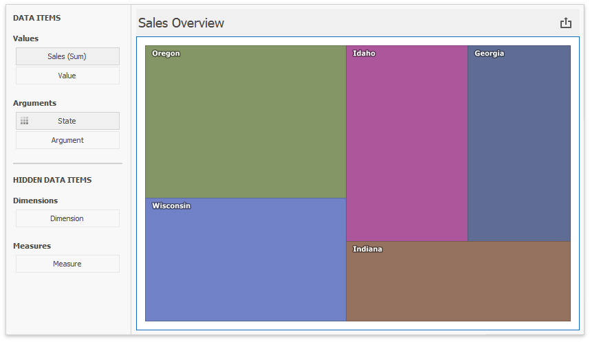
State values (Arguments) use different colors. To disable color variation, go to the Argument settings and select Color by | None.
Add a Chart with the same Argument and Value as in the Treemap:
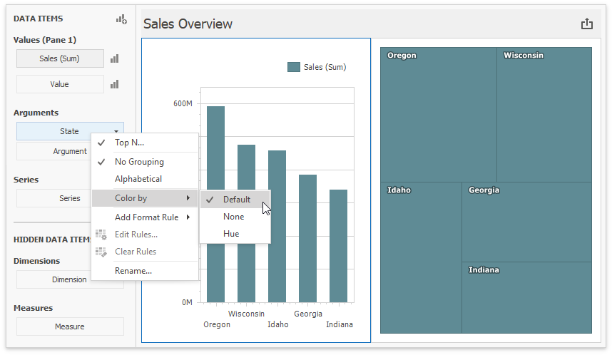
Default means None for chart arguments.
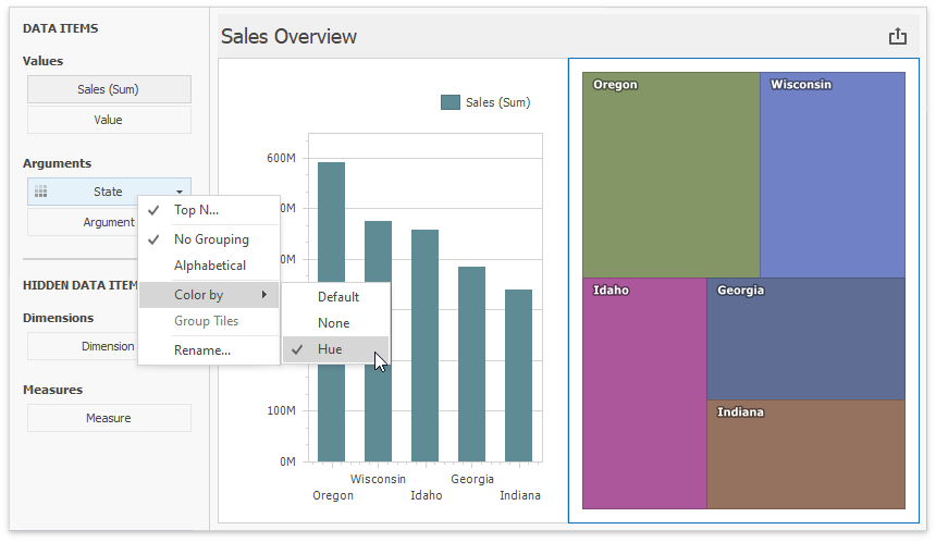
Color Mode: Hue
You can enable colors in both previously added items.
Set the Treemap’s color mode to Default or Hue:
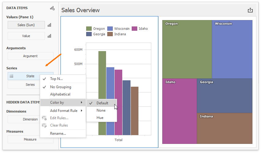
In the Chart settings, move State from Arguments to Series. Default now means Hue in this new context. The  icon on the data item shows that color variation by hue is enabled.
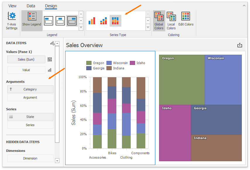
Add Category as a chart argument and switch to 100% Stacked View:
Use Global Color Scheme
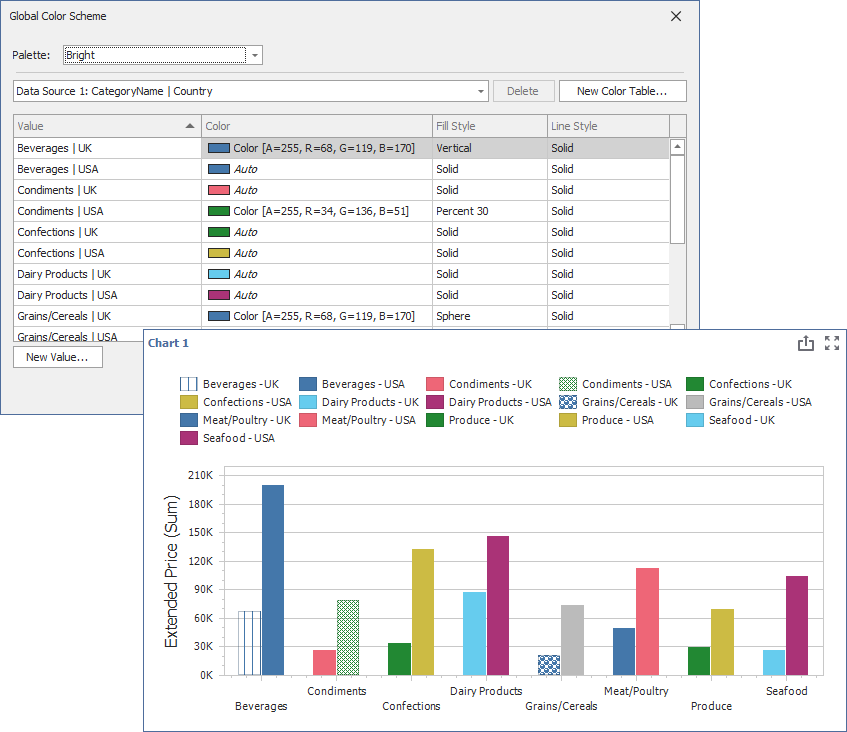
The same State data items use identical colors/styles. The dashboard constructs a Global Color Scheme for this purpose.
Add a Range Filter with the following settings:
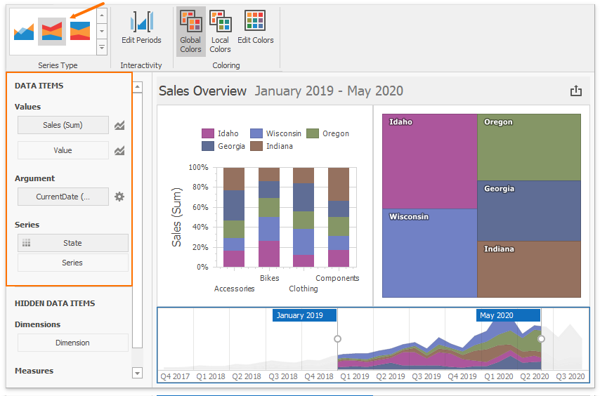
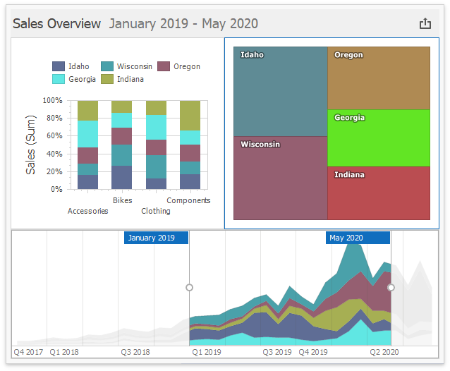
Identical colors and styles correspond to the same State values, so you can associate and compare data across all dashboard items. All items use Global Colors by default (you can toggle this in the Ribbon). Click Edit Colors to modify the colors and styles used in the palette:
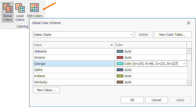
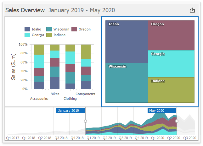
This is how the dashboard appears after you change the color/style for Georgia in the palette:
Use Local Color Scheme
If you want to use an independent set of colors and styles in the selected dashboard item, switch to the Local Color Scheme.
The Treemap’s arguments now use colors from the Local Color Scheme:
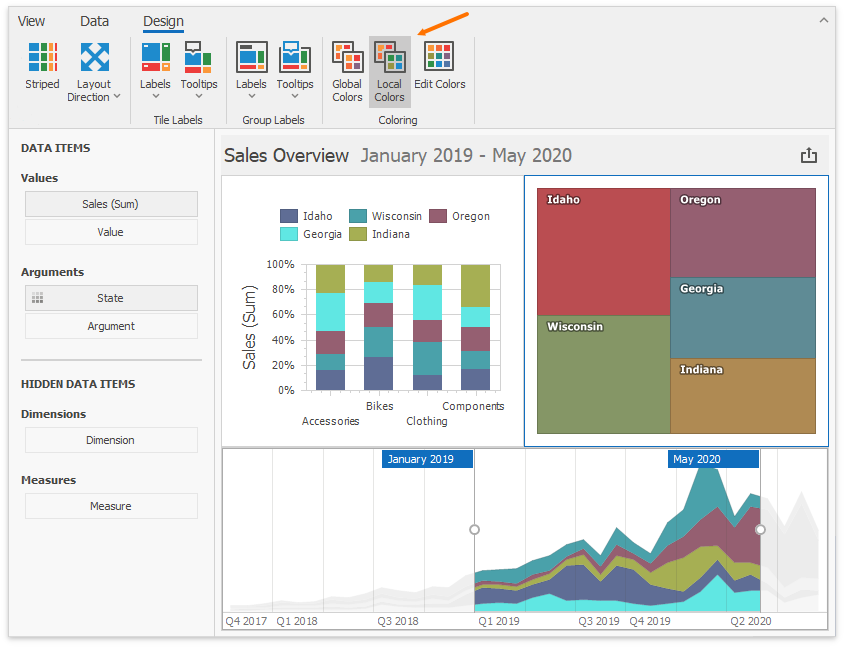
Colors modified in the local color scheme do not affect items that use the global color scheme. The following image shows the custom color for Georgia in the Treemap:
API Members
In code, use the Dimension.ColoringMode property to specify the dimension’s color mode. Use the DashboardItemColoringOptions.MeasuresColoringMode property to specify the color mode for dashboard item measures.
All dashboard items that can be painted expose the ColoringOptions property. It returns a DashboardItemColoringOptions object, which exposes the DashboardItemColoringOptions.UseGlobalColors property. Set UseGlobalColors to false to use a local color scheme.
| Dashboard Item | API | Description |
|---|---|---|
| ChartDashboardItem | ChartDashboardItemBase.ColoringOptions | Provides access to coloring options of the Chart and Pie dashboard items. |
| PieDashboardItem | ChartDashboardItemBase.ColoringOptions | Provides access to coloring options of the Chart and Pie dashboard items. |
| ScatterChartDashboardItem | ScatterChartDashboardItem.ColoringOptions | Provides access to coloring options of the Scatter Chart dashboard item. |
| PieMapDashboardItem | PieMapDashboardItem.ColoringOptions | Provides access to coloring options of the Pie Map dashboard item. |
| RangeFilterDashboardItem | RangeFilterDashboardItem.ColoringOptions | Provides access to coloring options of the Range Filter dashboard item. |
| TreemapDashboardItem | TreemapDashboardItem.ColoringOptions | Provides access to coloring options of the Treemap dashboard item. |
Related Classes
| Name | Description |
|---|---|
| DashboardItemColoringOptions | Contains dashboard item coloring options. |
| ColorScheme | A color scheme used to color dashboard item elements. |
Dashboard Item Color Mode Specifics
- Chart - Coloring
- Scatter Chart - Coloring
- Pie - Coloring
- Pie Map - Coloring
- Range Filter - Coloring
- Treemap - Coloring
How to Customize a Color Scheme
Refer to the following topic for more information on how to customize a color scheme: