IconStatic Class
Contains icon identifiers/names that specify a theme, outline/fill style, color composition, and size attributes. Use this class to display static icons (that remain unchanged regardless of the current theme or UI settings).
Namespace: DevExpress.Images.Blazor
Assembly: DevExpress.Images.Blazor.v26.1.dll
Declaration
public static class IconStaticRemarks
DevExpress Blazor components can display predefined icons from the DevExpress Icon Library.
Important
The DevExpress Icon Library is currently available as a community technology preview (CTP).
Explore Icons
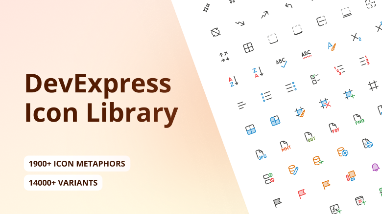
The DevExpress Icon Library includes over 13,000 icons designed to address a variety of UI requirements. Icons are categorized by the following attributes:
- Set: Fluent, Desktop Classic, Blazor Classic
- Style: Regular, Light, Filled
- Color: Multicolor, Monochrome
- Size: 12, 16, 20, 24, 28, 32, 48
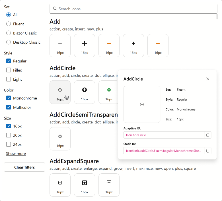
You can browse available icons in the Icon Explorer demo. The demo includes the following capabilities:
- Find icons by name or associated tag using the built-in search panel.
- Filter icons by attribute.
- Display detailed icon information (including API identifiers that you can copy directly into code).
To view the Icon Explorer demo locally, open the DevExpress product installation folder, run the Demo Center, and proceed to Icon Library → Icon Explorer.
Use Icons
To incorporate icons from the DevExpress Icon Library into a Blazor application, install the DevExpress.Images.Blazor NuGet package and register the corresponding namespace in the _Imports.razor file:
@using DevExpress.Images.Blazor
You can assign icons to Blazor components using their IconUrl properties (such as DxAccordionItem.IconUrl or DxRibbonItem.IconUrl).
Note
DxMap.MarkerIconUrl and DxMapMarker.IconUrl properties do not support the DevExpress Icon Library.
Based on the way you reference an icon, Blazor components can display adaptive or static icons.
- Adaptive Icons
Assign icons by their adaptive identifiers, also called metaphors. These identifiers include only icon names and do not specify size or style. The framework automatically selects the appropriate icon version based on the current theme and UI settings.
Example:
IconUrl="@Icon.Cancel"Static IconsAssign icons using full identifiers that specify the theme set, style, color, and size. Unlike adaptive icons, static icons do not change based on the theme or UI settings.
Example:
IconUrl="@IconStatic.Cancel.Fluent.Regular.Multicolor.Size16"
Display Static Icons
To display static icons in Blazor components, use the IconStatic class and specify icon attributes as needs dictate.
The following code snippet uses full icon identifiers to assign static icons to DevExpress Blazor Button components:
<DxButton RenderStyle="@ButtonRenderStyle.Primary"
          Text="Accept"
          IconUrl="@IconStatic.CheckmarkCircle.BlazorClassic.Regular.Monochrome.Size16"/>
<DxButton RenderStyle="@ButtonRenderStyle.Secondary"
          Text="Cancel"
          IconUrl="@IconStatic.Cancel.Fluent.Regular.Multicolor.Size16"/>
<DxButton RenderStyle="@ButtonRenderStyle.Info"
          Text="Help"
          IconUrl="@IconStatic.QuestionCircle.Fluent.Filled.Monochrome.Size20"/>
<DxButton RenderStyle="@ButtonRenderStyle.Link"
          Text="Delete"
          IconUrl="@IconStatic.Delete.Fluent.Filled.Multicolor.Size16"/>