DxEditorDropDownButtonBase.Focusable Property
Includes a drop-down button in the page’s tab sequence.
Namespace: DevExpress.Blazor.Base
Assembly: DevExpress.Blazor.v26.1.dll
Declaration
[DefaultValue(false)]
[Parameter]
public override bool Focusable { get; set; }
Property Value
| Type | Default | Description |
|---|---|---|
| Boolean | false |
|
Remarks
You can make drop-down buttons focusable (set the Focusable property to true). In this case, buttons are included in the page’s tab sequence, and users can access them with a keyboard:
- Tab / Shift+Tab: Move focus through focusable elements on the page (including buttons).
- Enter / Space: Invoke a click event handler for a focused button.
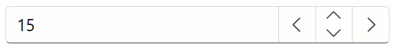
The following code makes Date Editor’s drop-down button focusable:
<DxDateEdit @bind-Date="@DateTimeValue"
            @bind-DropDownVisible="@CalendarVisible"
            ShowDropDownButton="false"
            CssClass="editor-width">
    <Buttons>
        <DxEditorButton IconCssClass="editor-icon editor-icon-chevron-left-small"
                        Tooltip="Previous Date"
                        Position="@EditorButtonPosition.Left"
                        Focusable="true"
                        Click="@(_ => OnChangeDayButtonClick(false))" />
        <DxEditorButton IconCssClass="editor-icon editor-icon-chevron-right-small"
                        Tooltip="Next Date"
                        Position="@EditorButtonPosition.Right"
                        Focusable="@true"
                        Click="@(_ => OnChangeDayButtonClick(true))" />
        <DxDateEditDropDownButton Focusable="true" />
    </Buttons>
</DxDateEdit>

@code {
    DateTime DateTimeValue { get; set; } = DateTime.Today;
    bool CalendarVisible { get; set; }

    void OnChangeDayButtonClick(bool isAdd) {
        CalendarVisible = false;
        DateTimeValue = DateTimeValue.AddDays(isAdd ? 1 : -1);
    }
}
Refer to Command Buttons for additional information on how to customize command buttons in DevExpress Blazor Editors.
See Also