Icons
- 3 minutes to read
You can assign icons to different DevExpress Blazor components. For example, assign icons to series legend items in a Chart, nodes in a Tree View, items in a Toolbar, and so on.
You can assign the icon as a URL or CSS class if you use predefined sets such as the DevExtreme Icon Library, Iconic, or Bootstrap-recommended libraries. DevExpress Blazor components also support custom icon libraries.
Note
Microsoft’s Blazor App template includes the Iconic library. To learn more about this template, see the following topic: Microsoft Templates (NuGet Packages).
Use the IconUrl property to specify a URL for an icon in the following navigation components:
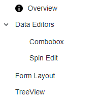
Specify the IconCssClass property to change the appearance of the icon specified by the IconUrl property. The example below shows how to assign an icon to a toolbar item and specify its size:
<style>
    .my-style {
        width: 15px;
    }
</style>

<DxTreeView>
    <Nodes>
        <DxTreeViewNode Name="Overview"
                        Text="Overview"
                        NavigateUrl="https://demos.devexpress.com/blazor/"
                        IconUrl="images/Info.svg"
                        IconCssClass="my-style" />
        <DxTreeViewNode Name="Editors" Text="Data Editors" Expanded="true">
            <Nodes>
                <DxTreeViewNode Text="Combobox" NavigateUrl="https://demos.devexpress.com/blazor/ComboBox" />
                <DxTreeViewNode Text="Spin Edit" NavigateUrl="https://demos.devexpress.com/blazor/SpinEdit" />
            </Nodes>
        </DxTreeViewNode>
        <DxTreeViewNode Name="FormLayout" Text="Form Layout" NavigateUrl="https://demos.devexpress.com/blazor/FormLayout" />
        <DxTreeViewNode Name="TreeView" Text="TreeView" NavigateUrl="https://demos.devexpress.com/blazor/TreeView" />
    </Nodes>
</DxTreeView>
For other components or when you can assign an icon as a CSS class, use the IconCssClass property. The code below demonstrates how to assign Iconic icons to Toolbar items:
<div class="card p-2 bg-transparent">
    <DxToolbar>
        <DxToolbarItem Text="Item" />
        <DxToolbarItem Text="Link to the next demo"
                       NavigateUrl="https://demos.devexpress.com/blazor/Toolbar#DropDown" />
        <DxToolbarItem BeginGroup="true" IconCssClass="oi oi-align-left" />
        <DxToolbarItem IconCssClass="oi oi-align-center" />
        <DxToolbarItem IconCssClass="oi oi-align-right" />
        <DxToolbarItem IconCssClass="oi oi-cog"
                       Alignment="ToolbarItemAlignment.Right"
                       BeginGroup="true" />
        <DxToolbarItem Text="About" IconCssClass="oi oi-info" />
    </DxToolbar>
</div>

DevExtreme Icon Library
DevExtreme includes SVG and font icons for all DevExtreme themes. You can find all available icons in the following topic: DevExtreme Icons.
Add a link to one of the DevExtreme themes in the _Layout.cshtml file to access the icon set. Specify dx-icon-<icon-name> as the IconCssClass property value, where icon-name is the name of the icon you want to use.
The example below shows how to assign DevExtreme icons to Toolbar items:
<div class="card p-2 bg-transparent">
    <DxToolbar>
        <DxToolbarItem Text="Item" />
        <DxToolbarItem Text="Link to the next demo"
                       NavigateUrl="https://demos.devexpress.com/blazor/Toolbar#DropDown" />
        <DxToolbarItem BeginGroup="true" IconCssClass="dx-icon-alignleft" />
        <DxToolbarItem IconCssClass="dx-icon-aligncenter" />
        <DxToolbarItem IconCssClass="dx-icon-alignright" />
        <DxToolbarItem IconCssClass="dx-icon-preferences"
                       Alignment="ToolbarItemAlignment.Right"
                       BeginGroup="true" />
        <DxToolbarItem Text="About" IconCssClass="dx-icon-info" />
    </DxToolbar>
</div>