Themes
- 9 minutes to read
The DevExpress.Blazor.Themes NuGet package contains the following Blazor application stylesheets:
- Four built-in DevExpress themes
- A stylesheet that allows you to apply Bootstrap-based themes to DevExpress Blazor components
Locate the Code that Sets the Theme
The code that sets the theme is always in the same place. The location does not depend on whether your application uses a DevExpress theme or the standard Bootstrap theme. The theme’s stylesheet is linked in the <head> section of the following files:
- In the Pages/_Layout.cshtml file for Blazor Server.
- In the wwwroot/index.html file for Blazor WebAssembly.
If you use the standard Bootstrap theme that ships with Microsoft Blazor templates or another Bootstrap-based theme, add a link to the bootstrap-external stylesheet below your theme’s stylesheet reference:
<head>
    @* For Bootstrap 5 *@
    <link rel="stylesheet" href="_content/DevExpress.Blazor.Themes/bootstrap-external.bs5.min.css" />
    @* For Bootstrap 4 *@
    <link rel="stylesheet" href="_content/DevExpress.Blazor.Themes/bootstrap-external.bs4.min.css" />
    @*...*@
</head>
To use another theme, replace the link to the theme stylesheet with a link to a DevExpress theme or third-party Bootstrap theme. You can use themes with Bootstrap v4 or v5. The Bootstrap version of the application and theme should match. Refer to the following property description for more information on how to configure the project to use Bootstrap 4: BootstrapVersion.
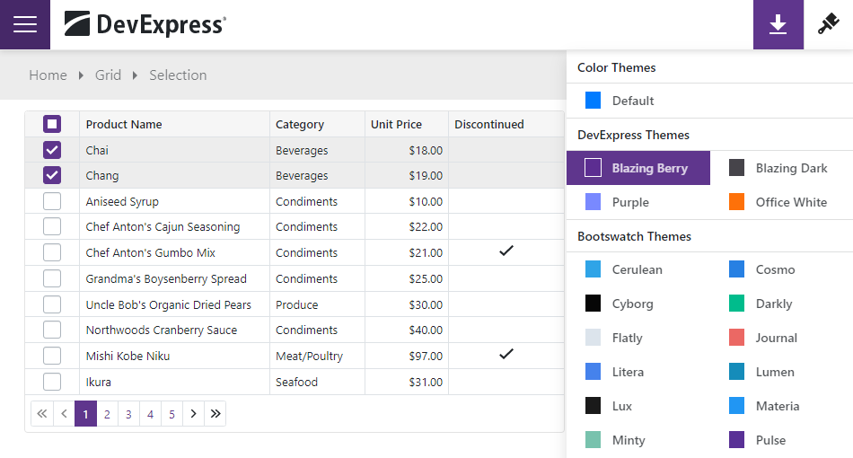
DevExpress Blazor Demos use the DevExpress Blazing Berry theme. You can select another theme in the theme switcher.
Apply a DevExpress Theme
The DevExpress.Blazor.Themes NuGet package contains the following themes:
- Blazing Berry
- Blazing Dark
- Purple
- Office White
If you installed Blazor components, you already have DevExpress themes on your machine as a DevExpress.Blazor dependency. In the layout file (_Layout.cshtml or index.html), add a link to a theme’s stylesheet before the site.css and <ProjectName>.styles.css links:
<head>
    @*...*@
    @* Bootstrap 5 *@
    <link href="_content/DevExpress.Blazor.Themes/blazing-berry.bs5.min.css" rel="stylesheet" />
    @* Bootstrap 4 *@
    <link href="_content/DevExpress.Blazor.Themes/blazing-berry.bs4.min.css" rel="stylesheet" />
    <link href="css/site.css" rel="stylesheet" />
    <link href="<ProjectName>.styles.css" rel="stylesheet" />
    @*...*@
</head>
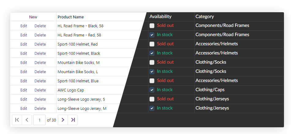
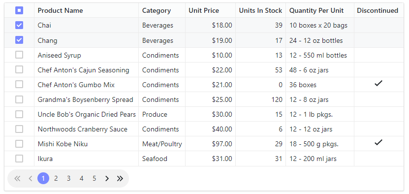
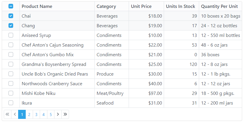
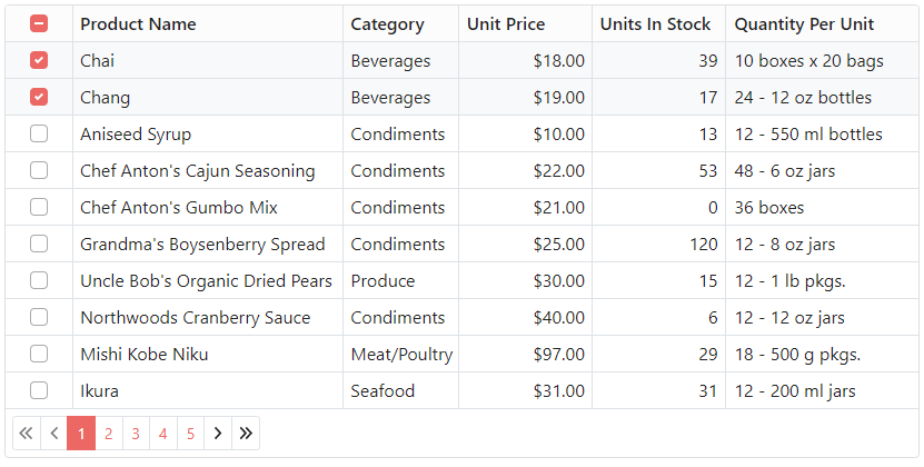
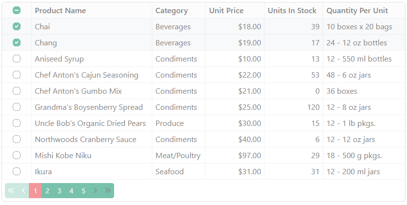
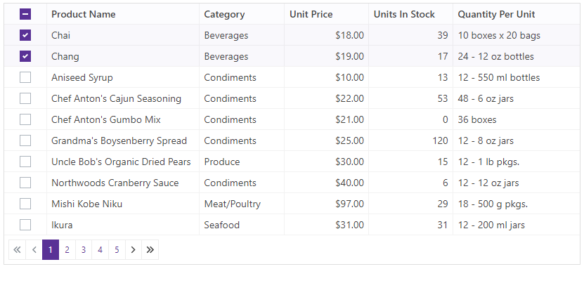
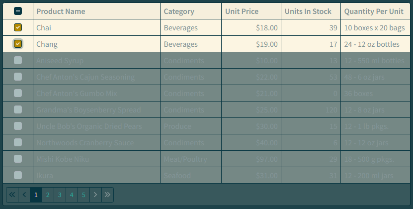
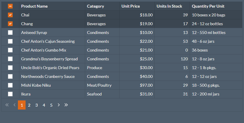
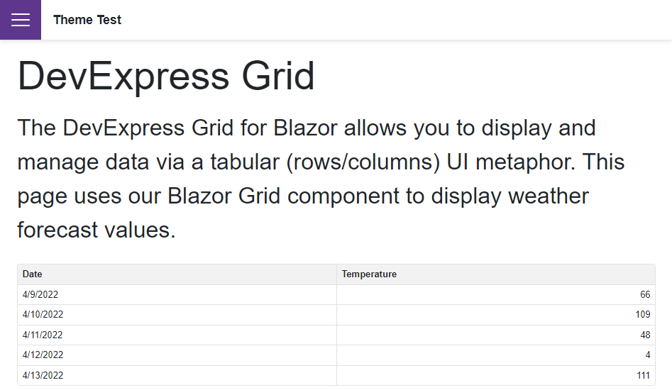
The following image gallery illustrates the Grid component with DevExpress themes:
DevExpress Blazing Berry
DevExpress Blazing Dark
DevExpress Purple
DevExpress Office White
Apply a Third-Party or Custom Bootstrap Theme
Follow the steps below to apply a Bootstrap-based theme to your application:
- Download any Bootstrap theme that uses Bootstrap 4 or 5, for instance, a free Bootswatch theme. You can also create a custom Bootstrap theme v4 or a custom theme v5.
- Copy a theme’s files to your application’s wwwroot/css folder.
- In the layout file (_Layout.cshtml or index.html), add a link to the theme’s CSS file.
- In the same file, add a link to the bootstrap-external stylesheet to apply CSS variables from Bootstrap CSS files to DevExpress Blazor components.
The code snippet below applies the Pulse Bootswatch theme:
<head>
    @*...*@
    <link rel="stylesheet" href="css/pulse/bootstrap.min.css" />
    @* bootstrap-external for Bootstrap 5 *@
    <link rel="stylesheet" href="_content/DevExpress.Blazor.Themes/bootstrap-external.bs5.min.css" />
    @* bootstrap-external for Bootstrap 4 *@
    <link rel="stylesheet" href="_content/DevExpress.Blazor.Themes/bootstrap-external.bs4.min.css" />
    @*...*@
</head>
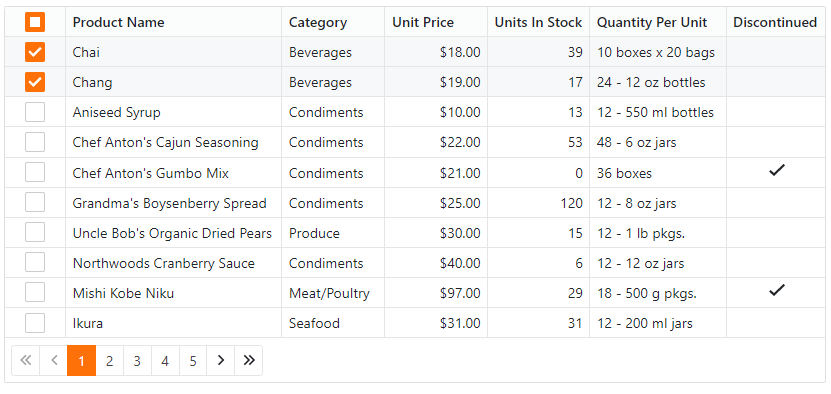
The following image gallery shows the Grid component with different Bootswatch themes:
Cerulean
Journal
Minty
Pulse
Solar
Superhero
Customize a DevExpress Theme
You can create a custom theme based on a DevExpress theme. See the sections below for instructions on how to do this.
Set Up the Environment
Install Node.js and npm if needed.
Navigate to the folder with DevExpress themes (the default path is
C:\Program Files\DevExpress XX.X\Components\Sources\DevExpress.Blazor.Themes) and execute the following command in this folder to install dependencies:npm iCreate a folder so that it is possible to access DevExpress source code with the relative path.
In this folder, execute the following command and name the package. You may skip the other package settings.
npm initThe command generates the package.json file.
Execute the following command to install the SASS dependency:
npm i sass -save-dev
Set Up the Theme Build
Create a file with the
*.scssextension, for example, scss-file-name.scss.In the package.json file, replace the Script attribute’s value with the following string:
"build": "sass ./scss-file-name.scss:<output-css-dir>/<theme-name>.css"The command creates the
<output-css-dir>folder and builds the<theme-name>stylesheet there.Open the scss-file-name.scss file and reference the DevExpress theme’s source file with the relative path, for example as follows:
@import "../../Program Files/DevExpress 22.1/Components/Sources/DevExpress.Blazor.Themes/scss/blazing-berry/blazing-berry.bs5.scss";
Customize a Theme
Open a theme’s source code. It is located in the C:/Program Files/DevExpress 22.1/Components/Sources/DevExpress.Blazor.Themes/scss folder. Find the variable whose value you want to override. For example, the
font-size-basevariable changes the default font size.Define the new variable value before the
@importstatement:$font-size-base: 2rem; @import "...";Execute the following command to build the stylesheet:
npm run build
Integrate a Custom Theme Into Your Application
Copy the stylesheet from the
<output-css-dir>folder to the wwwroot/css folder of your project.Remove the link to the old theme and include the theme stylesheet in the layout file (_Layout.cshtml or index.html) as follows:
<link rel="stylesheet" href="css/<theme-name>" />Build your project. You can now see the modified theme.
Implement a Theme Switcher
This example demonstrates how to create a Theme Switcher with the standard Bootstrap theme, 4 DevExpress themes, and custom themes.
The example passes the selected theme name as a query string in a URL and uses JavaScript Interop to preload external content for themes.
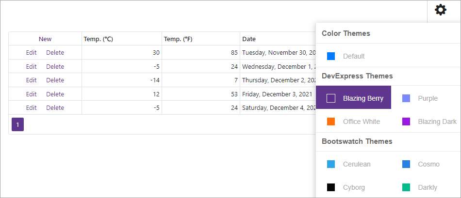
Follow the steps below to implement a Theme Switcher in your application:
Use a DevExpress Project Template to create a new Blazor Server or Blazor WebAssembly application that targets .NET 6.0.
Copy the custom theme’s resources folder to your application’s wwwroot/css folder. The image below shows an example of the folder structure:
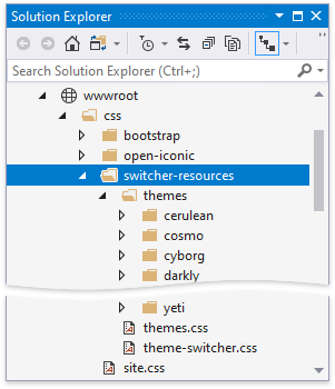
The themes folder includes nested folders whose names correspond to theme names. Each nested folder contains the theme’s stylesheet (the bootstrap.min.css file). The themes.css file contains CSS rules used to draw colored squares for each theme in the Theme Switcher. The theme-switcher.css file contains CSS rules that define the Theme Switcher’s settings and behavior.
Link the themes.css and theme-switcher.css files in the following file:
- site.css for Blazor Server
- site.css or app.css for Blazor WebAssembly, depending on the application template used.
@import url('switcher-resources/themes.css');
@import url('switcher-resources/theme-switcher.css');
// ...
Create the Utils.cs file in the Shared folder and list DevExpress themes that you want to switch between.
namespace switcher.Shared {
    public static class Utils {
        public static readonly string[] DevExpressThemes = { "blazing-berry", "purple", "office-white", "blazing-dark" };

    }
}
In the same folder, create the ThemeItem.cs file and define a type to store each theme’s name and a URL to the corresponding bootstrap.min.css file.
using System;
namespace switcher.Shared {
    public record ThemeItem(string Name, string[] StylesheetLinkUrl) {
        public static readonly ThemeItem Default = Create("default");
        public static ThemeItem Create(string name) {

            if (Utils.DevExpressThemes.Contains(name))
                return new ThemeItem(name, new[] { $"_content/DevExpress.Blazor.Themes/{name}.bs5.min.css" });
            return new ThemeItem(name, new[] { "_content/DevExpress.Blazor.Themes/bootstrap-external.bs5.min.css", $"css/switcher-resources/themes/{name}/bootstrap.min.css" });
        }
    };
}
Create a new ThemeSwitcherSideView.razor component in the same folder and declare the following:
- Variables that specify the theme selector panel’s visibility (
Visible) and the current theme’s URL (ActiveTheme). - Event callbacks (
VisibleChangedandActiveThemeChanged) that update the parent component state when you select another theme. Refer to the Microsoft documentation for more information: Binding with Component Parameters. - A theme collection to store all themes in the switcher (
GroupedThemes).
@code { static readonly Dictionary<string, string[]> GroupedThemes = new() { ["Color Themes"] = new[] { "default" }, ["DevExpress Themes"] = Utils.DevExpressThemes, ["Bootswatch Themes"] = new[] { "cerulean", "cosmo", "cyborg", "darkly", "flatly", "journal", "litera", "lumen", "lux", "materia", "minty", "pulse", "sandstone", "simplex", "sketchy", "slate", "solar", "spacelab", "superhero", "united", "yeti" } }; [Parameter] public bool Visible { get; set; } [Parameter] public EventCallback<bool> VisibleChanged { get; set; } [Parameter] public ThemeItem ActiveTheme { get; set; } [Parameter] public EventCallback<ThemeItem> ActiveThemeChanged { get; set; } @* ... *@ }- Variables that specify the theme selector panel’s visibility (
Add the sidebar’s layout to display icons for all themes in the
GroupedThemescollection:@if (Visible) { <nav id="themesMenu"> <ul class="nav nav-pills"> @foreach (var themeSet in GroupedThemes) { <li class="nav-item theme-group">@themeSet.Key</li> @foreach (var theme in themeSet.Value) { <li class="nav-item"> <a class="nav-link @(ActiveTheme.Name == theme ? "active" : "") " href="#" @onclick=@(async(e) => await OnItemClick(theme)) @onclick:preventDefault> <span class="image @theme.ToLower().Replace(" ", "-")" aria-hidden="true"></span> <span class="theme-name">@theme</span> </a> </li> } } </ul> </nav> }Handle the active theme changes. The snippet below uses JSInterop to fetch external resources when you click a theme tile:
@inject IJSRuntime JSRuntime
@* ... *@
@code {
@* ... *@
    [Parameter] public bool Visible { get; set; }
    [Parameter] public EventCallback<bool> VisibleChanged { get; set; }
    [Parameter] public ThemeItem ActiveTheme { get; set; }
    [Parameter] public EventCallback<ThemeItem> ActiveThemeChanged { get; set; }
    async Task OnItemClick(string theme) {
        if (ActiveTheme.Name != theme) {
            var themeItem = ThemeItem.Create(theme);
            foreach (string stylesheetLinkUrl in themeItem.StylesheetLinkUrl)
                await JSRuntime.InvokeVoidAsync("fetch", stylesheetLinkUrl, new {
                    method = "GET",
                    mode = "no-cors"
                });
            await Task.WhenAll(
                ActiveThemeChanged.InvokeAsync(themeItem),
                VisibleChanged.InvokeAsync(false)
            );
        }
    }
}
Create the ThemeSwitcherToggleButton.razor component in the Shared folder. Declare the
Activevariable andActiveChangedevent callback to allow data binding. Add the toggle button’s HTML markup that reflects theActivevariable’s value and invokes theActiveChangedevent callback when you click the button.<div align="right" class="theme-settings @Active"> <a class="nav-item nav-link" @onclick="@OnClick" @onclick:preventDefault href="#"> <span class="oi oi-cog"></span> </a> </div> @code { [Parameter] public bool Active { get; set; } [Parameter] public EventCallback<bool> ActiveChanged { get; set; } async Task OnClick() { await ActiveChanged.InvokeAsync(!Active); } }Define the Theme Switcher UI in HTML markup in the MainLayout.razor file. The component uses two-way binding to bind the link to the active theme. Use the
@keydirective attribute to guarantee preservation of elements or components based on the key’s value.@inherits LayoutComponentBase <HeadContent> @foreach(var item in _activeTheme.StylesheetLinkUrl) { <link href="@item" rel="stylesheet" /> } @{if(_activeTheme.StylesheetLinkUrl.Contains("slate")) { <style> .dxbs-gridview { --selection-bg: rgba(255, 255, 255, 0.075) !important; } </style> } } </HeadContent> <div class="main"> <ThemeSwitcherToggleButton @bind-Active=@_themeSwitcherShown /> <div id="settingsbar" class="@(_themeSwitcherShown ? "" : "hidden-settings-bar")"> <ThemeSwitcherSideView @bind-ActiveTheme="@_activeTheme" @bind-Visible="@_themeSwitcherShown" /> </div> <div class="content px-4" @key=@_activeTheme> @Body </div> </div> @code { bool _themeSwitcherShown = false; ThemeItem _activeTheme = ThemeItem.Default; }For Blazor server, remove the default theme’s stylesheet (
<link href="_content/DevExpress.Blazor.Themes/{your-default-theme-name}.bs5.css" rel="stylesheet" />) from the<head>section of the _Layout.cshtml file.Open the Index.razor file and add the DxGrid component.
@page "/"
@using switcher.Data
@inject WeatherForecastService ForecastService

<DxGrid Data="@forecasts"
        PageSize="5"
        ShowFilterRow="false">
    <Columns>
        <DxGridCommandColumn Width="150px"></DxGridCommandColumn>
        <DxGridDataColumn FieldName="@nameof(WeatherForecast.TemperatureC)" Caption="@("Temp. (\x2103)")" TextAlignment="@GridTextAlignment.Right"></DxGridDataColumn>
        <DxGridDataColumn FieldName="@nameof(WeatherForecast.TemperatureF)" Caption="@("Temp. (\x2109)")"></DxGridDataColumn>
        <DxGridDataColumn FieldName="@nameof(WeatherForecast.Date)" DisplayFormat="D"></DxGridDataColumn>
    </Columns>
</DxGrid>

@code {
    object[] forecasts;
    protected override async Task OnInitializedAsync() {
        forecasts = await ForecastService.GetForecastAsync(DateTime.Now);
        System.Threading.Thread.Sleep(3000);
    }
}
The example code relies on the HeadOutlet component. Refer to the following Microsoft article for information about this component in Blazor Server and WASM applications: HeadOutlet Component.