Card View
- 4 minutes to read
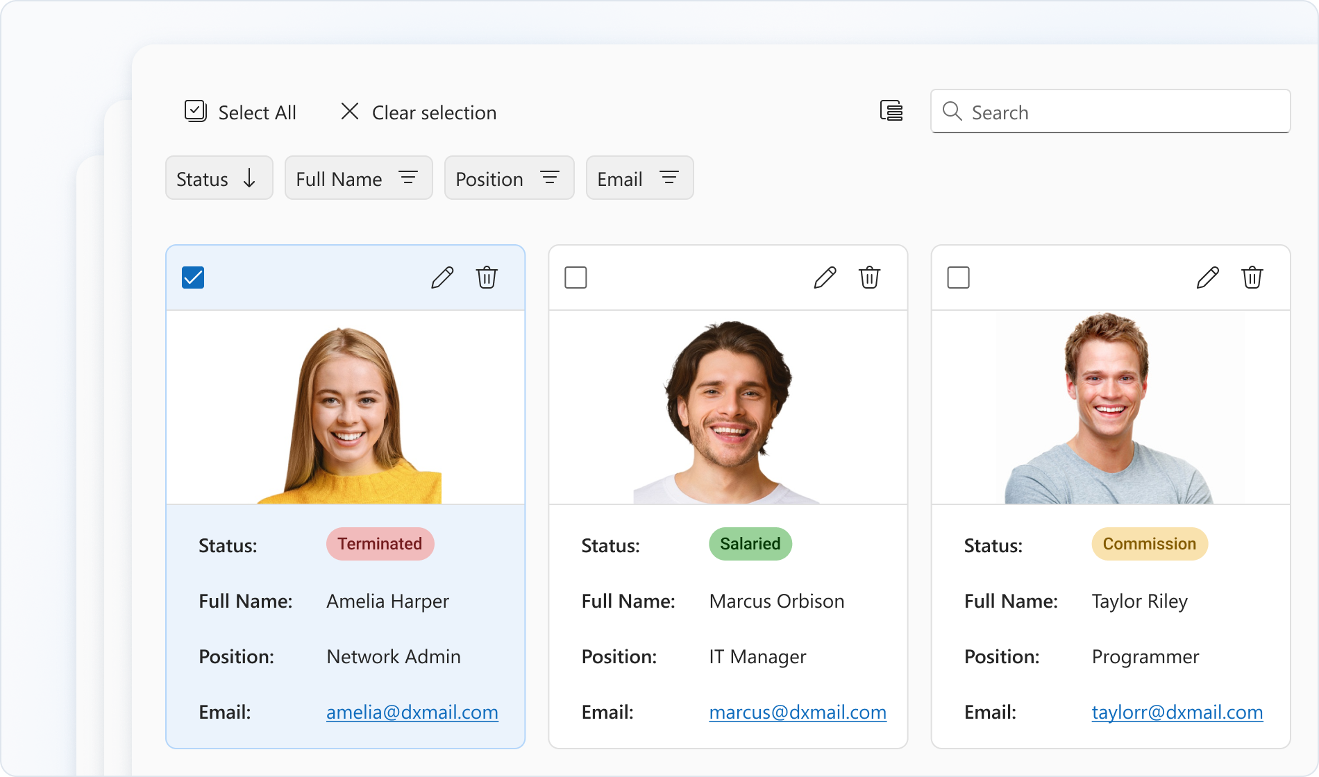
Card View is a responsive grid that displays data in cards. It supports data editing with validation, search, filtering, layout customization, and more.
Getting Started
The Card View UI Control is based on the DevExtreme Card View component.
The following help topics explain how to add this control to your project:
- Add DevExtreme to a Visual Studio Project or Configure a non Visual Studio Project
- Add Controls to a Project
- Razor Syntax
Basic Syntax
@using ASP.NET_Core.Models.CardView
@model IEnumerable<SampleOrder>

@(Html.DevExtreme().CardView<SampleOrder>()
    .DataSource(Model)
    .KeyExpr("OrderID")
    .Columns(c => {
        c.AddFor(m => m.CustomerID);
        c.AddFor(m => m.OrderDate);
        c.AddFor(m => m.ShipCountry);
        c.AddFor(m => m.ShipCity);
        c.AddFor(m => m.CustomerName);
    })
)
Built-in Capabilities and Configuration Guides
Data Binding
Card View supports different data source types, including local and remote data stores.Editing Operations
Card View allows users to add, update, and delete cards.Adaptability
Card View supports screens of all sizes. To adapt the component to your needs, you can specify maximum/minimum card widths and the number of cards per row.Filtering, Sorting, and Searching
You can configure header filters or the filter panel to allow users to filter Card View data. The component also supports sorting by single or multiple fields and searching.Selection
Card View supports single and multiple card selection. You can enable selection options such as checkboxes and selection of all cards.Column Hiding and Reordering
You can change column visibility in the Card View column chooser. To reorder columns, rearrange column headers in the header panel.Accessibility and Keyboard Navigation
Card View conforms to WCAG 2.x, European Accessibility Act (EAA), and Americans with Disabilities Act (ADA) standards. The component supports keyboard navigation and custom key handlers. Card View also ships with right-to-left (RTL) representation support.Card Customization
You can customize the appearance of card visual elements such as the cover, header, footer, and content. To implement further customizations, you can specify a card template.Component Customization
To customize the appearance and functionality of the Card View component, configure elements such as the toolbar, header panel, and pager.
API
Server-Side API
- Initialization
- Call the CardView() method to create a Card View control. This action initializes a CardViewBuilder<T> instance. Use the instance methods to specify Card View options and event handlers.
- Options
- For a complete option list, see CardViewBuilder<T> Members. For details on how to specify control options, refer to the following help topic: Specify Options.
- Events
- For available events, see Events. For details on how to handle events, refer to the following help topic: Handle Events and Define Callbacks.
Client-Side API
- Options
- If you need to specify the Card View options dynamically on the client side, use client-side API. For a complete option list, see DevExtreme Card View options.
- Methods
- For a list of available methods, see DevExtreme CardView methods. For details on how to call methods, refer to the following help topic: Call Methods.
Accessibility
For more information on Card View accessibility compliance, refer to the following help topic: Accessibility.