Legend Overview
- 7 minutes to read
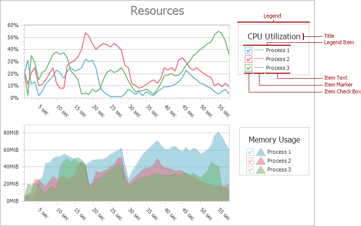
A legend is an area on a diagram that describes chart elements: series, series points, constant lines, strips, and indicators. The legend displays markers and check boxes with descriptions to identify chart elements.
Add Legends
Specify the WebChartControl.Legend property to add a single legend to a chart:
<dx:WebChartControl ID="WebChartControl1" runat="server">
    <Legend Name="Default Legend" AlignmentHorizontal="Left" AlignmentVertical="Bottom">
    </Legend>
    <%-- ... --%>
</dx:WebChartControl>
Use the WebChartControl.Legends collection to add multiple legends to a chart:
<dx:WebChartControl ID="WebChartControl1" runat="server">
    <Legends>
        <dx:Legend AlignmentHorizontal="Left" AlignmentVertical="Bottom" Name="Legend1">
        </dx:Legend>
        <dx:Legend AlignmentHorizontal="RightOutside" AlignmentVertical="Center" Name="Legend2">
        </dx:Legend>
    </Legends>
    <%-- ... --%>
</dx:WebChartControl>
Note
Series view types should be compatible to display them in the same legend. See the following help topic for more information: Combining Different Series Views.
You can hide a chart’s element from the legend. To do this, set the chart’s element ShowInLegend property to false. The following markup hides a constant line from the legend:
<ConstantLines>
    <dx:ConstantLine AxisValueSerializable="6" Name="Constant Line 1" ShowInLegend="False">
    </dx:ConstantLine>
</ConstantLines>
Show Series Points in a Legend
You can show each series point in a legend for series that support the SeriesViewColorEachSupportBase.ColorEach property. To do this, set the SeriesViewColorEachSupportBase.ColorEach property to true. The image below shows the Bar Series with the ColorEach property enabled:

Tip
The following help topic describes how to create the chart shown in the image above: Lesson 3 - Bind Chart Series to Data.
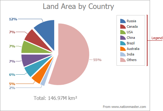
Legends for the Pie, Doughnut, and Funnel Series Views display an item for each series point. The following image shows the Pie chart with the legend:
Add Legend Title
Use the LegendBase.Title property to add a title to a legend:
<Legend>
    <Title Text="Average Temperature"
           Alignment="Center"
           Visible="True"
           TextColor="DarkRed"
           MaxLineCount="2"
           WordWrap="True">
        <Margins Top="5" Left="5" Right="5" Bottom="5" />
    </Title>
</Legend>
The following properties configure the legend’s title:
Name | Description |
|---|---|
Gets or sets the title alignment. | |
Specifies the indent between the title and other legend items, in pixels. | |
Gets or sets the number of lines to which a title’s text is allowed to wrap. | |
Gets or sets the title’s text. | |
Gets or sets a title’s text color. | |
Specifies whether the title is visible. | |
Indicates whether a long title text is carried over to a new line. |
Legend Items
The legend displays an item for each chart element. The item can contain a marker or a check box, or both. Use the Legend.MarkerMode property to define elements that the WebChartControl displays in legend items. The following table lists the possible values:
| Mode | Image | Description |
|---|---|---|
| CheckBox |  |
The legend displays check boxes and item descriptions. |
| CheckBoxAndMarker |  |
The legend displays check boxes, markers, and item descriptions. Check boxes are positioned in front of markers. |
| Marker |  |
The legend displays markers and item descriptions. |
| MarkerAndCheckBox |  |
The legend displays markers, check boxes, and item descriptions. Markers are positioned in front of check boxes. |
| None |  |
The legend displays item descriptions. |
Check Boxes
Users can use check boxes to manage chart element visibility in the diagram. When a check box is checked, the corresponding element is displayed. When the check box is unchecked the element is hidden.
Set the Legend.MarkerMode property to one of the following values: CheckBox, CheckBoxAndMarker, or MarkerAndCheckBox to display check boxes. Use the chart’s element CheckableInLegend property to hide the check box for a legend item.
The following markup hides the strip’s check box from the legend:
<Legends>
    <dx:Legend  Name="Legend1" MarkerMode="CheckBoxAndMarker">
    </dx:Legend>
</legends>
<%-- ... --%>
<Strips>
    <dx:Strip Name="Strip 1" LegendName="Legend1" LegendText="Optimal Load" CheckableInLegend="false">
        <MinLimit AxisValueSerializable="0.1" />
        <MaxLimit AxisValueSerializable="0.4" />
    </dx:Strip>
</Strips>
<%-- ... --%>
Result:

Note
The indicator check boxes are disabled when the SeriesBase.CheckedInLegend property is set to false for the series to which indicators belong.
The legend does not display check boxes for series points. When the Legend.MarkerMode property is set to one of the following values: CheckBox, CheckBoxAndMarker, or MarkerAndCheckBox, the legend displays an item for the series that contains these series points.
Set the WebChartControl.SaveStateOnCallbacks property to true to save the legend check box state on callbacks. You can also manually process the check box state on callbacks as shown in the following example:
You can handle the WebChartControl.LegendItemChecked event to change the default check box behavior. The following example uses custom radio buttons to control series visibility: How to: Create Custom Legend Radio Buttons to Control Visibility of a Chart Series.
Markers
A marker has the same color as its related element. A marker shape depends on the related chart element and series view type:

Item Text
The legend displays the element’s Name property value as the corresponding item’s text. To change item text for strips, constant lines, and indicators, specify their LegendText property. The following markup uses the ConstantLine.LegendText property to change a constant line’s description:
<ConstantLines>
    <dx:ConstantLine AxisValueSerializable="6" Name="Constant Line 1" LegendText="Optimal Temperature">
    </dx:ConstantLine>
</ConstantLines>
Specify the Series.LegendTextPattern property to customize descriptions for series and series points. You can use placeholders and format specifiers in this property. The following help topic lists available placeholders: LegendTextPattern.
The markup below displays series point values in the legend instead of a percentage:
<dx:Series Name="Area of Countries" LegendTextPattern="{V:F2} M km²">
    <%-- ... --%>
    <ViewSerializable>
        <dx:PieSeriesView Rotation="90" RuntimeExploding="True">
        </dx:PieSeriesView>
    </ViewSerializable>
    <%-- ... --%>
</dx:Series>
Result:

Add Custom Item
You can add a custom item to the legend to display additional information. To do this, follow the steps below:
- Create an instance of the CustomLegendItem class and add it to the LegendBase.CustomItems collection.
- Set the CustomLegendItem.Text property to the text that you want to display.
- Specify the CustomLegendItem.MarkerImage property to display an image in the custom item.
- Set the LegendBase.ItemVisibilityMode property to AutoGeneratedAndCustom to show custom and generated items in the legend simultaneously.
The markup below adds the total value to the legend:
<Legend Name="Default Legend" Direction="TopToBottom" ItemVisibilityMode="AutoGeneratedAndCustom">
    <CustomItems>
        <dx:CustomLegendItem Text="Total: 146.97 M km²">
            <MarkerImage  ImageUrl="~\Images\total-icon.png" />
        </dx:CustomLegendItem>
    </CustomItems>
</Legend>
Result:

Note
Custom items do not support check box elements, since a custom item does not have any corresponding chart’s element, that should be shown or hide based on the check box state.
Customize the Legend at Runtime
Handle the WebChartControl.CustomDrawSeries event to customize the legend item appearance for an individual series. The following example uses the e.LegendMarkerImage property to display a custom image as a marker for a series:
using System;
using System.Windows.Forms;
using DevExpress.XtraCharts;
// ...

protected void WebChartControl1_CustomDrawSeries(object sender, CustomDrawSeriesEventArgs e) {
    if (e.Series.Name == "Series 1") {
        e.LegendMarkerImage = System.Drawing.Image.FromFile(Server.MapPath("legend-marker.png"));
        e.DisposeLegendMarkerImage = true;
    }
}
The WebChartControl.CustomDrawSeriesPoint event allows you to customize the legend item appearance for series points.
The example below conditionally customizes legend items in the ChartControl.CustomDrawSeriesPoint event handler:
using System;
using System.Windows.Forms;
using DevExpress.XtraCharts;
// ...

private void WebChartControl1_CustomDrawSeriesPoint(object sender,
CustomDrawSeriesPointEventArgs e) {
    if (Convert.ToDouble(e.SeriesPoint.Values[0]) > 5) {
        e.LegendText = "exceeded";
        e.LegendTextColor = Color.Red;
    }
    else {
        e.LegendMarkerVisible = false;
        e.LegendTextVisible = false;
    }
}